21 Elegant Taupe & Grey Kitchen Backsplash Designs
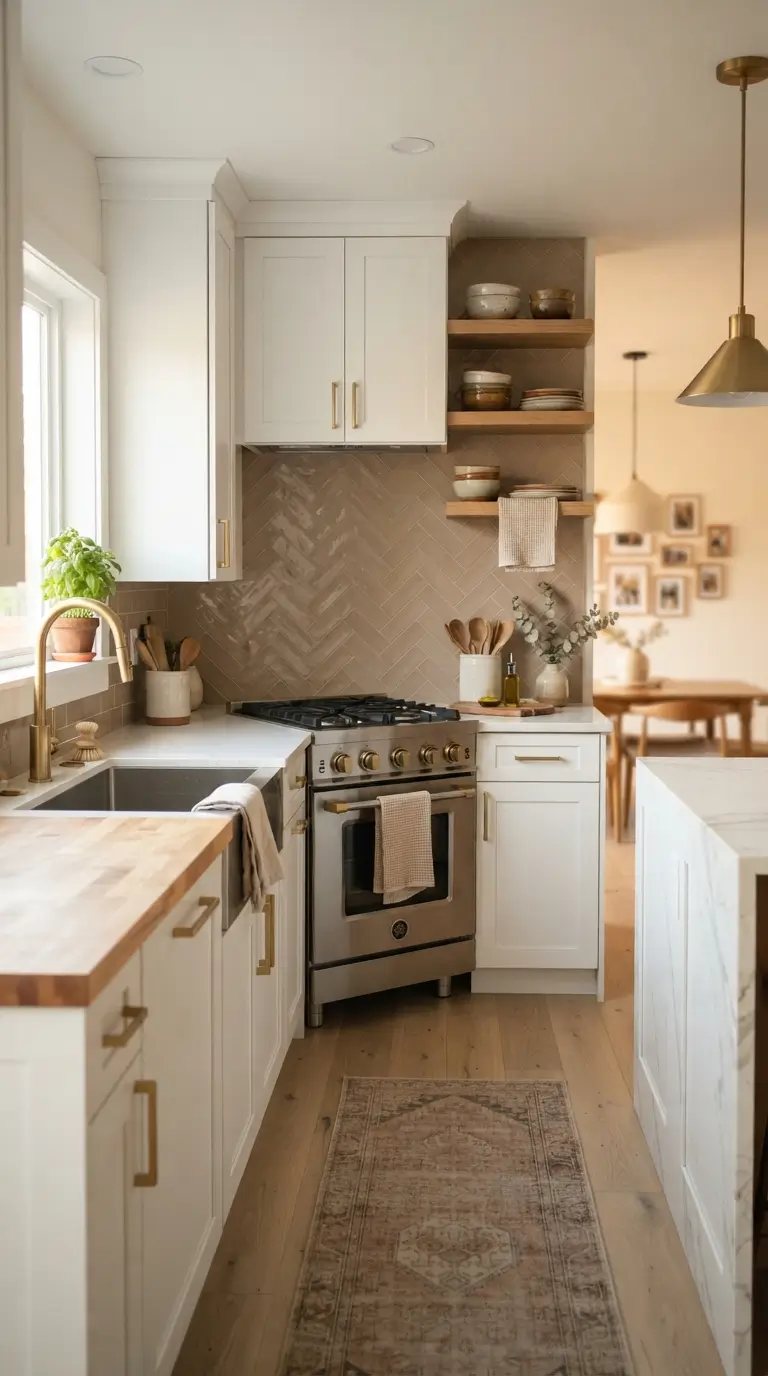
If your kitchen feels a little flat and you cannot figure out why, the backsplash is usually the answer. A good taupe or grey backsplash does something white tile never quite manages. It adds warmth without shouting for attention, and it makes wood cabinets, brass hardware, and even plain white counters look intentional instead of accidental. I have pulled together twenty one backsplash designs that use taupe and grey in different ways, from soft warm tones to deeper charcoal shades. Some use classic subway shapes, others lean into texture and pattern. Every idea here is something you can actually source at a tile shop or online, not a one off custom job. Whether you are planning a full renovation or just swapping out a dated backsplash over a weekend, you will find a design in this list that fits your kitchen and your budget.
1. Taupe Subway Tile
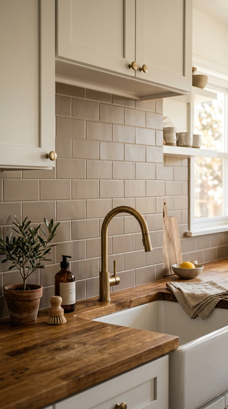
A classic subway shape in warm taupe gives your kitchen a soft, grounded look without feeling cold or clinical. This works best in kitchens with white or cream cabinets, since the taupe tile adds just enough color to break up all that brightness. Choose a matte finish rather than glossy, since matte taupe tile hides water spots and looks more expensive. Lay the tiles in a classic offset brick pattern for a timeless feel, or try a vertical stack pattern if your kitchen has lower ceilings and needs a taller visual line.
Pair the tile with warm brass or aged bronze hardware to pull out the warmth in the taupe tone. A butcher block counter or warm oak open shelf next to the backsplash makes the whole wall feel cohesive rather than tiled in isolation. This is one of the easiest updates on this list because subway tile is widely available and simple enough for a confident do it yourself weekend project.
2. Grey Marble Herringbone
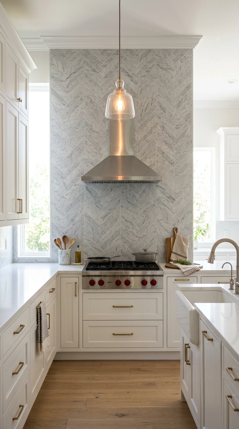
Herringbone pattern tile in soft grey marble turns a plain backsplash wall into the focal point of the whole kitchen. The zigzag pattern catches light differently than a straight lay, which gives the grey marble a bit of movement instead of looking flat. This design works especially well behind a stove, where it can run all the way up to the range hood for a dramatic full height look.
Keep the grout thin and close in color to the tile so the herringbone lines stay clean rather than busy. Pair this backsplash with simple white or light grey cabinets so the pattern stays the star of the room. A brushed nickel faucet and pendant lights with a warm bulb balance out the coolness of the grey marble. If your budget allows, use real marble for the veining, but a good porcelain look alike will still give you this same elegant effect for less money and less maintenance.
3. Warm Greige Zellige
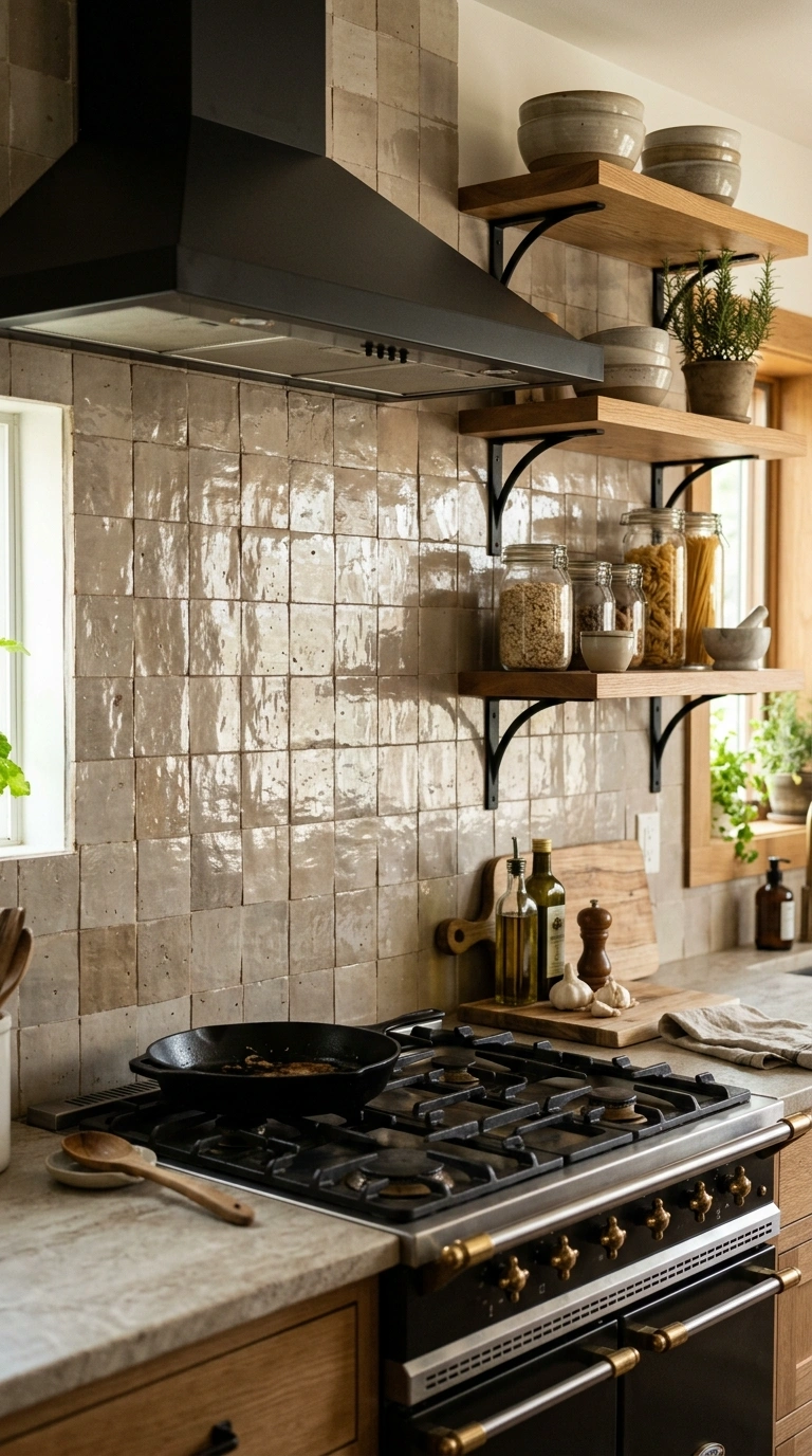
Zellige tile has an uneven, handmade surface that catches light in a way factory tile never does, and a warm greige color gives it a soft, lived in feel. Each tile has small dips and waves, so the wall looks slightly different depending on the time of day and the angle of your light. This is a great pick for kitchens that already lean traditional or Mediterranean, though it also works surprisingly well in modern spaces that want a bit of texture.
Use a simple grid layout so the natural texture of the tile does the visual work instead of a busy pattern. Greige zellige looks beautiful paired with warm wood cabinets, open shelving, and simple black or brass fixtures. Keep the counters plain, maybe a honed stone or butcher block, so the backsplash has room to shine. This tile does cost more than standard ceramic, so many homeowners use it only behind the stove as an accent rather than across the full wall.
4. Charcoal Grey Grout Lines
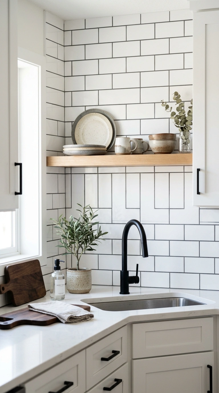
Sometimes the tile is not what changes a backsplash, the grout is. Standard white subway tile with dark charcoal grout gives a completely different look than the same tile with white grout. The charcoal lines create a grid pattern that reads almost like a design choice on its own, and it hides daily kitchen grime far better than pale grout ever could.
This works in almost any kitchen style, from farmhouse to modern minimalist, because the tile itself stays simple and neutral. Pair dark grout subway tile with black cabinet hardware or a matte black faucet to tie the whole look together. If your kitchen has a lot of white already, from cabinets to counters, this backsplash adds definition and structure without introducing a new color. It is also one of the more budget friendly ideas on this list since basic subway tile and colored grout cost very little compared to specialty tile.
5. Taupe Stone Mosaic
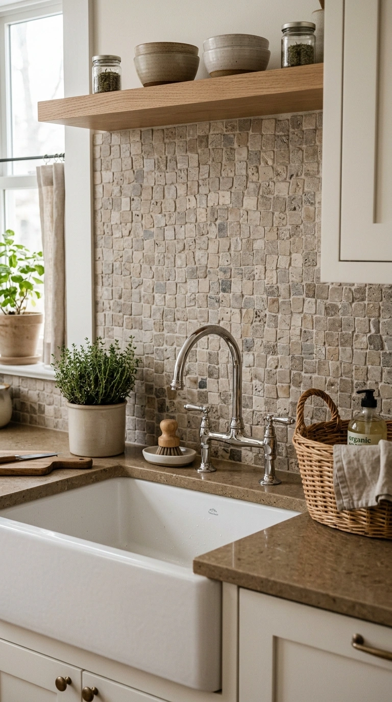
A mosaic backsplash made of small taupe toned natural stone pieces gives your kitchen a soft, organic texture that reads as high end without a high end price tag. The small tiles come pre mounted on mesh sheets, which makes them easier to install than you might expect. Because the pieces are natural stone, no two tiles are exactly the same shade, which gives the wall subtle depth.
This mosaic style works best in kitchens with simple, quiet cabinetry, since the tile itself already brings texture and interest. Seal the stone after installation to protect it from oil splatters and water stains near the sink. Pair the mosaic with a plain quartz counter in a warm white or soft grey so the two surfaces do not compete. A woven basket on the counter or a linen tea towel nearby echoes the natural, tactile feel of the stone mosaic.
6. Soft Grey Hexagon Tile
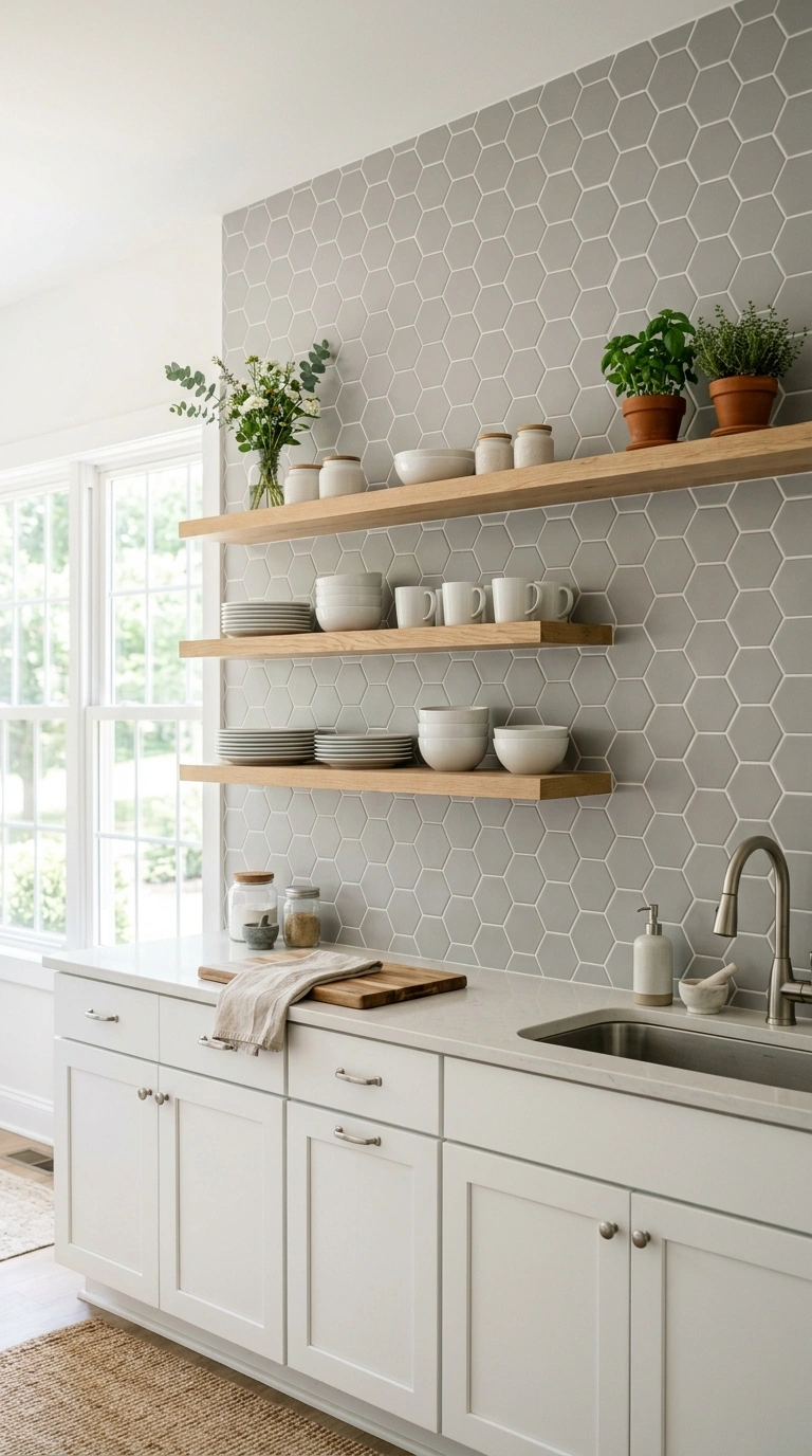
Hexagon tile brings a slightly playful geometric shape while soft grey keeps the overall look calm and grown up. This shape works particularly well as a full wall backsplash in kitchens that want a bit of pattern without going bold or colorful. The honeycomb layout also happens to be one of the more forgiving patterns to install yourself, since the hexagons naturally lock together.
Choose a small to medium hexagon size for kitchens, since oversized hexagons can look better suited to floors. Pair soft grey hexagon tile with white or pale wood cabinets and simple pull hardware so the tile pattern stays the focal point. A row of open shelves with plain white dishware sits beautifully against this backsplash, letting the honeycomb shape show through. This design photographs especially well thanks to the repeating geometric shape, making it a strong choice if you plan to share your kitchen online.
7. Taupe and White Mix
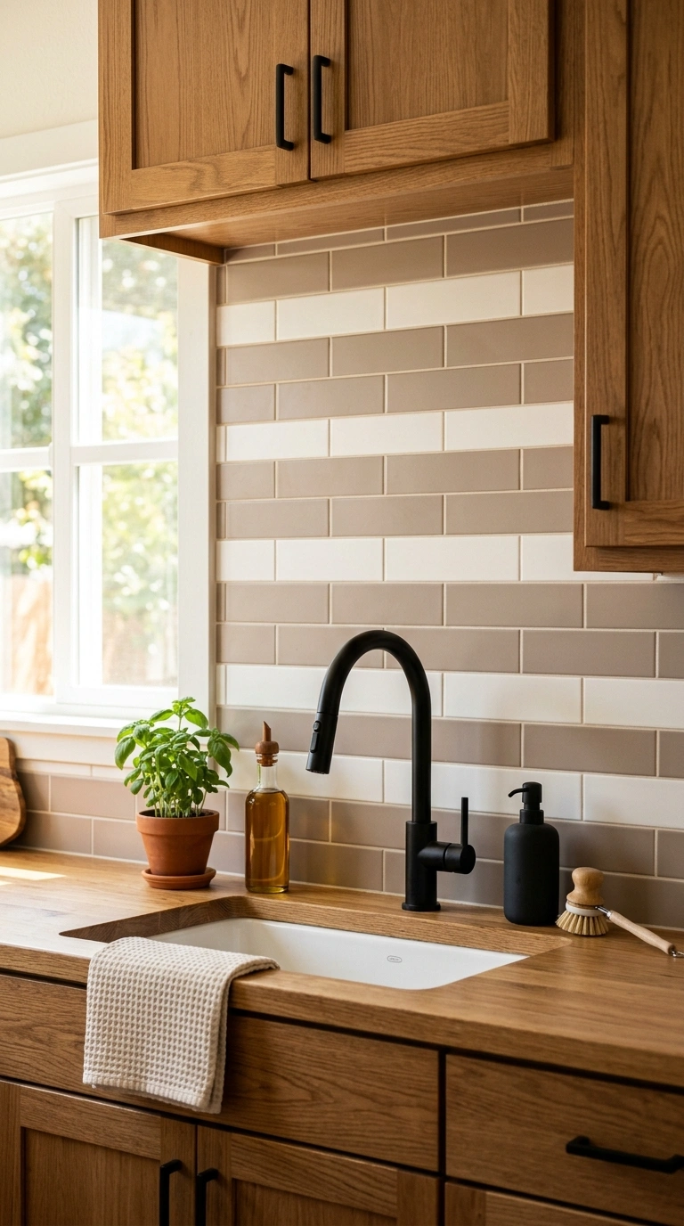
Mixing taupe and white tile in a simple pattern, such as alternating rows or a checkerboard style spacing, gives your kitchen two tone depth without needing bold color. This works especially well in kitchens where you want warmth from the taupe but still need brightness from the white to keep the space feeling open. The contrast between the two tones also makes tile edges and grout lines pop in a pleasing, intentional way.
Keep the mix simple, maybe every third row in taupe among white, rather than a complicated pattern that competes with cabinetry. This backsplash pairs naturally with cabinets in either white or a mid tone wood, since both colors in the tile already bridge the gap. A brass or matte black faucet adds a bit of contrast against the lighter tones. This design is especially useful in kitchens with limited natural light, since the white keeps things bright while the taupe adds grounding warmth.
8. Grey Fluted Tile Panels
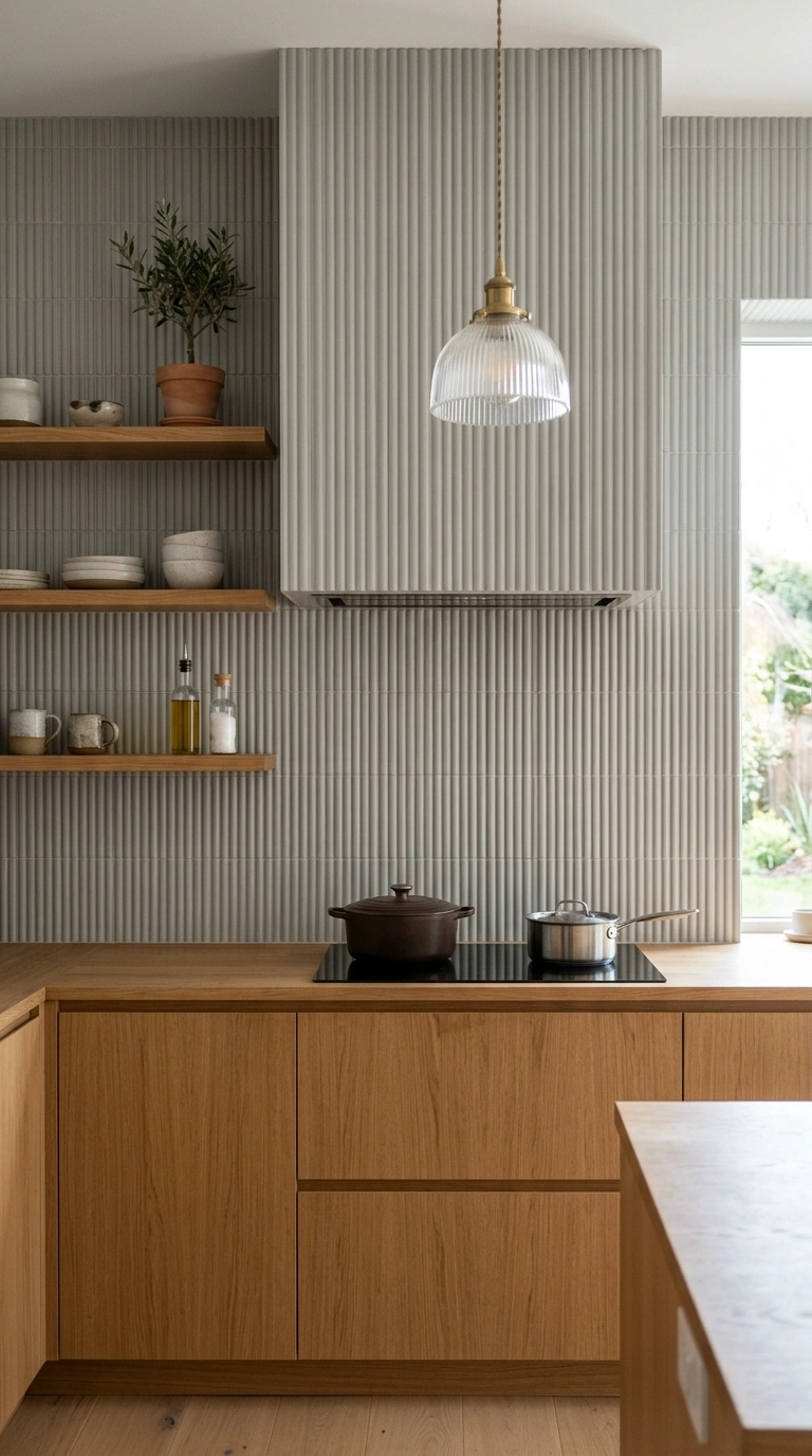
Fluted or ribbed tile panels in a soft grey tone bring a sculptural, almost furniture like quality to a kitchen wall. Unlike flat tile, fluted panels catch light and shadow along their grooves, which gives the backsplash a changing look throughout the day. This design fits especially well in modern kitchens that already favor clean lines and minimal ornamentation elsewhere.
Because fluted tile has a strong vertical or horizontal texture, keep the surrounding elements simple. Plain slab cabinets, a single pendant light, and an uncluttered counter let the fluted texture stand out as the main design feature. This style works beautifully as a stove backsplash that runs floor to ceiling, framed by open shelving on either side. Grey fluted tile also pairs nicely with warm wood tones, since the contrast between smooth wood grain and ribbed tile texture adds visual interest without adding more color.
9. Textured Taupe Plaster
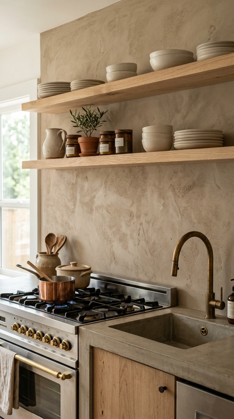
Instead of tile at all, some kitchens are using a hand applied plaster finish in warm taupe for the backsplash wall. This creates a soft, matte, almost velvety texture that feels closer to a piece of art than a typical tiled surface. Plaster backsplashes work especially well behind a range where you want a seamless look with no grout lines to clean.
This finish needs a proper sealant to handle grease and water near cooking areas, so talk to your installer about food safe, heat resistant plaster products made for kitchens. Pair textured taupe plaster with simple open shelving in warm wood and ceramic dishware in cream or soft white. A brass or unlacquered brass faucet adds warmth that matches the plaster tone beautifully. This backsplash style suits kitchens going for a quiet, organic, almost old world European feel.
10. Dark Grey Slate Backsplash
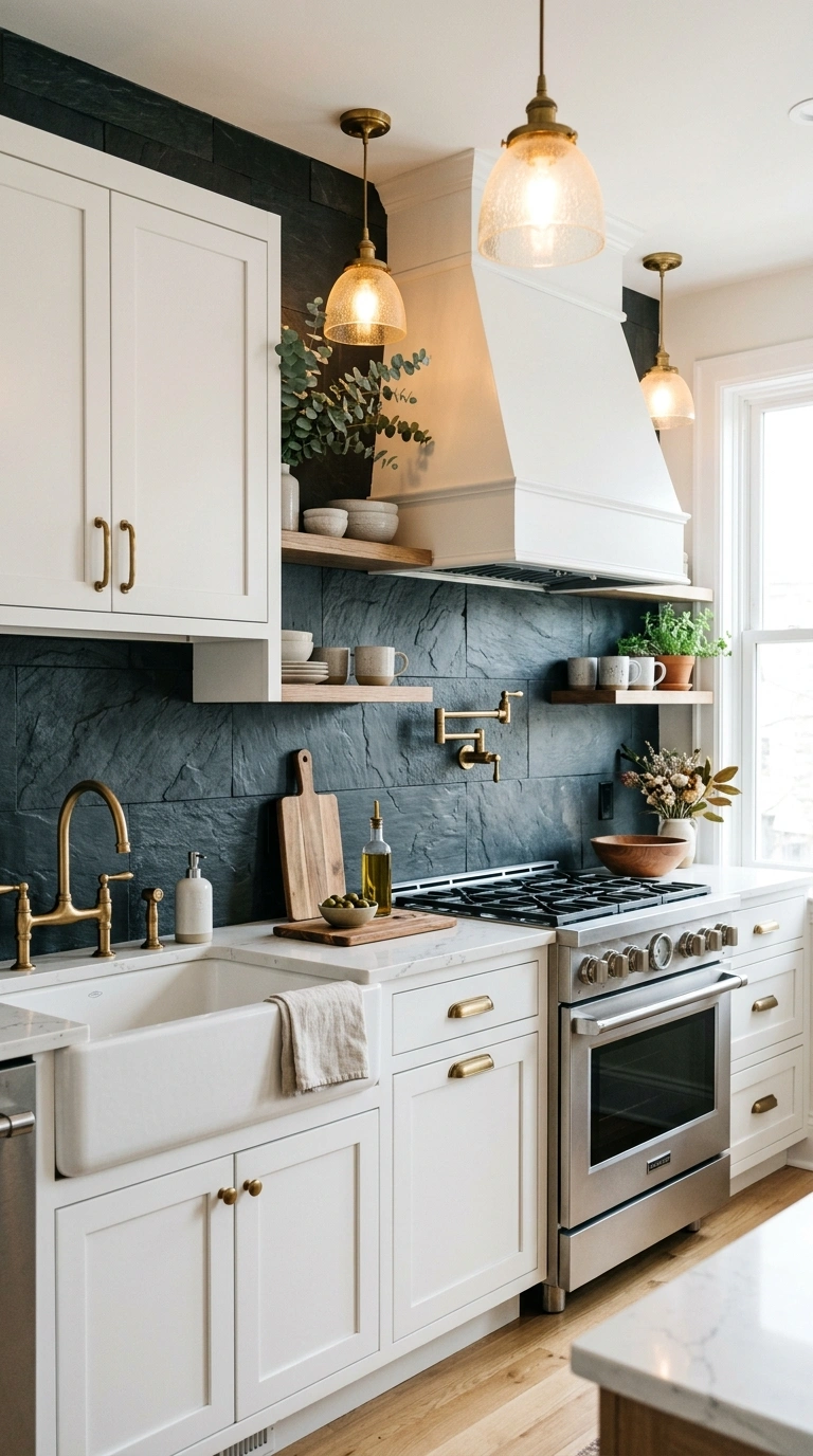
Natural slate tile in a deep charcoal grey brings a moody, grounded feel to a kitchen, especially one with lighter cabinets and counters. The natural texture of slate, with its slight ridges and variation in tone, keeps the backsplash from looking flat even in a single dark color. This works especially well in kitchens that want a dramatic contrast point against white or pale wood cabinetry.
Slate needs sealing to resist stains from oil and water, so plan for annual maintenance to keep it looking its best. Pair dark slate with brass or aged bronze fixtures, since the warmth of those metals balances the coolness of the stone. A simple runner in a warm tone on the floor nearby, plus warm toned pendant lighting above the island, keeps the kitchen from feeling too cool overall. This backsplash choice suits kitchens with plenty of natural light, since dark tile can feel heavy in a dim space.
11. Taupe Ceramic Scallop Tile
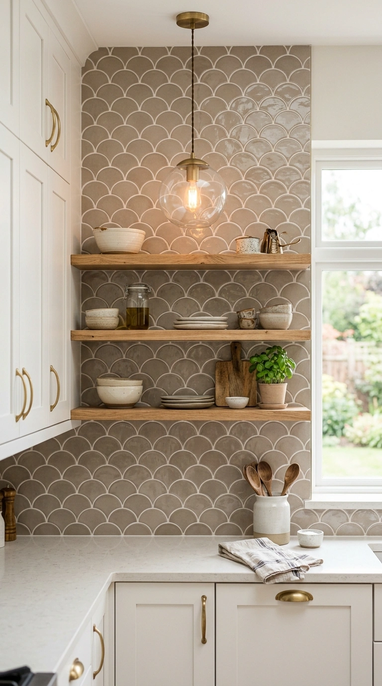
Scallop shaped tile, sometimes called fish scale tile, in a warm taupe color adds a soft, curved pattern that feels fresh compared to standard rectangular tile. The rounded edges of each scallop create a gentle, almost fabric like texture across the wall. This design works particularly well as an accent behind open shelving or above a stove, rather than across an entire kitchen wall.
Because the shape is already detailed, keep the color palette simple around it, sticking to white or soft wood cabinets. Scallop tile pairs nicely with round pendant lights and curved cabinet pulls, since the rounded shapes throughout the kitchen echo each other. This backsplash design is popular for its Pinterest friendly look, since the pattern photographs beautifully under natural light. If you want a bolder statement, extend the scallop tile all the way to the ceiling behind the range for a striking vertical feature.
12. Grey Marble Slab Backsplash
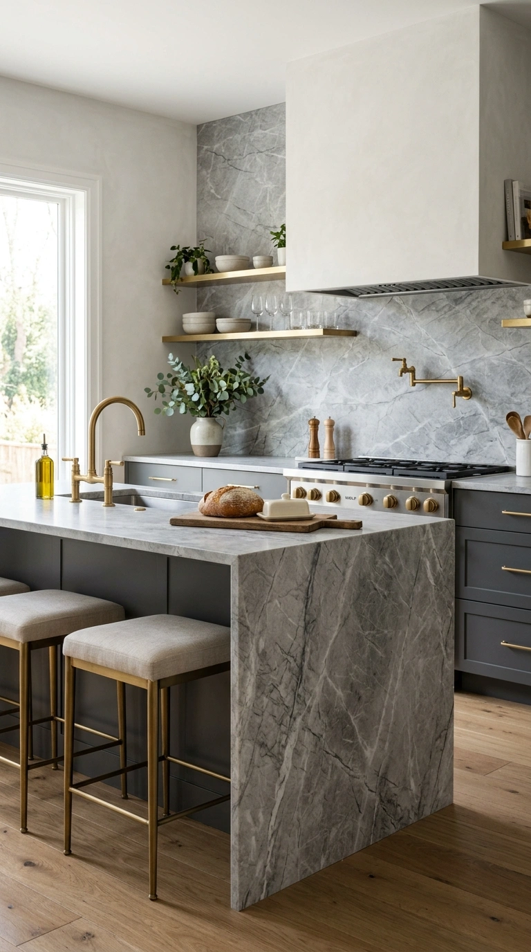
A single slab of grey marble, cut to match your counter or run as a standalone backsplash, gives a seamless, luxury hotel kind of feel to a kitchen. Unlike tile, a slab has no grout lines at all, which means less cleaning and a smoother visual flow from counter to wall. The natural veining in the marble becomes the main design detail, so no two kitchens using this idea look exactly the same.
This backsplash works especially well when the same marble continues onto the countertop, creating a waterfall effect that feels custom and expensive. Pair grey marble slab with simple, understated cabinetry, either in white or a warm wood tone, so the marble veining stays the focal point. Brass or polished nickel fixtures both work well here, depending on whether you want a warm or cool overall feel. Slab backsplashes do cost more upfront, but many homeowners find the reduced maintenance worth the investment over time.
13. Taupe Brick Pattern Tile
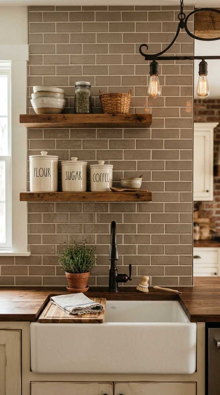
Long, narrow tile in warm taupe, laid in a traditional brick offset pattern, gives a kitchen backsplash a slightly rustic, textured look without going into full farmhouse territory. The narrow shape of the tile creates more grout lines than standard subway tile, which adds a subtle grid texture across the wall. This design suits kitchens that want warmth and a bit of old world charm.
Keep the grout close in tone to the tile itself for a cleaner, more cohesive look, or go a shade darker for more definition between each brick. Pair taupe brick tile with warm wood open shelving and simple ceramic canisters in cream or soft white. A cast iron pot rack or wrought iron light fixture nearby adds to the rustic warmth of this backsplash style. This design works especially well in kitchens with farmhouse sinks and shaker style cabinets.
14. Grey Penny Tile Accent
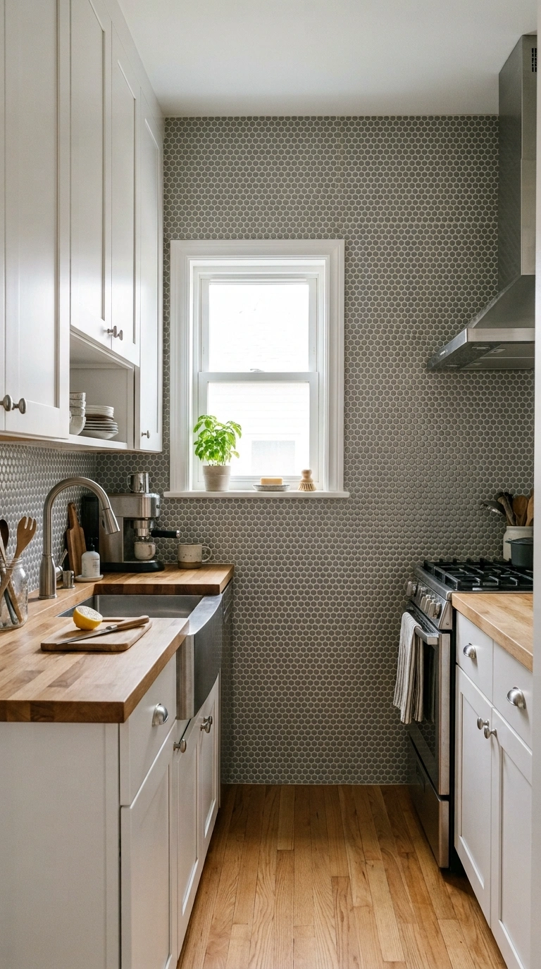
Small round penny tile in soft grey creates a delicate, detailed texture that works beautifully as an accent rather than a full wall treatment. This tile shape is especially good for smaller kitchens, since the tiny scale of each piece keeps the wall from feeling heavy or overwhelming. Penny tile also handles curves and corners more easily than large format tile, making it a good pick for kitchens with unusual layouts.
Use penny tile as a band behind open shelves or as the full backsplash in a small galley kitchen where a bold pattern might feel too busy. Pair grey penny tile with white grout for definition, or grey grout for a more blended, monochrome look. Simple white cabinets and brushed nickel hardware let the texture of the penny tile take center stage. This design is easy to clean thanks to the tight grout lines, making it practical for daily cooking as well as attractive.
15. Warm Taupe Wood Look
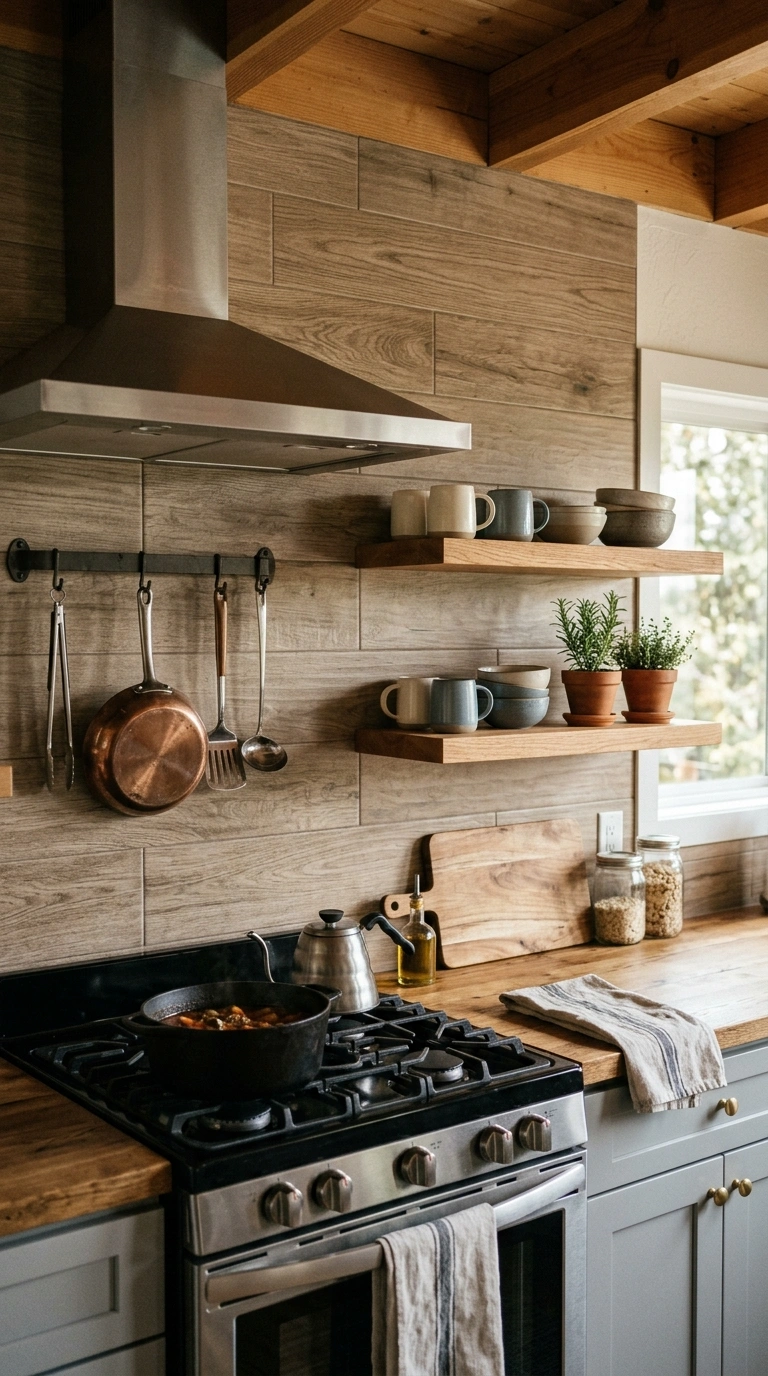
Wood look porcelain tile in a warm taupe tone gives kitchens a cozy, cabin like feel while still holding up to water and heat the way real wood cannot. Installed as a backsplash, the wood grain pattern runs horizontally, mimicking the look of a paneled wall behind the stove or sink. This is a good pick for kitchens that already lean rustic, coastal, or modern farmhouse in style.
Choose a matte finish for the most realistic wood look, since glossy tile tends to look more like plastic than timber. Pair this backsplash with simple white or soft grey cabinets so the wood look tile reads as a warm accent rather than competing with actual wood cabinetry elsewhere in the kitchen. Open shelving in a slightly different wood tone above the backsplash adds layered warmth without matching too perfectly. This design also works well in kitchens that want the look of shiplap without the maintenance real wood requires near a cooking area.
16. Grey Chevron Pattern
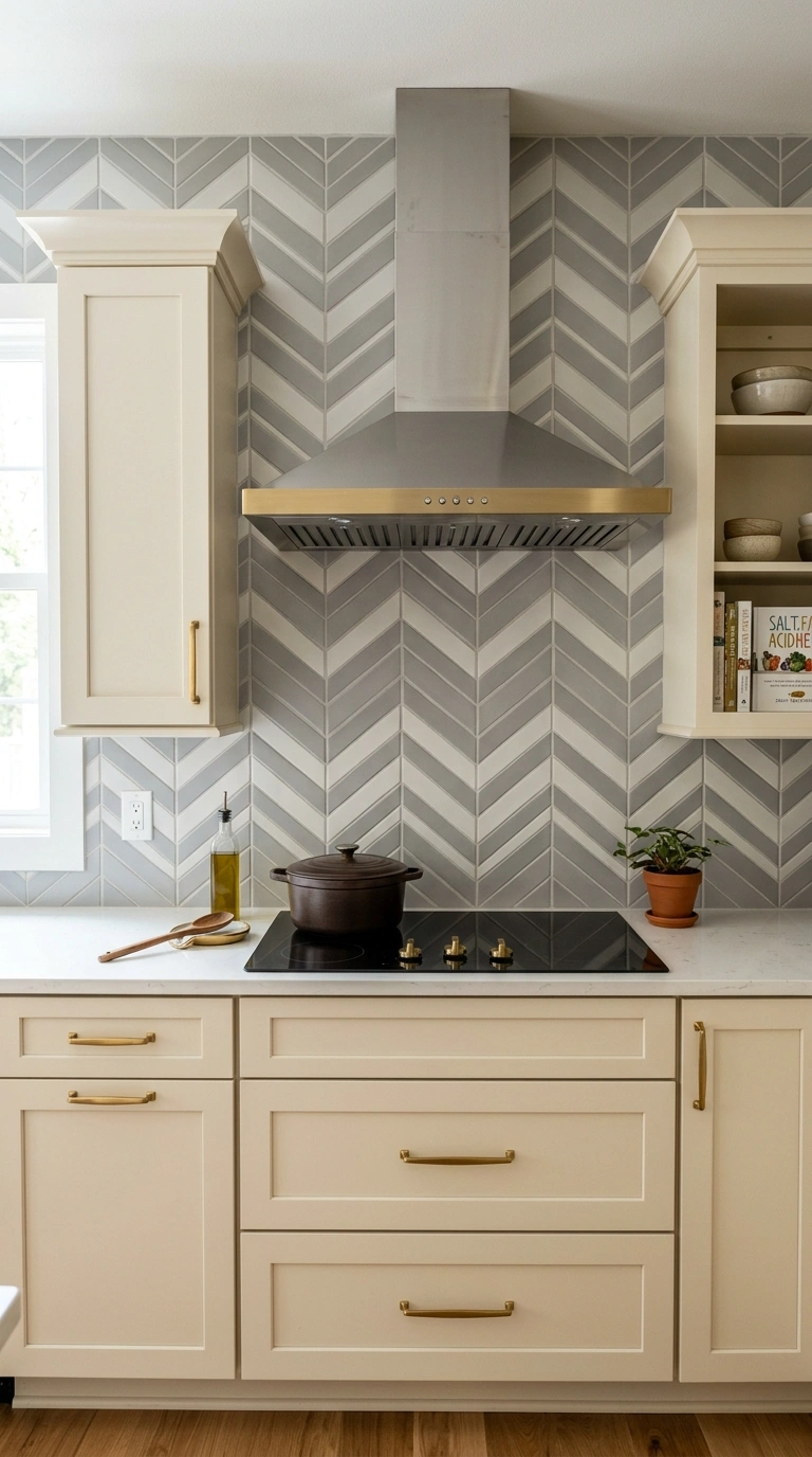
Chevron pattern tile in soft grey creates a bold zigzag design that adds energy and movement to an otherwise plain kitchen wall. Unlike herringbone, which has tiles meeting at an angle without a clean point, chevron tiles are cut to form a sharp, continuous V shape across the wall. This pattern works especially well as a focal point behind a stove or range, drawing the eye upward toward a hood or shelf above.
Because chevron is already a strong visual pattern, keep cabinet colors simple, sticking to white, cream, or a soft grey that matches the tile. Thin grout lines in a matching grey tone keep the zigzag pattern clean rather than choppy. Pair this backsplash with brushed gold or brass fixtures for warmth against the cool grey tone. This design suits modern kitchens that want a statement wall without adding actual color to the space.
17. Taupe Handmade Tile
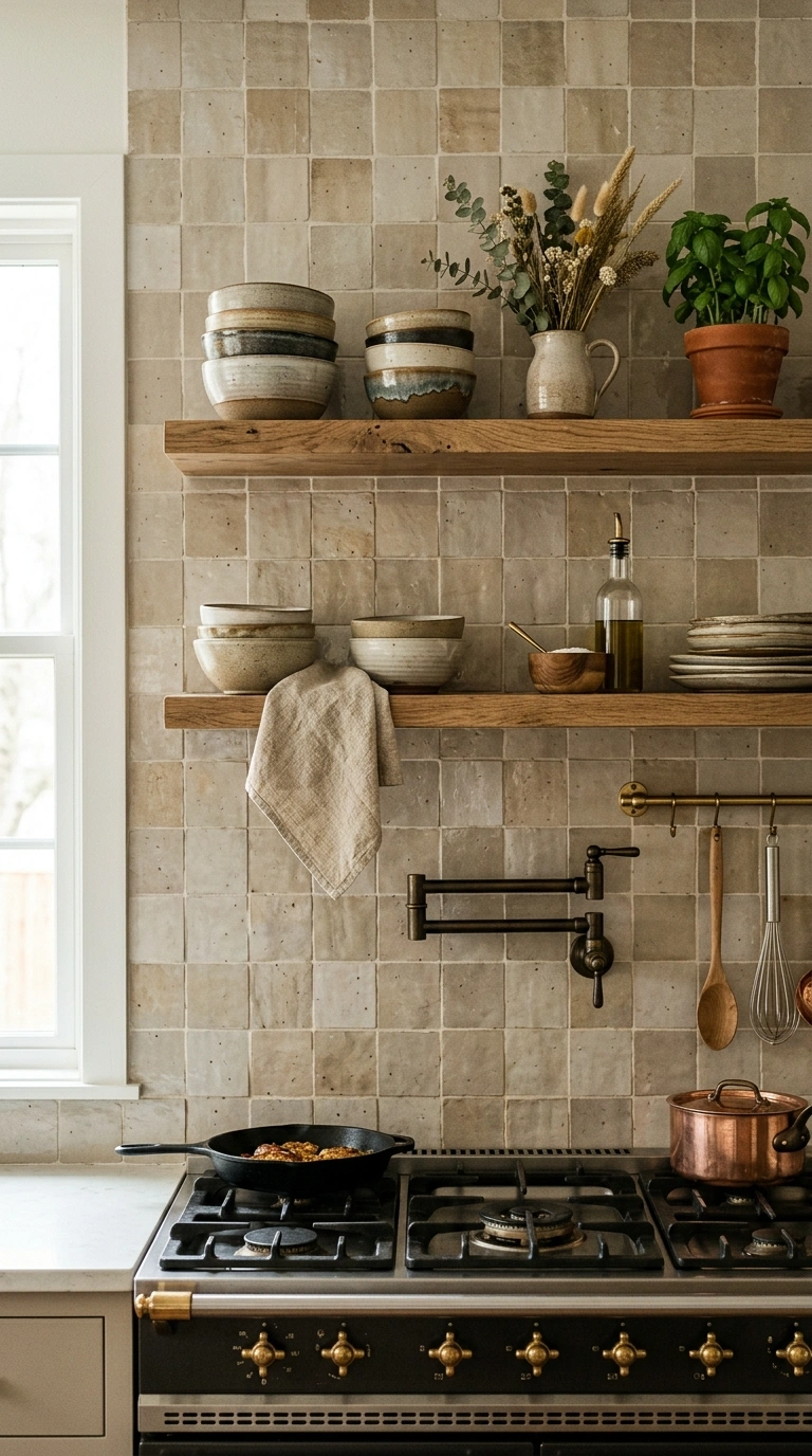
Small batch, handmade tile in warm taupe tones brings gentle imperfections, like slight color variation and soft edges, that give a kitchen backsplash real character. Unlike factory made tile, each piece looks a little different, which creates a subtle, organic pattern across the wall even in a simple grid layout. This style works especially well in kitchens aiming for a warm, artisan feel rather than a slick, uniform look.
Because handmade tile already has texture and variation built in, keep the layout straightforward, a classic grid or simple offset, rather than a busy pattern. Pair taupe handmade tile with open wood shelving, ceramic bowls, and linen towels to lean into the artisan feel further. Brass hardware and warm toned pendant lighting complete the look. This tile does tend to cost more than mass produced options, so many homeowners use it as a feature behind the stove rather than across the entire kitchen.
18. Grey and Brass Combo
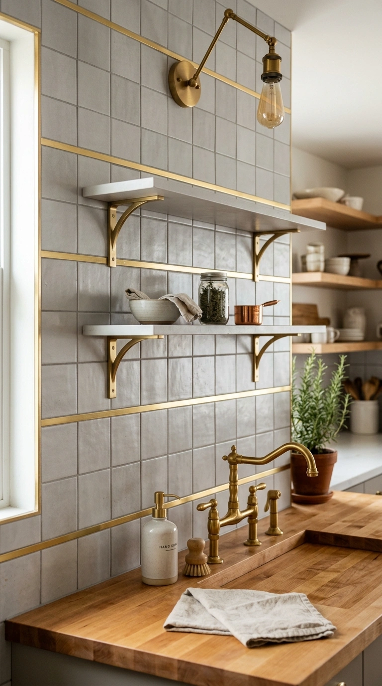
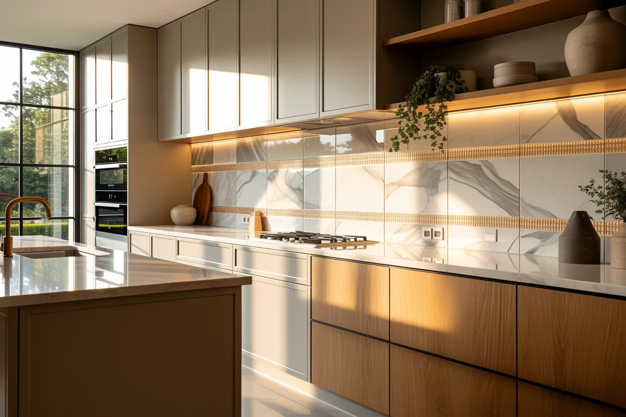
Pairing a soft grey tile backsplash with brass trim pieces, brass shelf brackets, or a brass framed mirror style accent tile creates a warm and cool combination that feels polished and intentional. The brass does not need to cover much of the wall, even small brass strips between tile sections or a brass edged shelf can tie the whole look together. This combination works in both modern and traditional kitchens, which makes it a flexible choice.
Choose a simple grey subway or square tile as the base, then add brass detailing through hardware, a faucet, and light fixtures rather than more tile. This keeps costs reasonable while still achieving the warm and cool contrast. A butcher block counter section near the backsplash adds another layer of warmth that complements both the grey tile and brass accents. This pairing photographs beautifully thanks to the contrast between cool tile and warm metal tones.
19. Taupe Large Format Tile
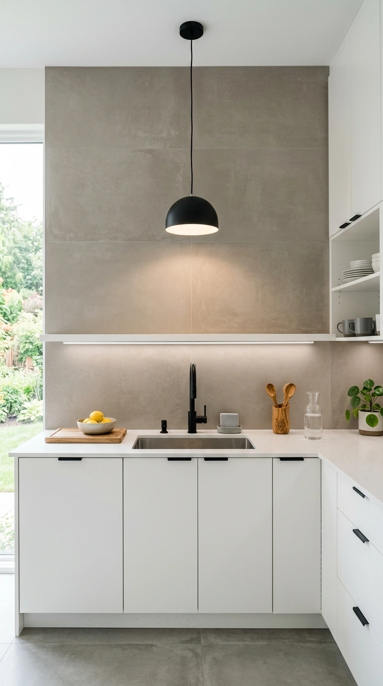
Large format tile in warm taupe, meaning bigger tiles with fewer grout lines, gives a kitchen a clean, modern look while still bringing warmth through the taupe color. Because there are fewer seams, the wall feels smoother and more expansive, which works especially well in smaller kitchens that need to feel larger than they are. This design also means less grout to clean over time, a practical bonus for busy kitchens.
Install large format tile with a very thin grout line for the most seamless look possible. Pair this backsplash with simple slab front cabinets in white or soft wood tones, since the minimal grout lines already give the kitchen a streamlined feel. A single pendant light with a warm bulb and simple black or brass hardware complete this modern, understated look. This design suits kitchens going for a quiet, contemporary feel without heavy pattern or texture.
20. Grey Geometric Tile Design
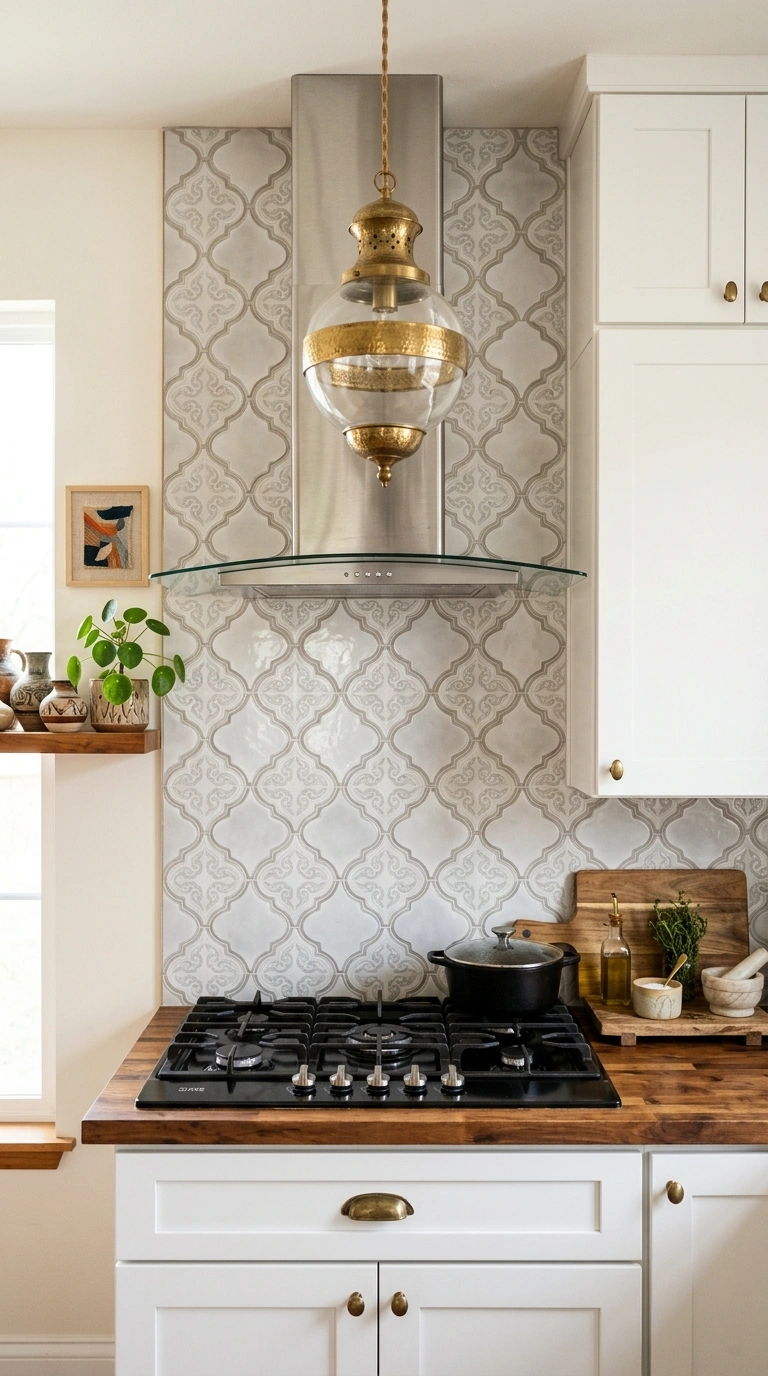
Geometric patterned tile in soft grey tones, whether arabesque shapes, diamonds, or a repeating trellis design, brings pattern and personality to a kitchen wall without needing bold color. These tiles usually come pre patterned, so the design work is already done, you just need to choose a layout that fits your wall space. This works especially well as a focal accent behind the stove, framed by simpler tile or a plain wall on either side.
Keep cabinetry and counters simple when using patterned tile, since the pattern itself is already doing plenty of visual work. White or soft grey cabinets let the geometric design stand out clearly. Simple black or brass pulls, along with a single statement pendant light, round out the look without adding competing patterns. This backsplash style is especially popular for kitchens with a global or eclectic design influence, since geometric patterns often draw from Moroccan and Mediterranean tile traditions.
21. Taupe Grey Ombre Tile
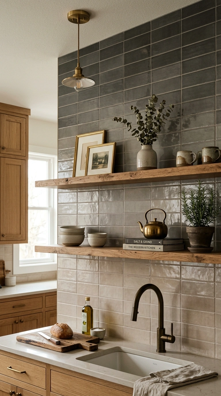
An ombre backsplash that shifts gradually from light taupe near the counter to a deeper grey near the top creates a soft, gradient effect that feels artistic and completely unique to your kitchen. This design requires careful planning during installation, since tiles need to be ordered and placed in the correct shade order to achieve a smooth transition rather than an abrupt color change. The effect works especially well on a full height backsplash that runs behind open shelving or up to the ceiling.
This design suits kitchens that want a single striking feature wall rather than pattern or texture elsewhere. Keep cabinets and counters plain and light so the ombre effect reads clearly against a simple backdrop. Warm brass fixtures and a wood cutting board or shelf nearby help ground the gradient in a natural, warm feeling kitchen rather than something too abstract. This is one of the more unique ideas on this list, and it tends to become the conversation piece of the entire room.
Picking a taupe or grey backsplash does not mean picking a boring one. As you can see from these twenty one designs, there is a huge range between a simple subway tile and a full gradient feature wall, and every option here brings its own kind of warmth to a kitchen. Start by thinking about how much pattern and texture the rest of your kitchen already has, then choose a backsplash that either matches that energy or gently balances it out. Whichever design you pick, you are adding a detail that will make your whole kitchen feel more finished and more like home.
FAQs
Does taupe or grey work better in a small kitchen?
Both colors work well in small kitchens, but lighter taupe and soft grey tones tend to make a small space feel more open, while darker charcoal grey can add depth if you have good natural light. If your kitchen is small and dim, stick to the lighter shades on this list.
What cabinet colors go best with a grey or taupe backsplash?
White, cream, and warm wood tones all pair well with taupe and grey backsplash tile. If your cabinets are already a bold color, choose a simpler tile pattern so the two elements do not compete.
Is taupe tile harder to keep clean than white tile?
Not really. Taupe and grey tones actually tend to hide small stains, water spots, and everyday grease splatters better than bright white tile, which makes them a practical choice for busy kitchens.
Can I install a taupe or grey backsplash myself?
Many of these designs, especially subway tile, penny tile, and large format tile, are beginner friendly for a confident do it yourself project. Slab backsplashes, plaster finishes, and natural stone mosaics usually need a professional installer.
What metal finish looks best with grey or taupe tile?
Brass and aged bronze bring out the warmth in taupe tones, while brushed nickel and matte black pair nicely with cooler grey shades. Choose your metal finish based on whether your tile leans warmer or cooler.