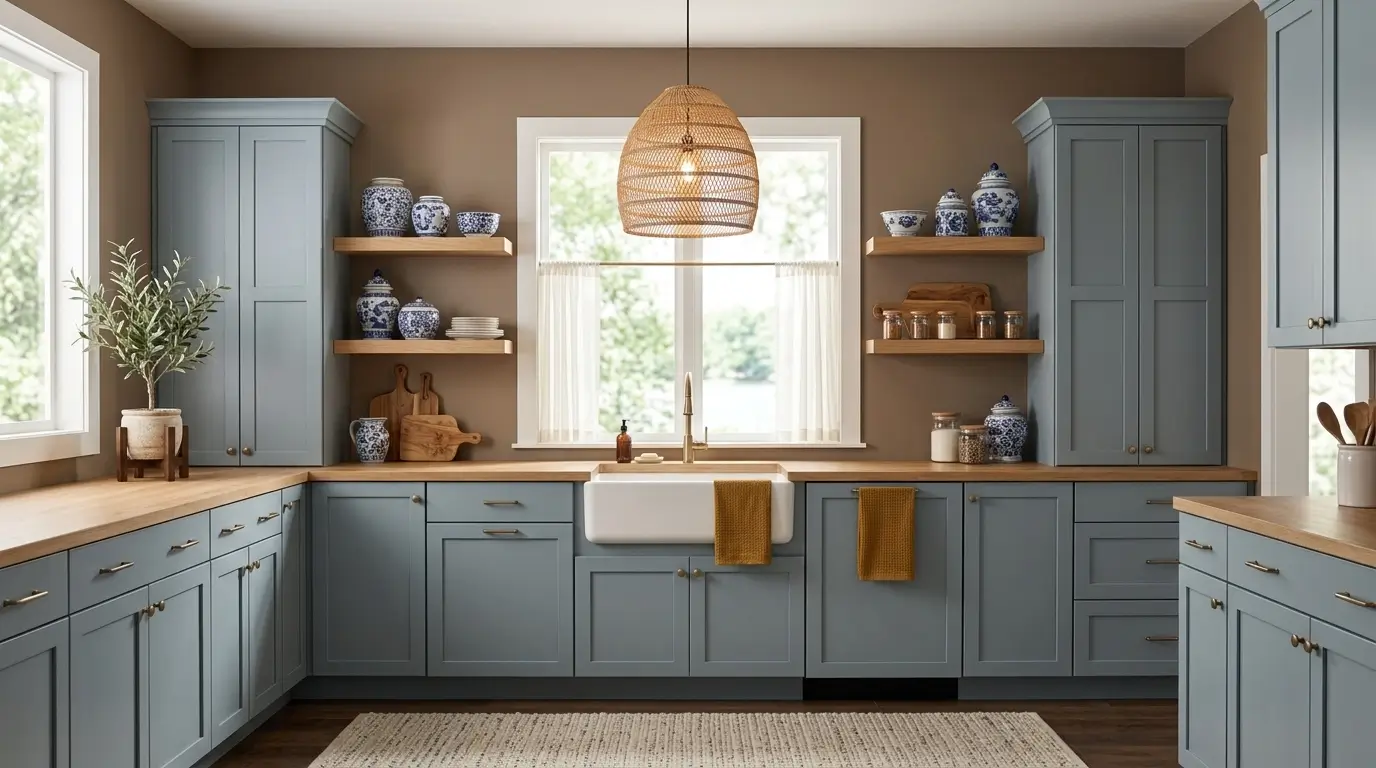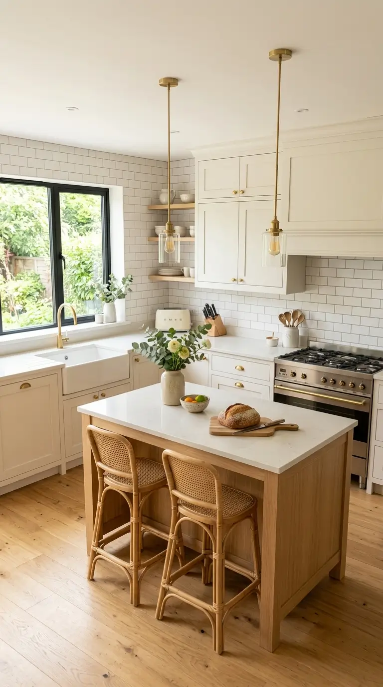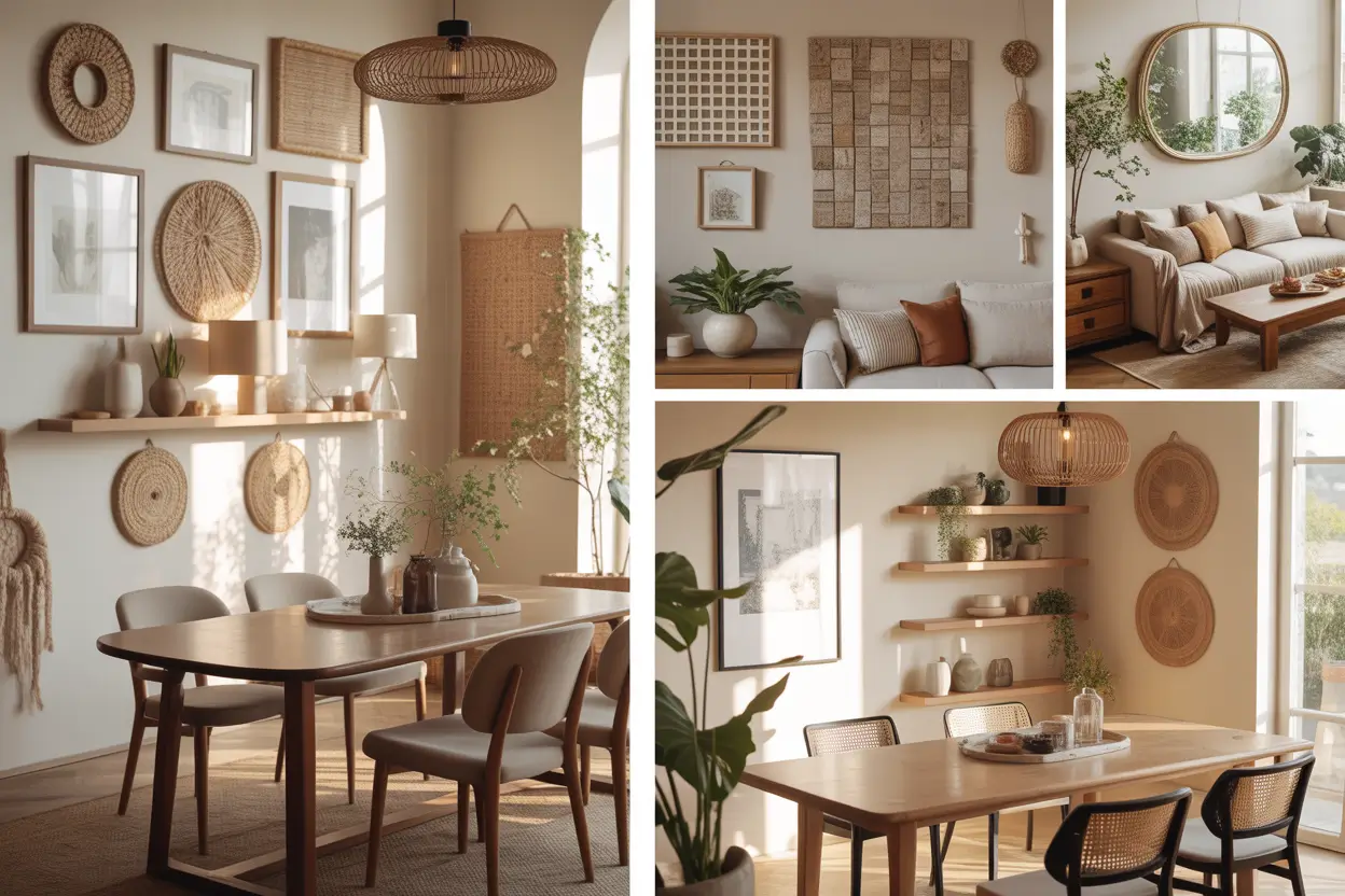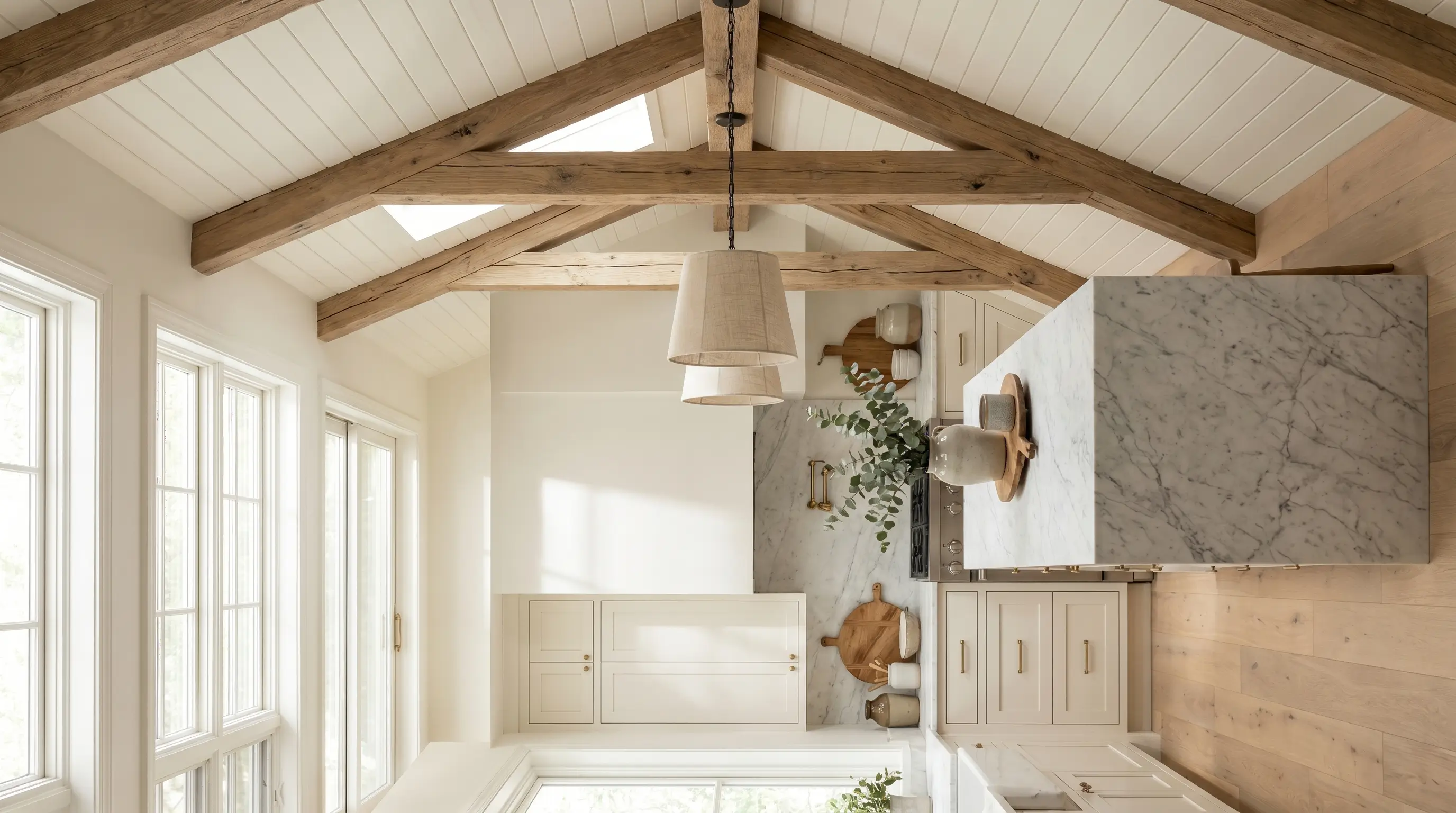
23 Stunning Cashmere Kitchen Ideas for a Soft Neutral Look
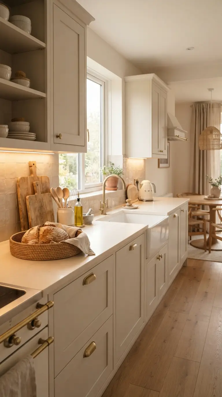
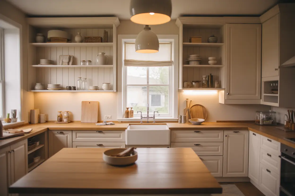
If you have ever walked into a kitchen that felt like a warm sweater on a cold day, you already know what cashmere style kitchens feel like. This color palette leans on soft beige, warm ivory, and gentle taupe tones that feel calm the moment you step inside. It is not stark white and it is not heavy brown. It sits right in the middle, and that is exactly why it works in almost any home. In this article, you will find 23 real ways to bring that cashmere kitchen look into your own space, from cabinet colors to small styling touches. Every idea here is something you can actually plan and pull off, whether you are painting cabinets this weekend or slowly collecting pieces over a few months. Let’s walk through them one by one so you can pick what fits your kitchen and your budget.
1. Cashmere Cabinet Doors
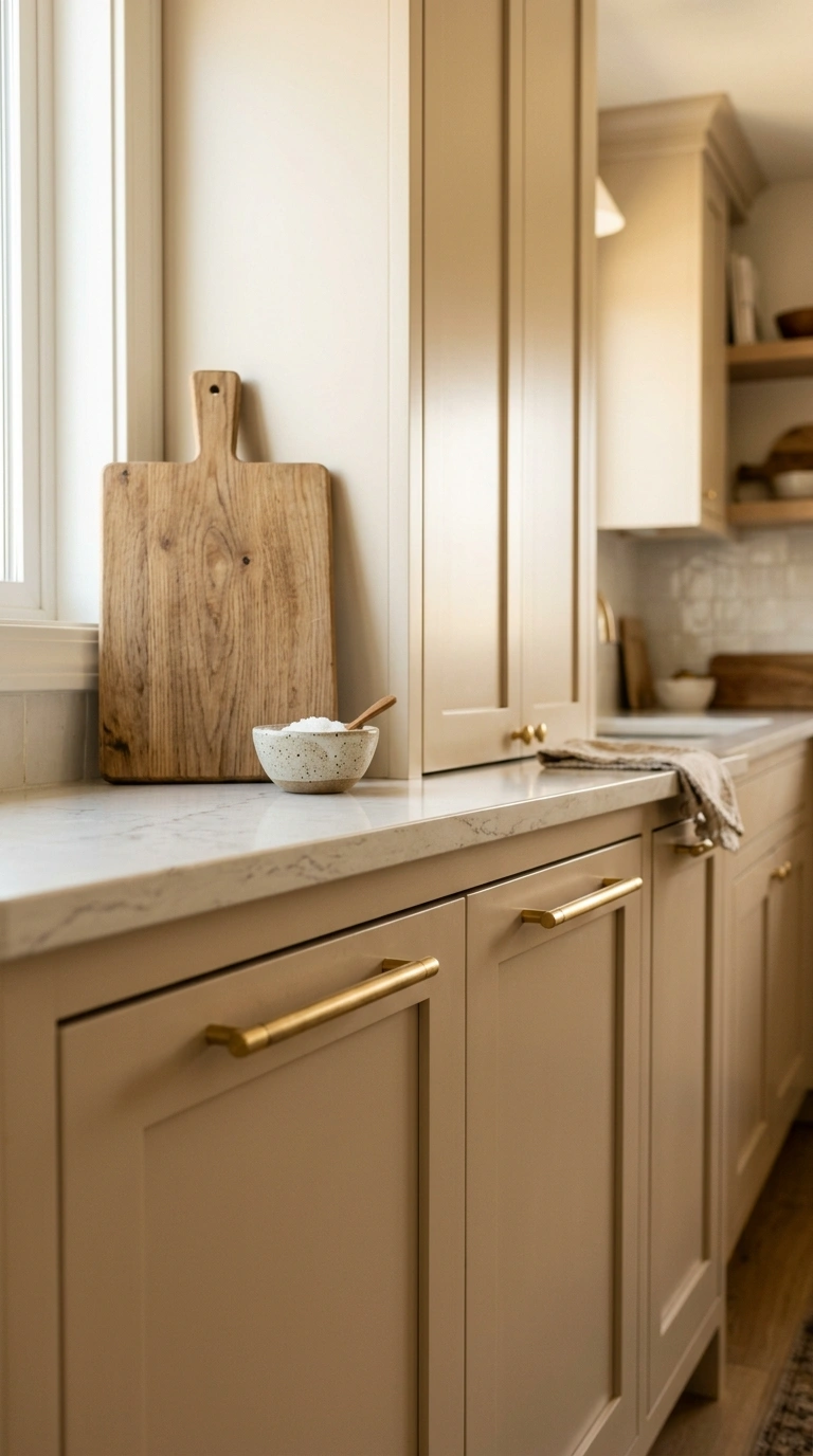
Painting your cabinets in a warm cashmere shade instantly softens a kitchen. This color sits between beige and light gray, so it never looks flat or cold like pure white can. Use a satin finish paint so light bounces gently off the surface instead of glaring. If you have shaker style doors, this color makes the grooves stand out just enough to add depth without looking busy. Pair the cabinets with brushed brass or matte black pulls to keep the look grounded. This works well in both small and large kitchens because the tone never fights with your countertop or backsplash. If you are not ready to paint every cabinet, start with just the lower row and leave the uppers a shade lighter for a two tone effect that still feels calm and pulled together.
2. Warm Ivory Countertops
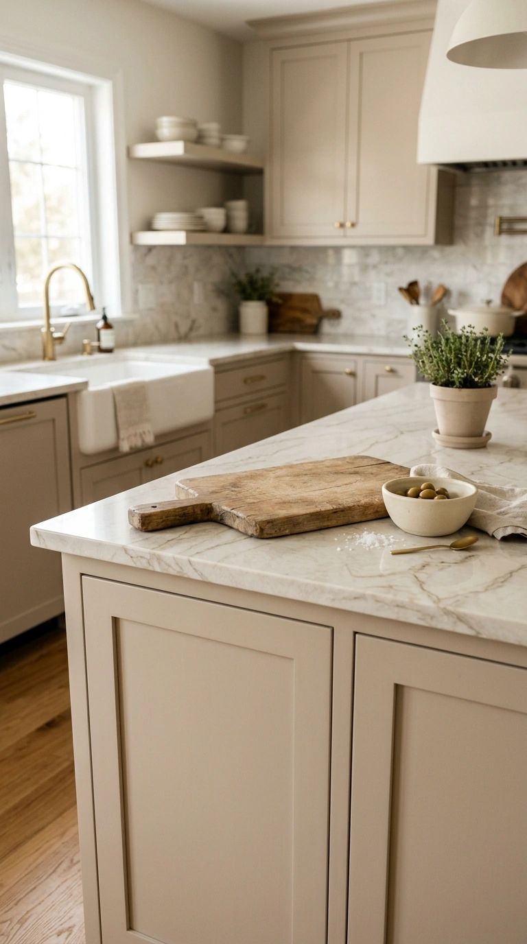
Warm ivory countertops give your kitchen a soft glow instead of a bright white shine. Quartz or engineered stone in this shade hides small stains better than pure white and still photographs beautifully for a cozy kitchen look. Choose a countertop with subtle veining in taupe or soft gray so it does not compete with your cabinets. This works especially well next to wood cutting boards left out on the counter, since the warm tones blend instead of clash. If a full countertop replacement is not in your budget right now, even a small ivory countertop on a kitchen island can shift the whole feel of the room. Keep the surface styled with just one or two items, like a ceramic bowl or a small plant, so the warm color has room to breathe and show off its natural texture.
3. Soft Taupe Backsplash
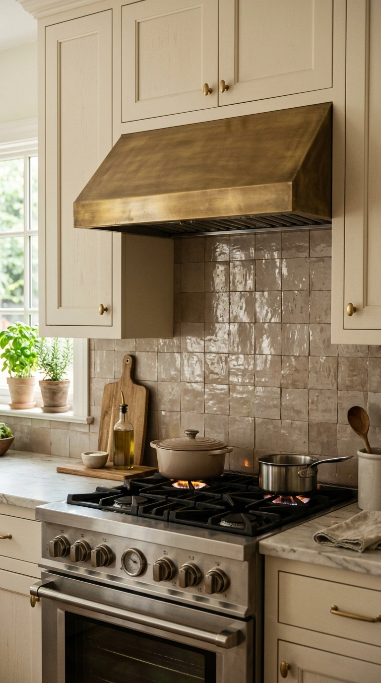
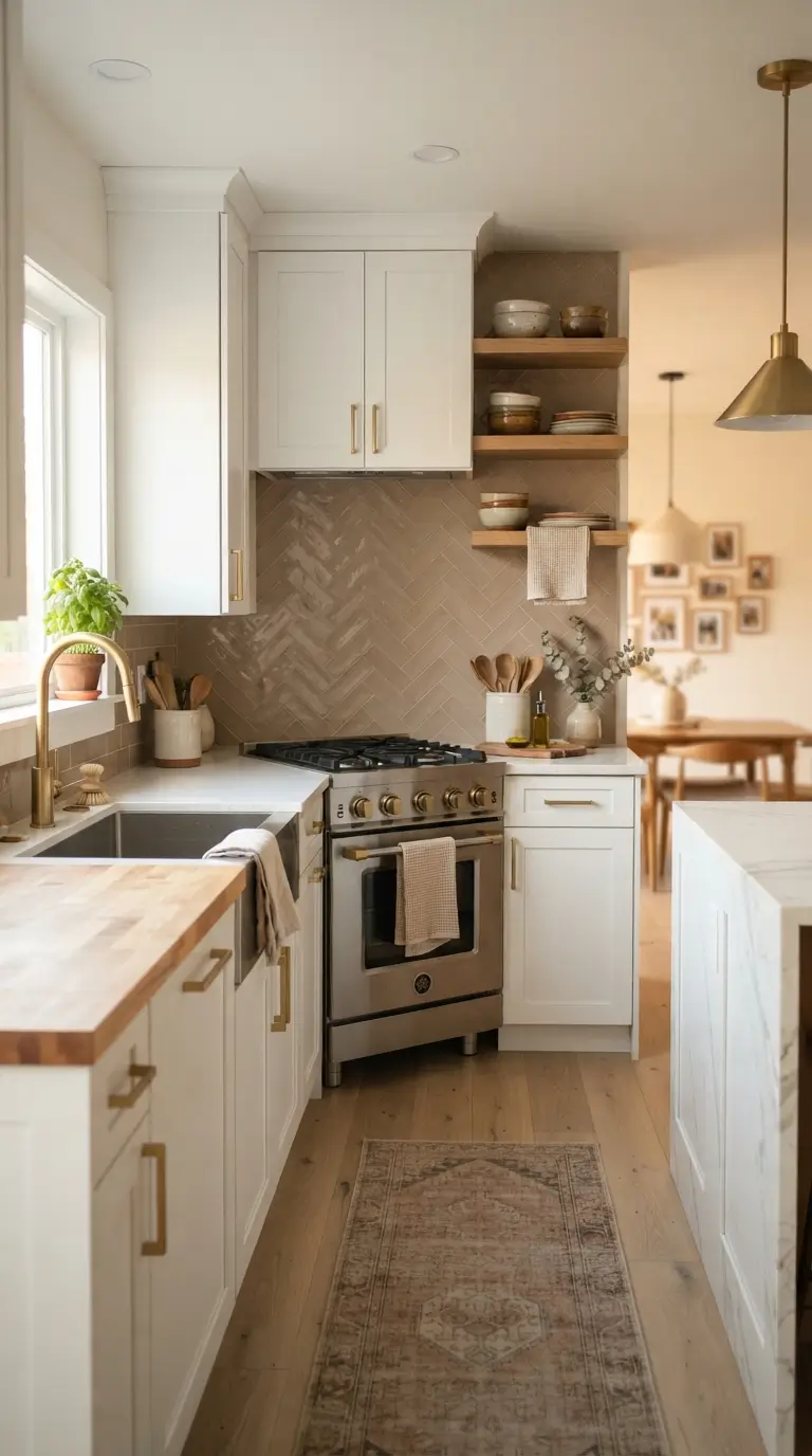
A soft taupe backsplash adds texture without adding a loud pattern. Look for zellige style tiles or handmade ceramic tiles in a taupe or greige tone, since their slightly uneven surface catches light in a way that flat tile cannot. This backsplash works beautifully behind a stove or sink where you want a little visual interest but nothing too busy. Keep your grout close to the tile color so the wall reads as one soft surface rather than a grid. If you already have white cabinets, this backsplash color bridges the gap between white and any darker wood tones in your flooring. For renters, peel and stick taupe tile sheets now come in realistic textures that mimic this same soft, handmade look without any drilling or major renovation work.
4. Brushed Brass Hardware
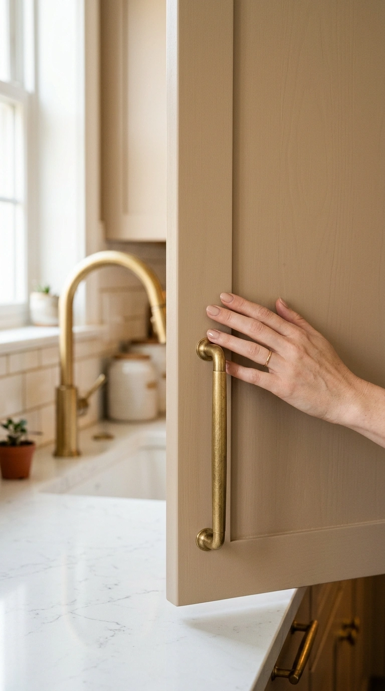
Brushed brass hardware is one of the easiest upgrades in this whole list. Unlike shiny gold, brushed brass has a soft, worn in look that pairs perfectly with cashmere tones instead of standing out too much. Swap your cabinet knobs and pulls first, since this is a weekend project that needs only a screwdriver. Choose slim bar pulls for a modern feel or knob style pulls for a more classic kitchen. Carry the same brass finish through to your faucet and cabinet hinges so everything feels intentional instead of mismatched. This small detail makes a bigger difference than people expect, since hardware touches your hand every single day and sets the tone for how put together the whole kitchen feels, even if the walls and cabinets stay the same.
5. Open Wood Shelving
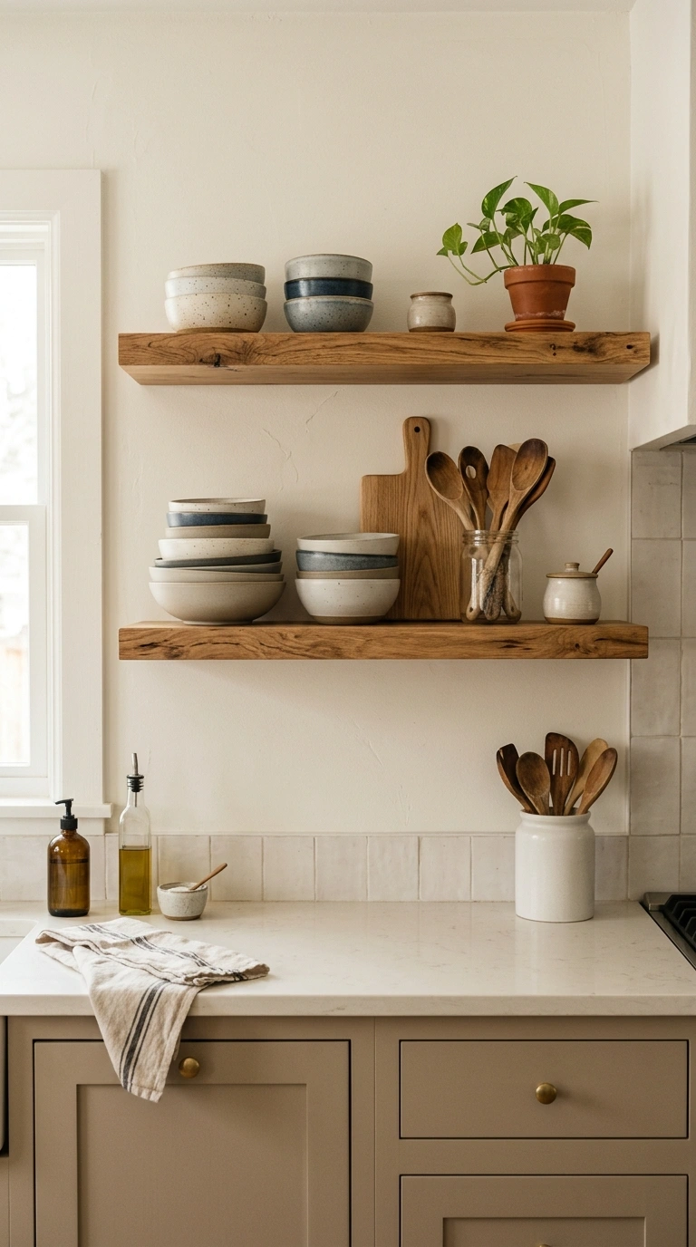
Open wood shelving in a warm oak or walnut tone breaks up a wall of cabinets and adds a lived in feel. Install one or two floating shelves above your counter and style them with simple items like stacked ceramic bowls, a small cutting board, and a jar of wooden spoons. Keep the shelf styling light, since open shelves get cluttered fast and lose their charm. This idea works especially well in a kitchen with cashmere colored cabinets, since the warm wood tone matches the same soft, cozy family of colors. If you rent your home, look for shelf brackets that use small screws instead of large anchors, so you can patch the wall easily later without much damage.
6. Woven Bread Basket
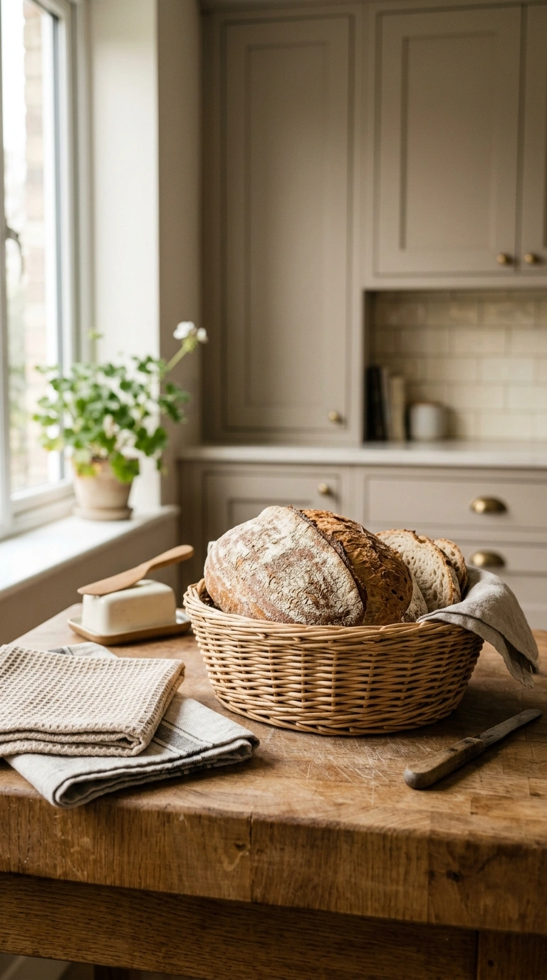
A woven bread basket left out on the counter or hanging from a hook adds instant texture to a cashmere kitchen. Natural rattan or seagrass baskets bring in a handmade feel that balances out smooth countertops and painted cabinets. Use one to hold fresh bread, fruit, or even folded kitchen towels near your stove. The natural fiber color works with almost every shade in the cashmere palette, from ivory to soft taupe. If counter space is tight, a hanging basket from the ceiling near a window works just as well and adds a bit of height to the room. This is a low cost styling trick that photographs beautifully and instantly makes a kitchen feel warmer and more welcoming.
7. Linen Window Curtains
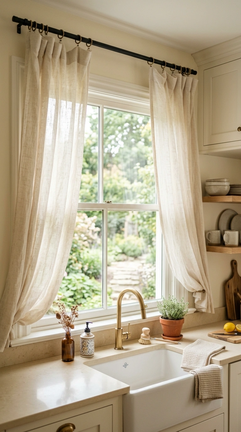
Soft linen curtains in a warm cream or oatmeal shade soften the hard lines of kitchen windows. Choose a lightweight linen so it moves gently with the breeze and lets natural light filter through during the day. Hang the curtains close to the ceiling rather than right above the window frame, since this makes the whole room feel taller. Linen also wrinkles naturally, which gives it a relaxed, unfussy look that fits perfectly with the soft cashmere color scheme. If your kitchen window is small, a simple café curtain covering just the bottom half still adds privacy while keeping the top of the window open for light. Wash the curtains occasionally to keep them fresh, since kitchen fabric absorbs cooking smells over time.
8. Neutral Tile Flooring
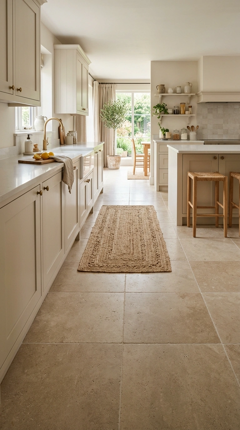
Neutral tile flooring in a warm beige or soft gray tone grounds the whole kitchen without competing with your cabinets. Look for large format tiles to reduce grout lines, since fewer lines make small kitchens feel bigger and calmer. A honed finish, rather than glossy, keeps the floor from feeling cold or slippery looking in photos. If a full floor replacement feels like too much right now, vinyl plank flooring in a similar warm neutral tone is a budget friendly option that still gives the same soft look. Pair the floor with a jute or wool blend rug near the sink area for both comfort underfoot and an extra layer of warm texture in the room.
9. Matte Stone Island
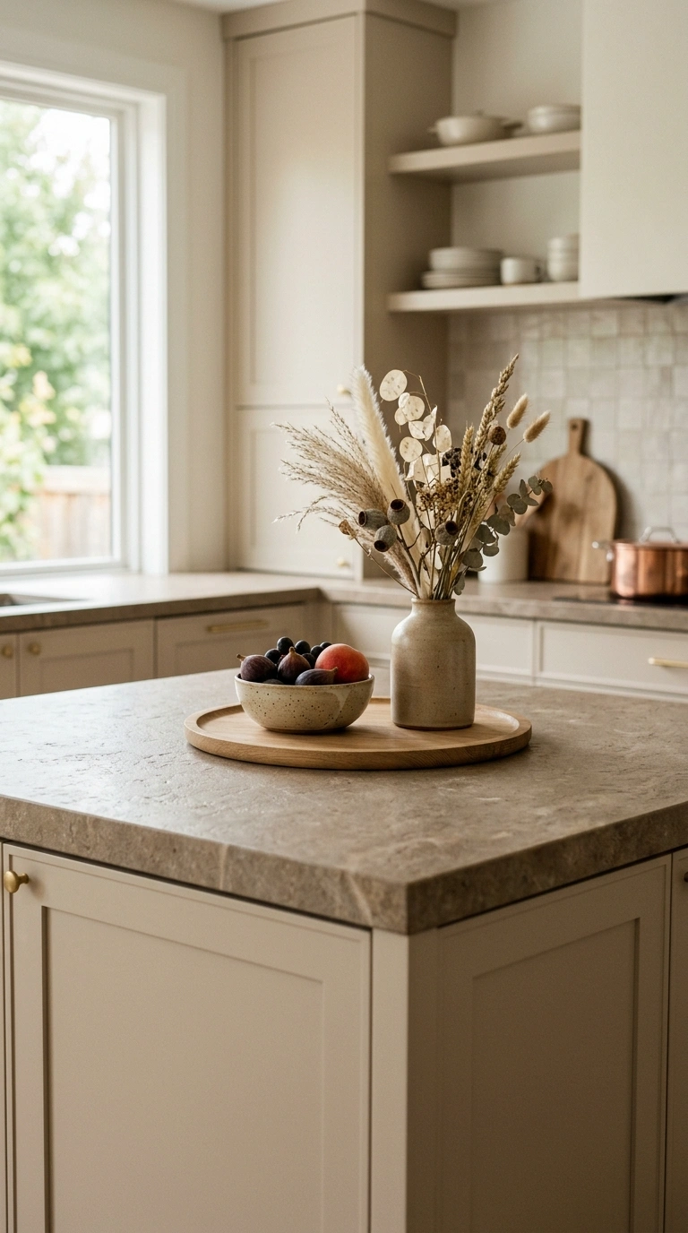
A kitchen island topped with matte stone in a warm taupe or soft gray shade becomes the anchor of a cashmere kitchen. Matte finishes hide fingerprints and water spots better than polished stone, which matters a lot in a space used every day. Keep the island base a shade darker than your surrounding cabinets to add subtle contrast without breaking the neutral color story. Style the top with just a wooden tray, a small bowl of fruit, and maybe a single vase of dried flowers. This restrained styling lets the natural stone pattern be the star. If you already have a laminate island, a matte stone look contact paper can mimic this same effect at a much lower cost.
10. Cream Bar Stools
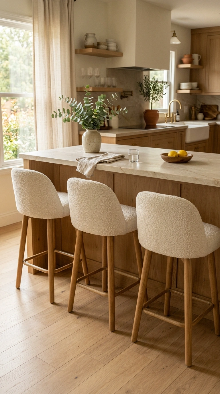
Cream colored bar stools with a slightly rounded shape soften the straight lines of a kitchen island. Look for stools with a boucle or woven fabric seat, since the texture adds another soft layer to the cashmere palette. Wood or brass legs work best here, keeping the stool grounded in the same warm tone family as your cabinets and hardware. If you have young kids or entertain often, a performance fabric in cream still gives you the same soft look while being easier to wipe clean. Group three stools at your island rather than two, since an odd number often looks more natural and inviting, almost like the seats are waiting for a conversation to happen.
11. Ceramic Canister Set
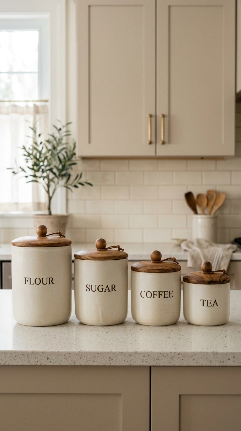
A matching ceramic canister set in warm ivory or soft beige tones turns everyday storage into a styling moment. Use the canisters for flour, sugar, and coffee, and line them up along your counter or open shelf in order of height. Look for canisters with wood lids instead of plastic, since the wood ties back into your cabinet or shelving tones. This idea works well because it replaces plastic bags and boxes that usually clutter a pantry, giving your counter a calm, uniform look instead. If you bake often, a slightly larger canister for baking supplies keeps everything within reach while still looking intentional rather than like leftover packaging sitting out.
12. Rattan Pendant Lights
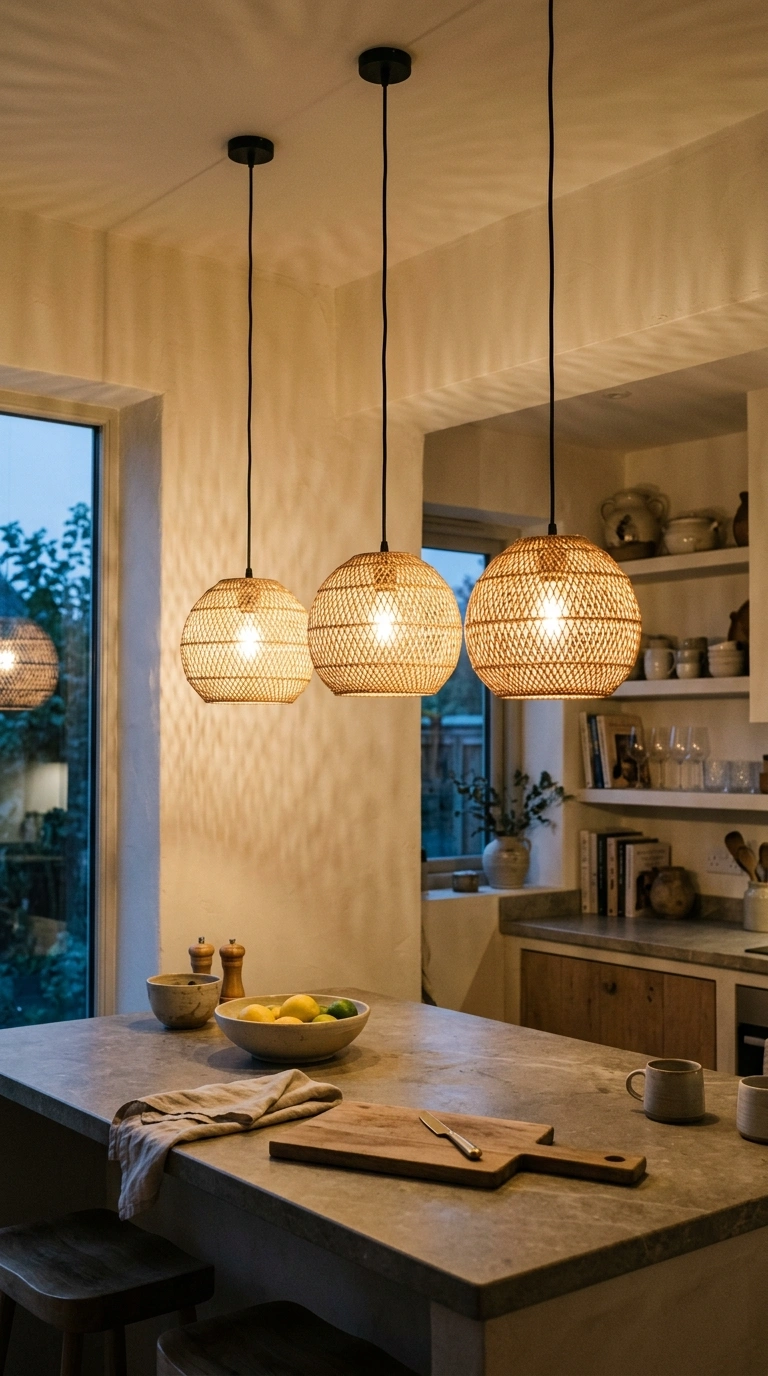
Rattan pendant lights hanging above a kitchen island bring warmth and texture to the ceiling, which is often the most overlooked part of a kitchen. The woven material casts soft, dappled shadows when lit, adding a cozy glow in the evening. Choose two or three pendants in a row above an island rather than one large fixture, since this creates rhythm and visual interest. Keep the pendant color in the same warm neutral family as your cabinets so the whole room feels connected from top to bottom. This lighting choice works especially well in kitchens that already lean coastal or organic modern, since rattan naturally fits both styles without feeling out of place.
13. Sand-Toned Rugs
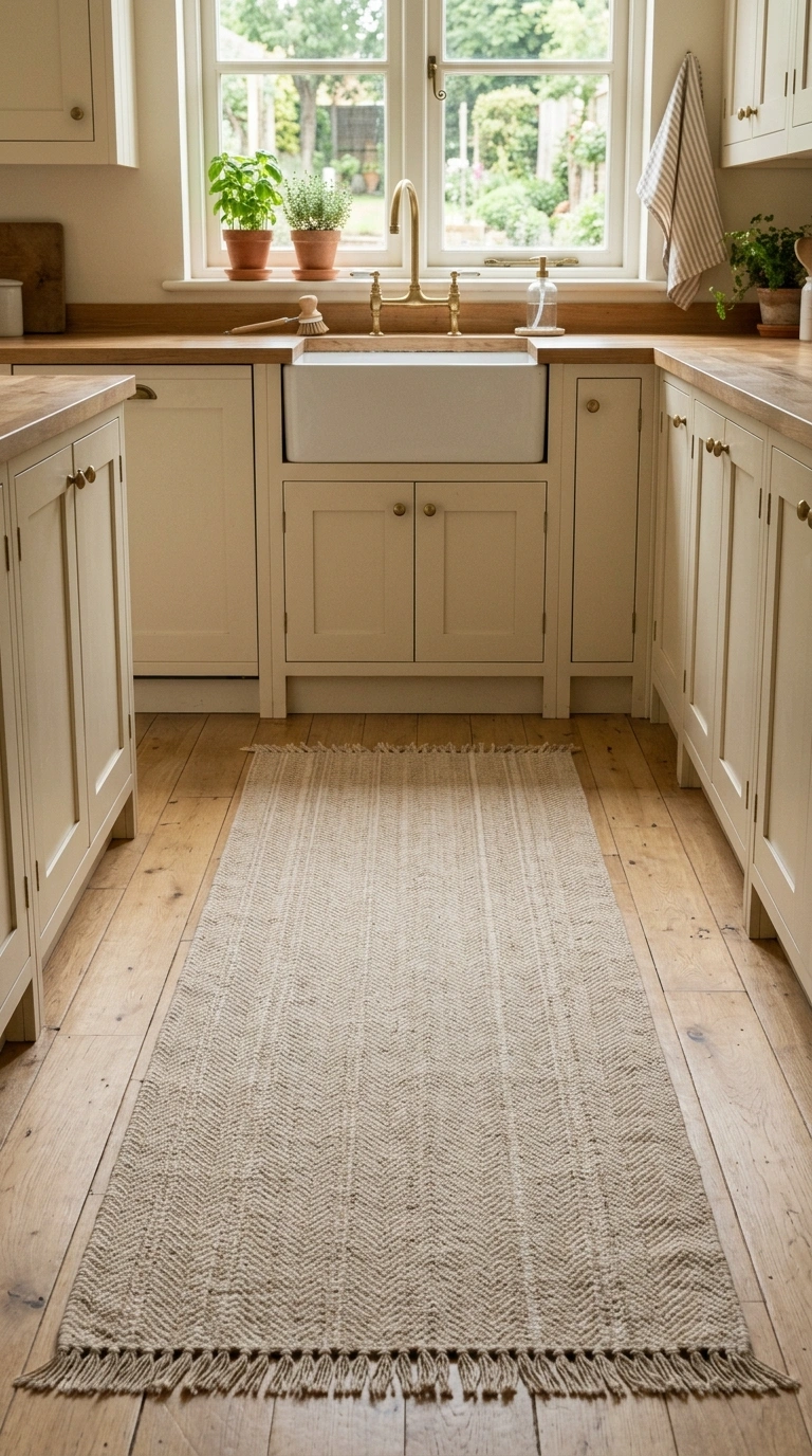
A sand toned runner rug placed in front of your sink or stove adds comfort underfoot and another layer of soft color to the room. Choose a low pile rug for kitchens, since it is easier to keep clean than a thick shag style rug. Flatweave cotton or jute blend rugs in warm sand tones work particularly well because they can be tossed in the wash when spills happen. Position the rug so it lines up with your cabinets rather than sitting crooked, since straight placement makes the whole kitchen feel more organized. This small addition also helps break up a large expanse of tile or wood flooring, giving the eye a place to rest.
14. Wooden Cutting Boards
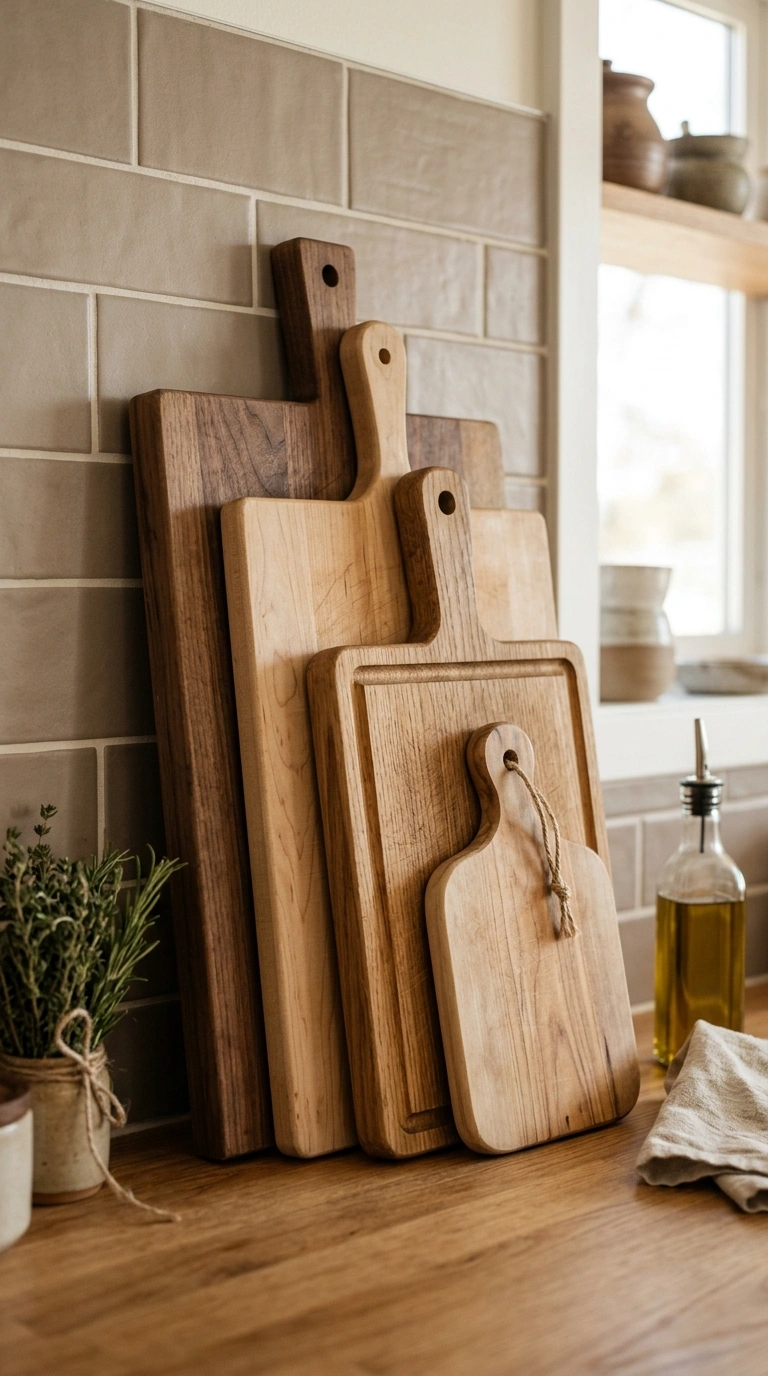
Leaving one or two wooden cutting boards out as décor, propped against the backsplash or leaning in a stand, adds warmth without costing anything extra if you already own them. Choose boards in different sizes and place them so the largest sits in back and the smallest in front, creating a simple layered look. The natural wood grain pairs beautifully with cashmere cabinets and ivory countertops, tying the whole space together. This works as both function and style, since you can grab the board when cooking and simply set it back in place afterward. Wipe the boards with a little food safe oil every few weeks to keep the wood tone rich and prevent it from drying out.
15. Beige Marble Backsplash
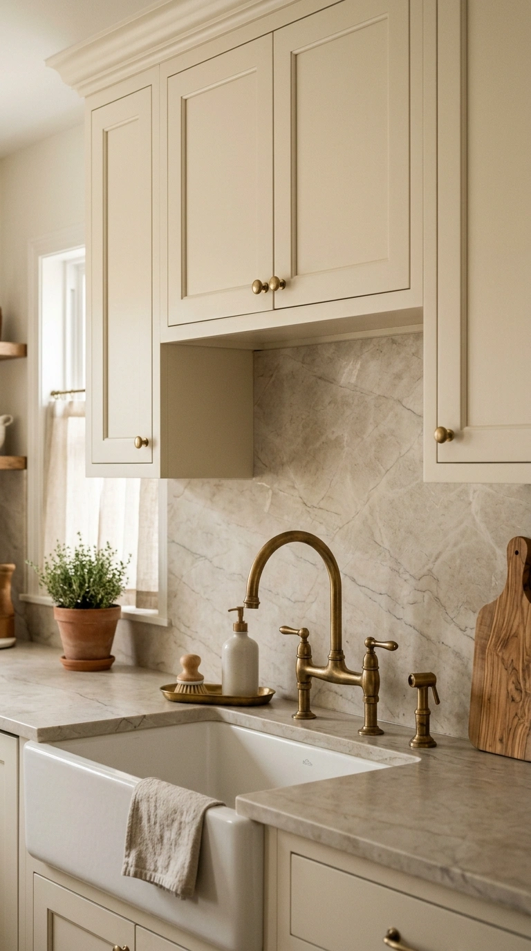
A beige marble backsplash with soft gray veining adds a quiet elegance to a cashmere kitchen without feeling too formal. Choose a honed rather than polished finish, since honed marble feels more relaxed and hides water spots better around a busy sink area. Run the marble up to the underside of your upper cabinets for a clean, finished look, or extend it behind open shelving for extra impact. This backsplash pairs beautifully with brass fixtures, since the warm undertones in the marble echo the warmth in the metal. If real marble is out of budget, marble look porcelain tile now closely mimics the same veining pattern at a much lower price point.
16. Soft Gray Walls
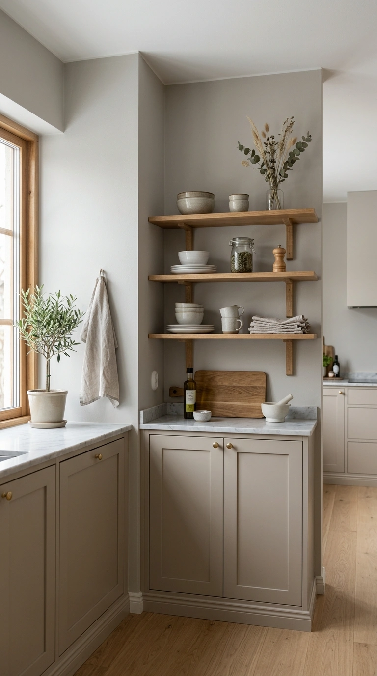
Painting the walls in a soft warm gray, rather than a cool blue-gray, keeps the whole kitchen feeling cozy instead of clinical. This shade acts as a gentle backdrop that lets your cabinets, countertops, and backsplash stand out without any harsh contrast. Choose an eggshell finish for walls, since it is easier to wipe clean than flat paint but does not shine like satin. If your kitchen gets a lot of natural light, this gray will look almost beige at certain times of day, which only adds to the soft, changeable feel of the room. Pair the walls with warm wood open shelving or a wooden table nearby to keep the space from feeling too monochrome.
17. Woven Curtain Valance
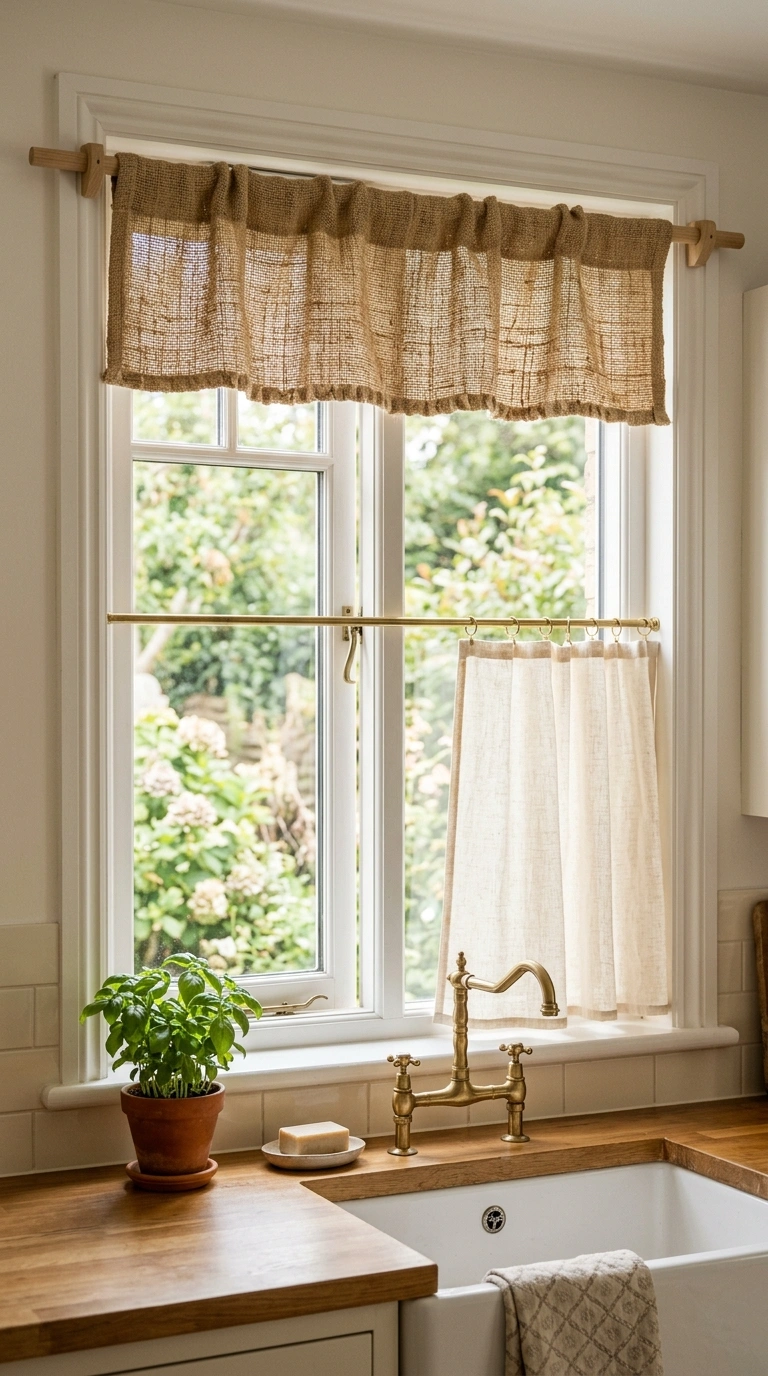
A woven curtain valance made from natural jute or rattan fiber adds texture at the top of a kitchen window without blocking any light. This works especially well over a sink window where a full curtain might get in the way of daily dishwashing. Choose a valance with a slightly uneven, handmade weave rather than a perfectly smooth one, since the texture reads more organic and cozy. Pair it with a simple café curtain below for a layered window treatment that still lets in plenty of sunlight. This detail is a small one, but it adds a finished, styled look to a window that often gets left completely bare in most kitchens.
18. Cashmere Velvet Bench
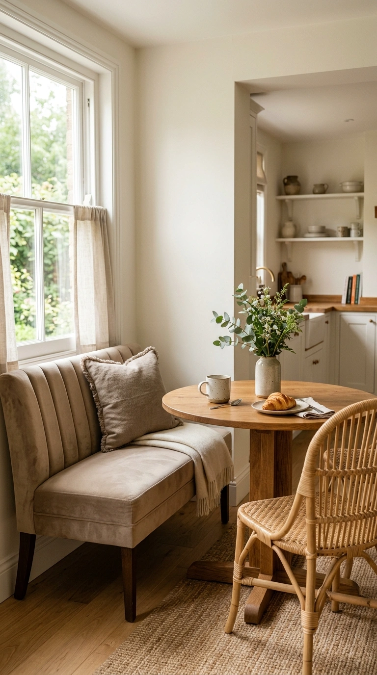
If your kitchen has room for a small breakfast nook, a bench upholstered in warm cashmere colored velvet turns the corner into a cozy seating spot. Velvet in a soft beige or oatmeal tone catches light beautifully and adds a plush texture that contrasts nicely with hard countertops and tile. Pair the bench with a round wooden table and one or two rattan chairs on the opposite side for balance. Add a few pillows in a slightly darker taupe tone to ground the look. This idea works well in kitchens with awkward corners that are hard to furnish otherwise, turning unused space into the most inviting seat in the house.
19. Neutral Ceramic Vases
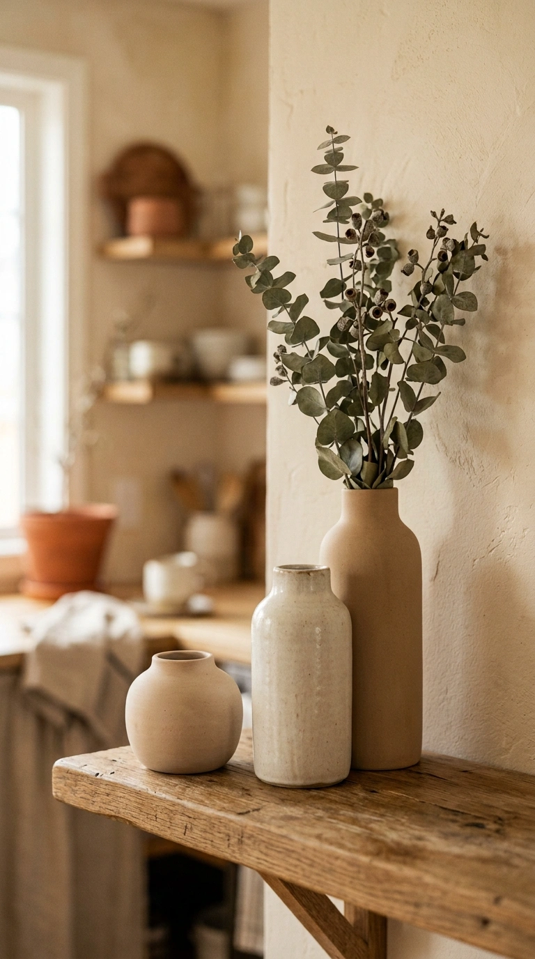
A small collection of ceramic vases in varying warm neutral shades, from ivory to soft clay, adds an artful touch to open shelves or counters. Group two or three vases of different heights together rather than spacing them out evenly, since clustering creates a more natural, collected over time look. Leave one vase empty as a sculptural object and fill another with a few dried stems or eucalyptus. This idea costs very little if you already have mismatched vases at home, since the trick is simply grouping them by color rather than buying anything new. The result is a styled shelf that looks curated rather than cluttered.
20. Warm Wood Accents
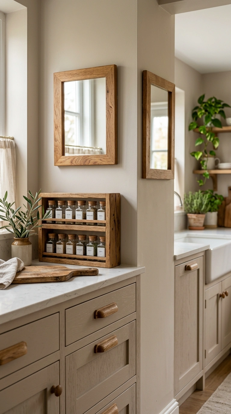
Adding warm wood accents throughout the kitchen, like a wooden spice rack, a wood framed mirror, or wooden drawer pulls, ties the whole cashmere color story together. Choose wood tones that lean warm, like oak or walnut, rather than cool gray-washed wood, since warm tones match the softness of the cashmere palette. These accents do not need to match perfectly in shade, since natural wood grain variation actually adds more character to the space. This idea is especially useful for renters, since small wood accessories can move with you to your next home. Even swapping plastic utensil holders for a simple wooden one makes a noticeable difference in how put together the kitchen feels.
21. Ivory Pantry Doors
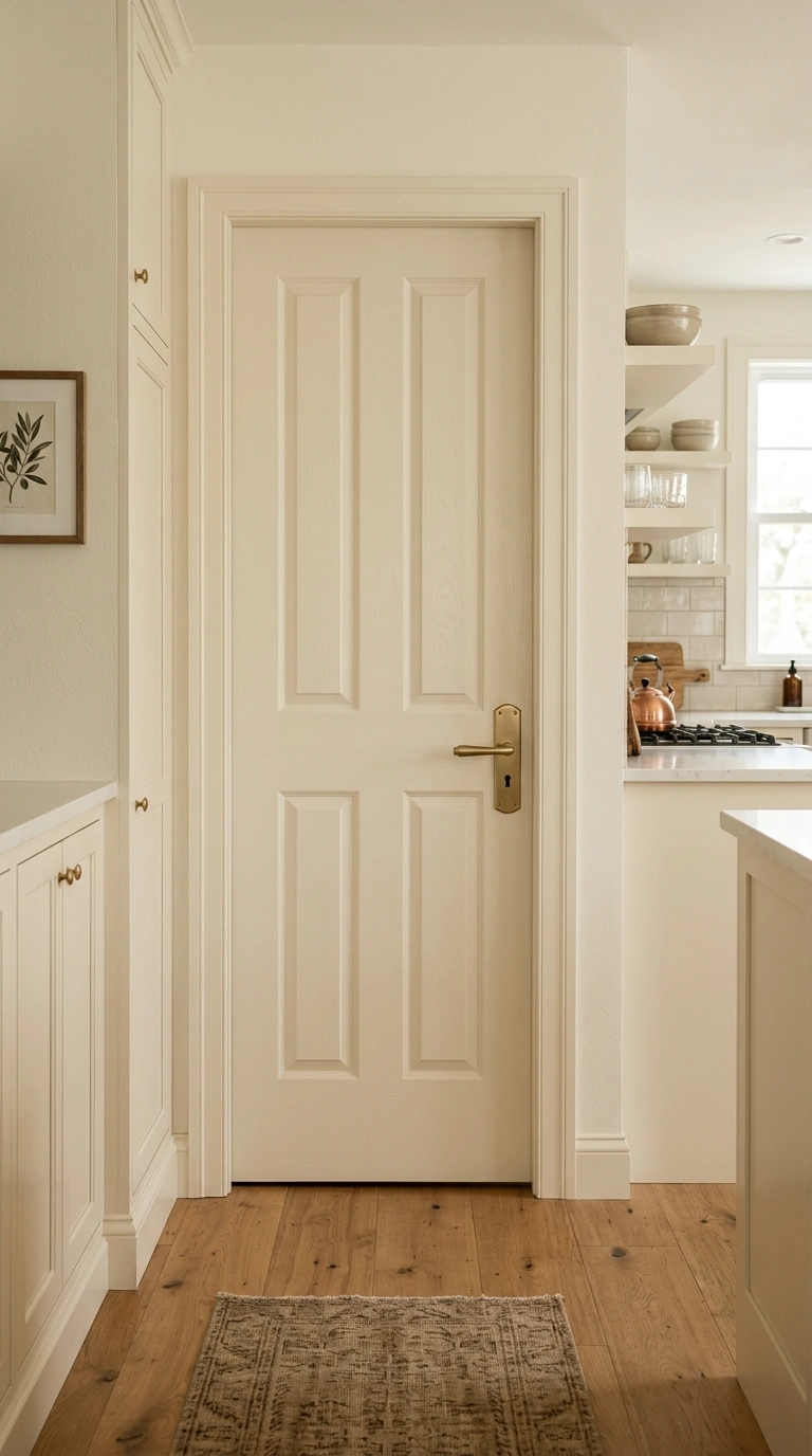
If your kitchen has a pantry door, painting it in the same warm ivory as your cabinets makes the whole space feel seamless rather than choppy. Add a bit of interest by choosing a paneled door style over a flat slab, since the extra detail catches light in a subtle way. Swap the pantry door hardware to match your cabinet pulls so nothing feels out of place. If you have glass panes in the pantry door, consider a sheer curtain on the inside to hide clutter while still letting light pass through. This small update often gets overlooked, but a mismatched pantry door can pull attention away from an otherwise well styled kitchen.
22. Textured Linen Towels
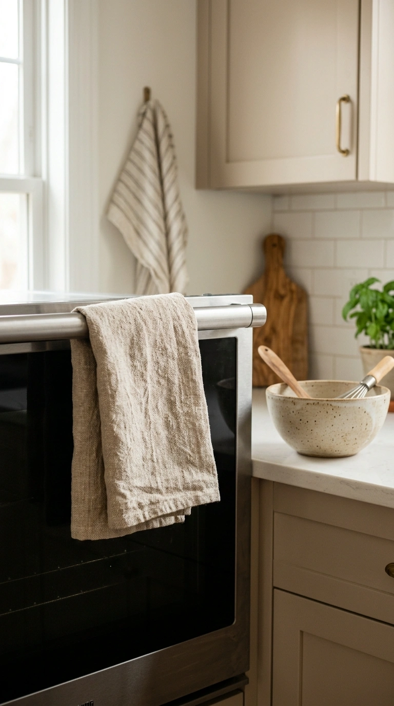
Swapping plain kitchen towels for ones made from textured linen in warm cream, oatmeal, or soft clay tones adds a small but noticeable styling detail. Fold the towels neatly over your oven handle or drape them casually over the sink edge, since both looks work with the relaxed cashmere aesthetic. Choose towels with a simple striped or waffle weave pattern rather than a busy print, so they stay in the same soft, neutral family as the rest of the kitchen. This is one of the most affordable ideas on this list and one of the easiest to change out seasonally if you want a small refresh without any real cost.
23. Soft Beige Nook
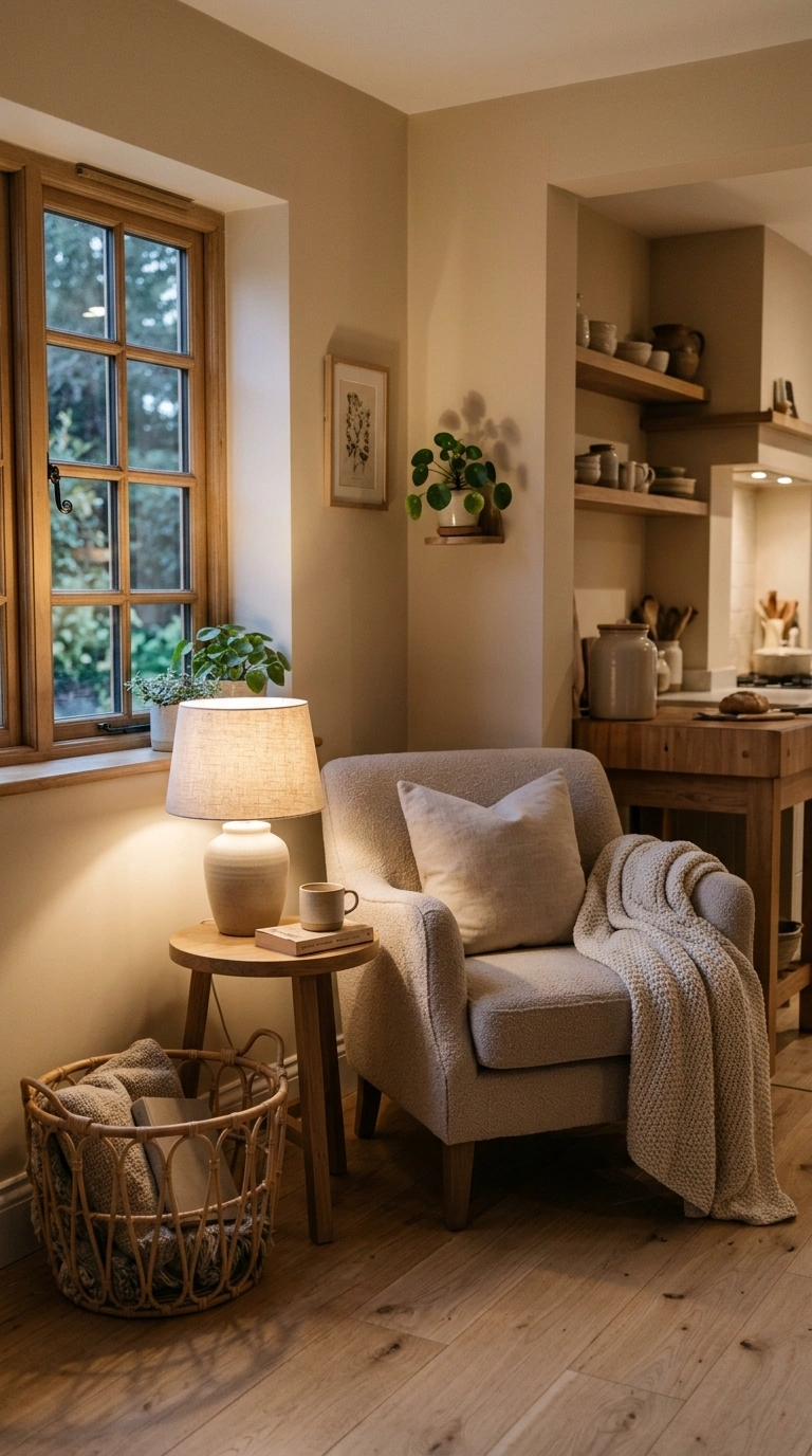
A small reading or coffee nook tucked into an unused kitchen corner, styled with a soft beige armchair and a tiny round side table, gives the room an unexpected cozy touch. Add a small woven basket beside the chair for magazines or a throw blanket, and a simple table lamp with a linen shade for warm evening light. This nook works well in larger kitchens with awkward empty corners that usually collect clutter instead of serving a purpose. Keep the styling simple, just one chair, one table, and one lamp, so the space still feels open rather than cramped. This idea turns a wasted corner into one of the coziest spots in the whole house.
Bringing a cashmere color palette into your kitchen does not mean redoing everything at once. Start with one or two ideas from this list, like new cabinet hardware or a woven basket on the counter, and build from there as your budget allows. The beauty of this soft neutral style is that it never goes out of date, since it leans on warmth and texture rather than trends. Try one idea this weekend and see how much calmer your kitchen feels.
FAQs
What is a cashmere kitchen color scheme?
A cashmere kitchen uses soft, warm neutral tones like beige, ivory, and taupe instead of stark white or dark colors. It creates a cozy, calm feeling that works well with wood and brass accents.
What colors go with a cashmere kitchen?
Warm wood tones, brushed brass, soft gray, and cream all pair well with cashmere kitchen colors. Avoid cool blue or stark black tones, since they can clash with the warm neutral palette.
Is a cashmere kitchen hard to keep clean?
Not at all. Warm neutral tones like beige and taupe actually hide small marks and water spots better than pure white surfaces, making daily cleanup a little easier.
Can I get this look on a budget?
Yes. Small changes like new cabinet hardware, a woven basket, or linen curtains can bring the cashmere kitchen look into your home without a full renovation.
Does this style work in small kitchens?
Yes, soft neutral tones like cashmere often make small kitchens feel larger and calmer since the colors do not create harsh contrast or visual clutter.