25 Neutral Paint Colors That Make Any Home Look Elegant
The right paint color does more than cover a wall. It sets the whole mood of a room before you add a single piece of furniture. Neutral paint colors are the secret that most stylish homes share. They create a calm, polished look that works with almost any decor style, any furniture color, and any budget. The best part is that a good neutral makes your room look bigger, cleaner, and more put together without much effort.
In this article, you will find 25 of the most beautiful neutral paint colors that bring real elegance to any room. Each one has been chosen for how it looks in natural light, how it pairs with textures, and how it makes a space feel warm and welcoming instead of plain or boring.
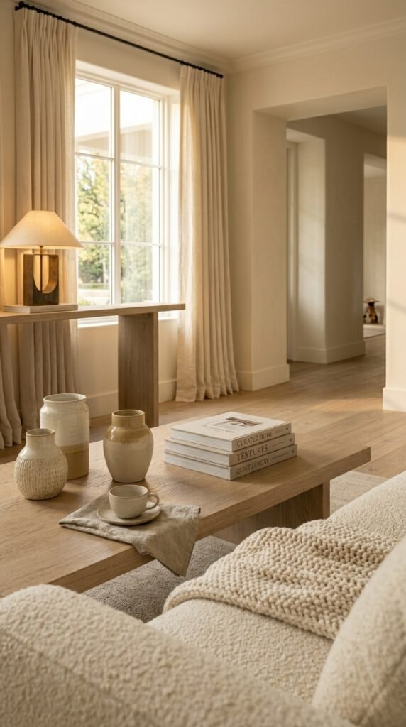
1. Warm Ivory
Warm ivory is not just white. It carries a soft golden undertone that makes walls feel cozy and inviting. Unlike a cold bright white, warm ivory soaks up natural light beautifully and glows in the evening under warm bulbs. This color works especially well in living rooms and bedrooms. Pair it with aged oak floors, cream linen curtains, and brushed gold accents to create a look that feels quietly luxurious. Add a chunky cream knit throw on the sofa and a potted fiddle leaf fig for a natural finishing touch.
2. Soft Greige
Greige is the perfect mix of gray and beige, and it is one of the most popular neutral paint colors used by interior designers. It has just enough warmth to feel homey and just enough cool tone to look modern and sleek. Soft greige works in almost any room in the house. Try it in an open-plan living and dining area with warm walnut furniture, matte black hardware, and soft white roman blinds. The result is a space that looks expensive but feels completely approachable.
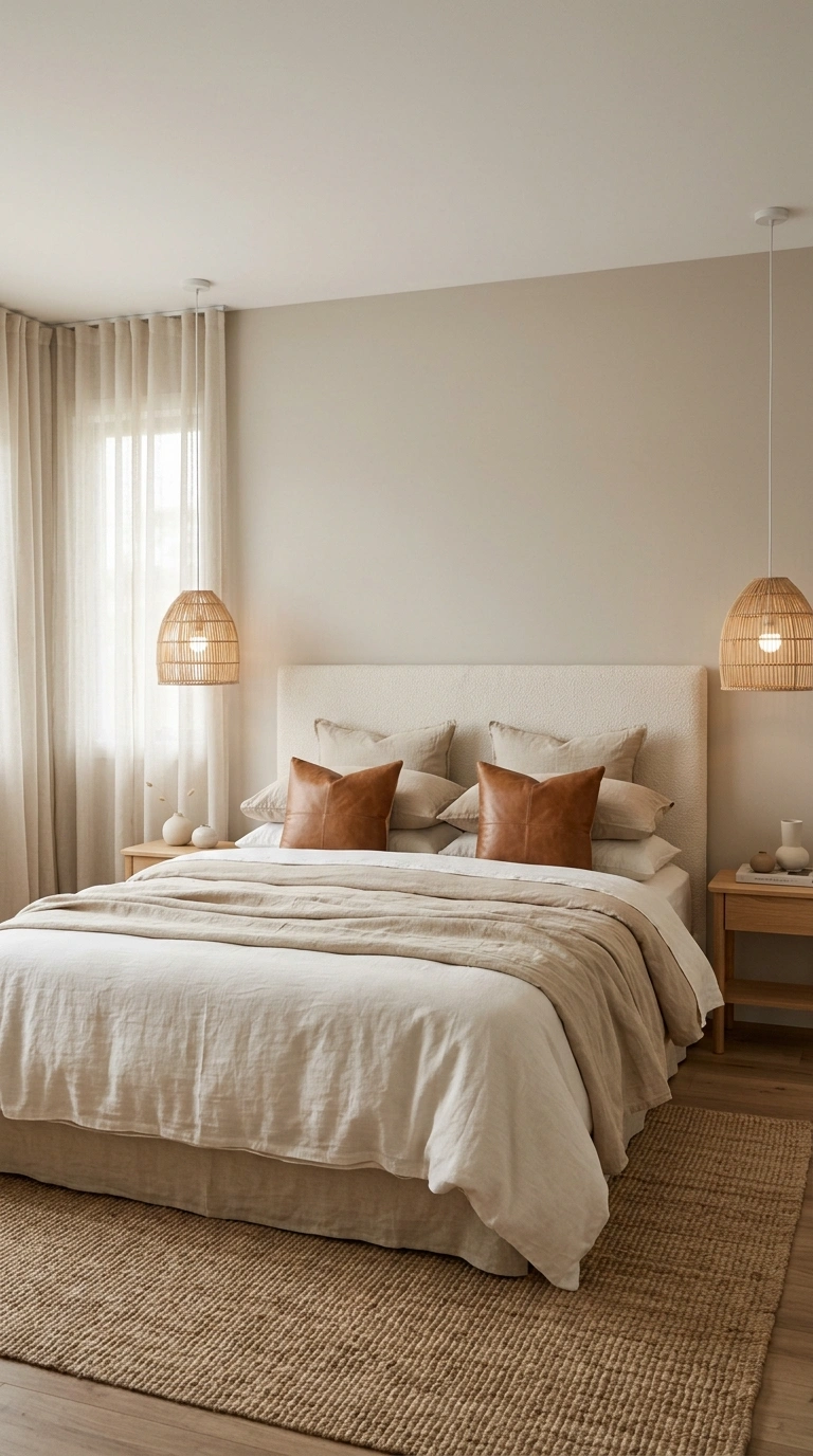
3. Pale Mushroom
Pale mushroom is a deep, sophisticated neutral with earthy brown undertones. It is richer than a basic beige and more natural-looking than a standard gray. This color adds depth to a room without making it feel dark or heavy. Use pale mushroom in a bedroom with a cream upholstered headboard, raw linen bedding, and soft caramel leather accents. Layer in a jute rug and woven rattan bedside pendants to keep the mood organic and warm.
4. Classic Linen
Classic linen is a light, breathable neutral that feels like the color of fresh laundry. It has creamy white undertones that keep it from looking yellow, and it works well in both traditional and modern interiors. This shade is perfect for open, airy spaces. Paint it in a sunlit kitchen alongside white shaker cabinets, a marble subway tile backsplash, and brushed nickel hardware. The combination looks clean, elegant, and timelessly beautiful.
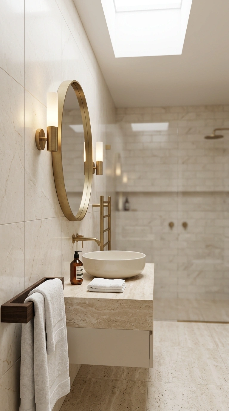
5. Stone White
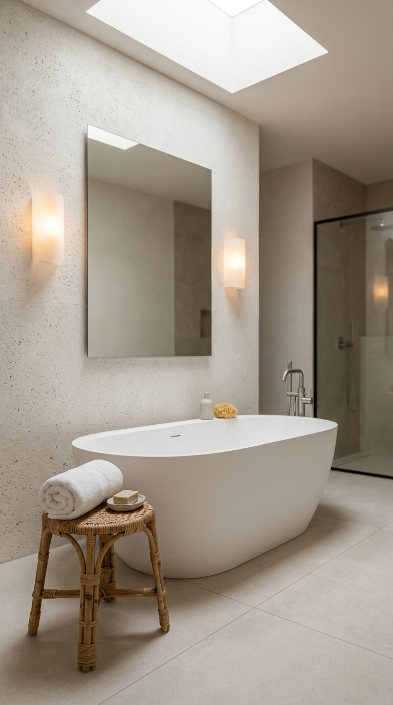
Stone white sits right between a true white and a warm gray. It has mineral undertones that give it just a hint of weight and depth. This makes it feel grounded rather than cold. Stone white looks stunning in modern bathrooms. Combine it with large-format matte porcelain tiles, a white freestanding tub, and a single rattan stool for a spa-like atmosphere. Soft diffused light from frosted sconces finishes the look perfectly.
6. Dusty Sage
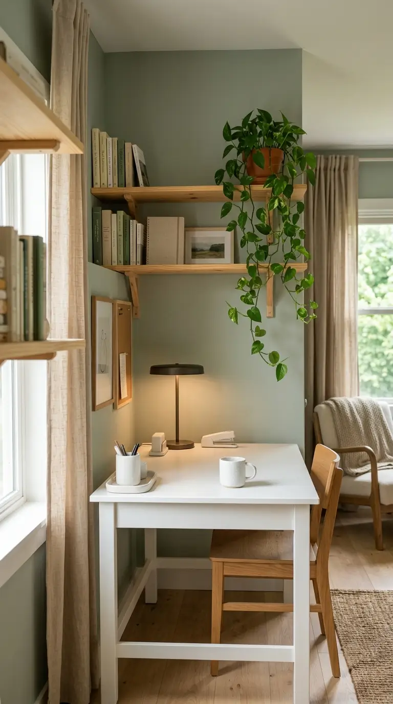
Dusty sage is a soft green with plenty of gray mixed in, making it one of the most calming neutral paint colors available. It connects the room to nature without being bold or overpowering. This color works beautifully in home offices and nurseries. Pair it with natural wood shelving, white desk accessories, and linen curtains in a warm oat color. The combination supports focus and creativity while keeping the space soft and peaceful.
7. Pebble Gray
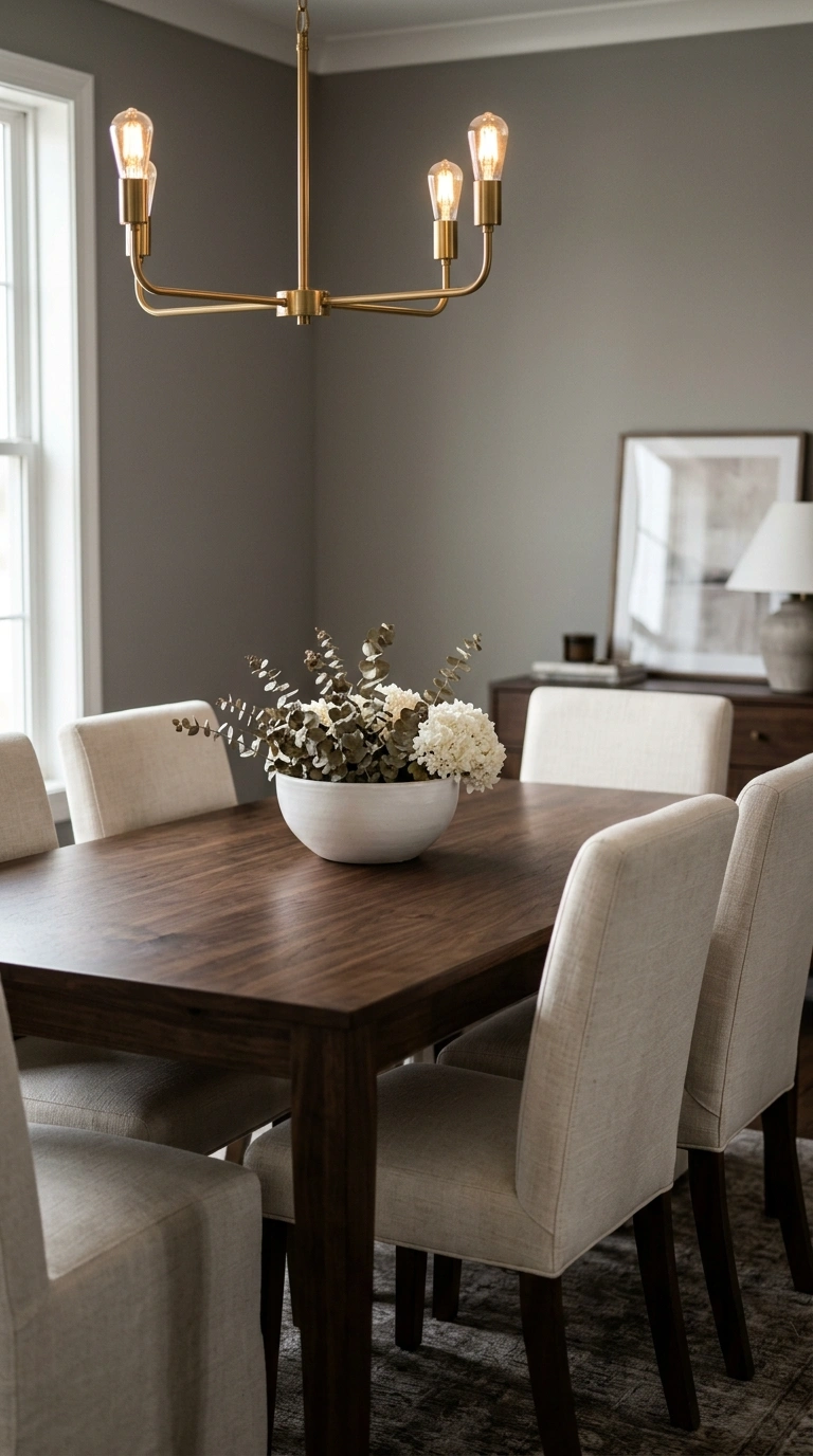
Pebble gray is a medium-toned neutral that leans slightly warm. It has the sophistication of a true gray but none of the coldness. In a well-lit room, it looks timeless and effortlessly polished. Try pebble gray in a dining room with a dark walnut table, cream upholstered dining chairs, and a simple brass chandelier. The color creates a backdrop that makes both the furniture and the food on the table look more beautiful.
8. Antique White
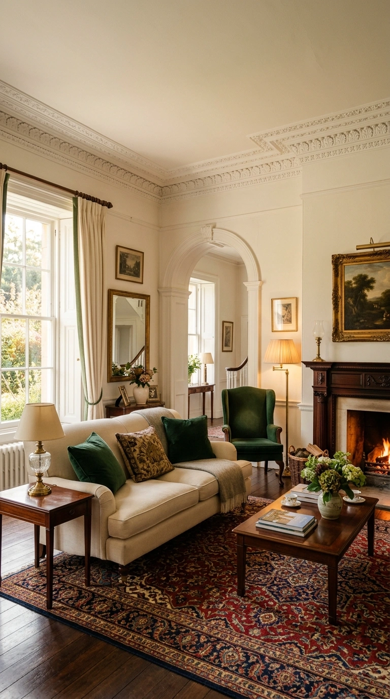
Antique white has a soft, aged quality that feels traditional and warm. It is slightly deeper than a standard white and carries subtle yellow-gray undertones that give it character. This color is ideal for homes with architectural details like crown molding, wainscoting, or coffered ceilings. Use it alongside rich mahogany furniture, hunter green velvet cushions, and a Persian-style area rug for a room that feels layered, lived-in, and genuinely elegant.
9. Warm Sand
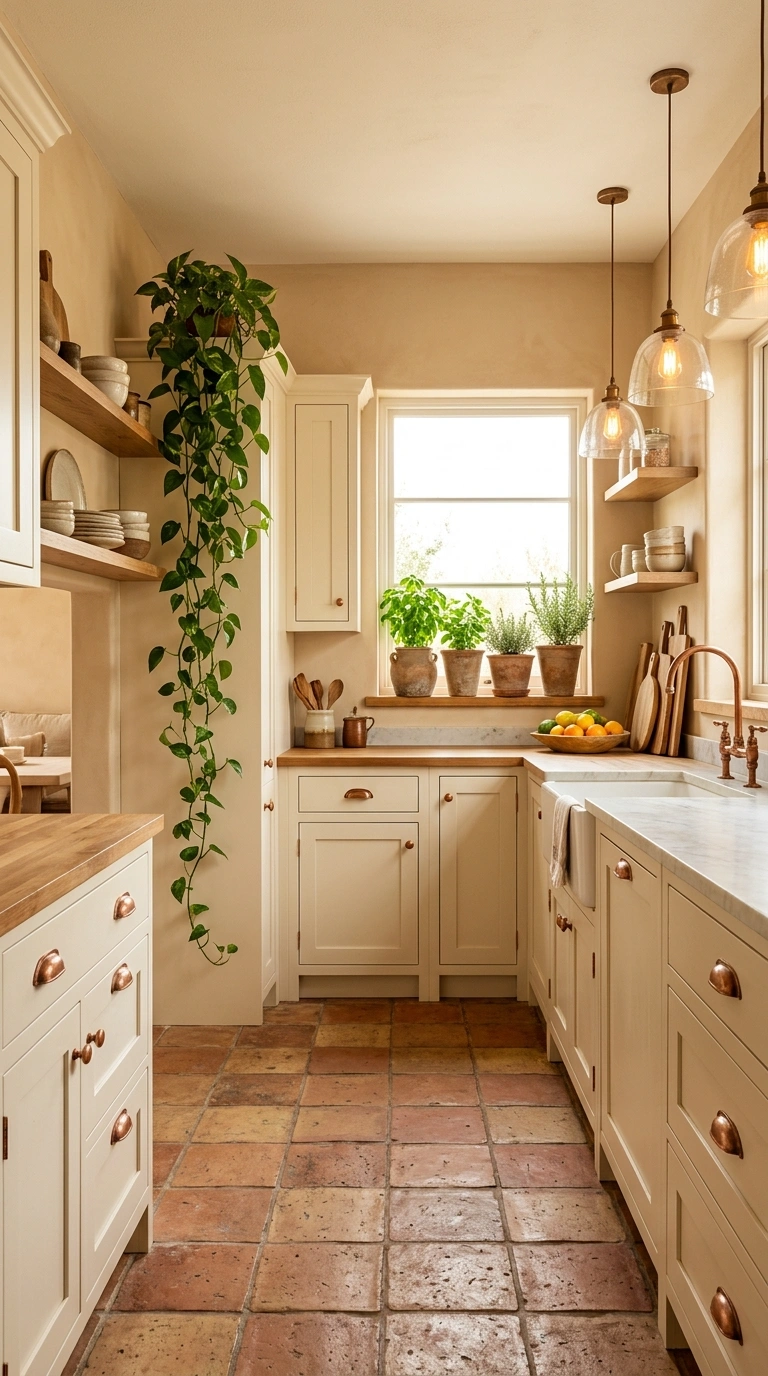
Warm sand is exactly what the name suggests. It is a soft, sun-baked neutral with orange-beige undertones that feel friendly and uplifting. In a well-lit room, it looks like afternoon sunlight on bare skin. This shade works well in kitchens and entryways. Pair it with terracotta tile floors, cream-painted cabinets, and copper hardware. Layer in a woven seagrass rug and some trailing green plants to complete the warm Mediterranean feel.
10. Oyster Pink
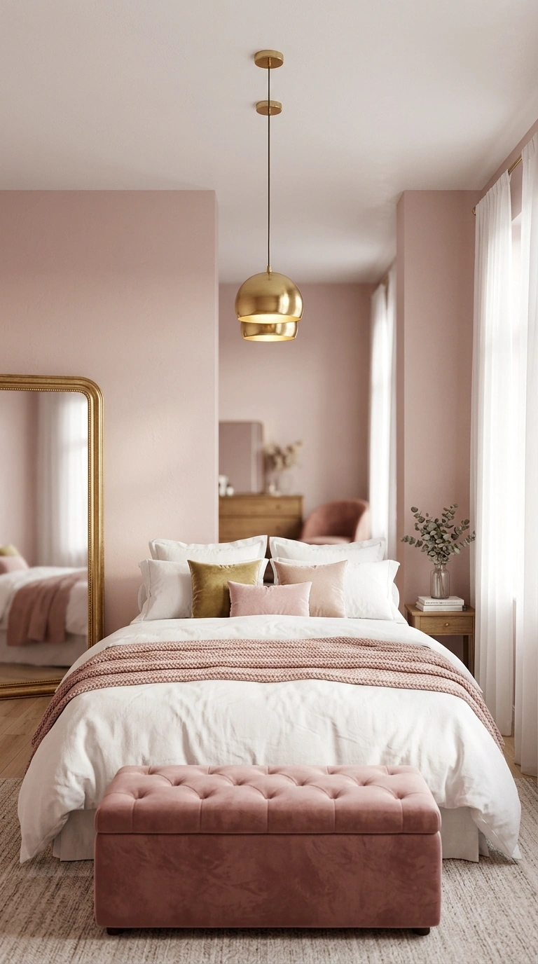
Oyster pink is a barely-there blush that reads almost as a warm neutral in most lighting conditions. It has enough pink to feel feminine and gentle, but enough beige to work beautifully in any room. Use oyster pink in a master bedroom with white bedding, soft taupe throws, and brass pendant lights. Add a large gilt-framed mirror and a velvet ottoman in a slightly deeper dusty rose for a room that feels romantic without being overdone.
11. Muted Taupe
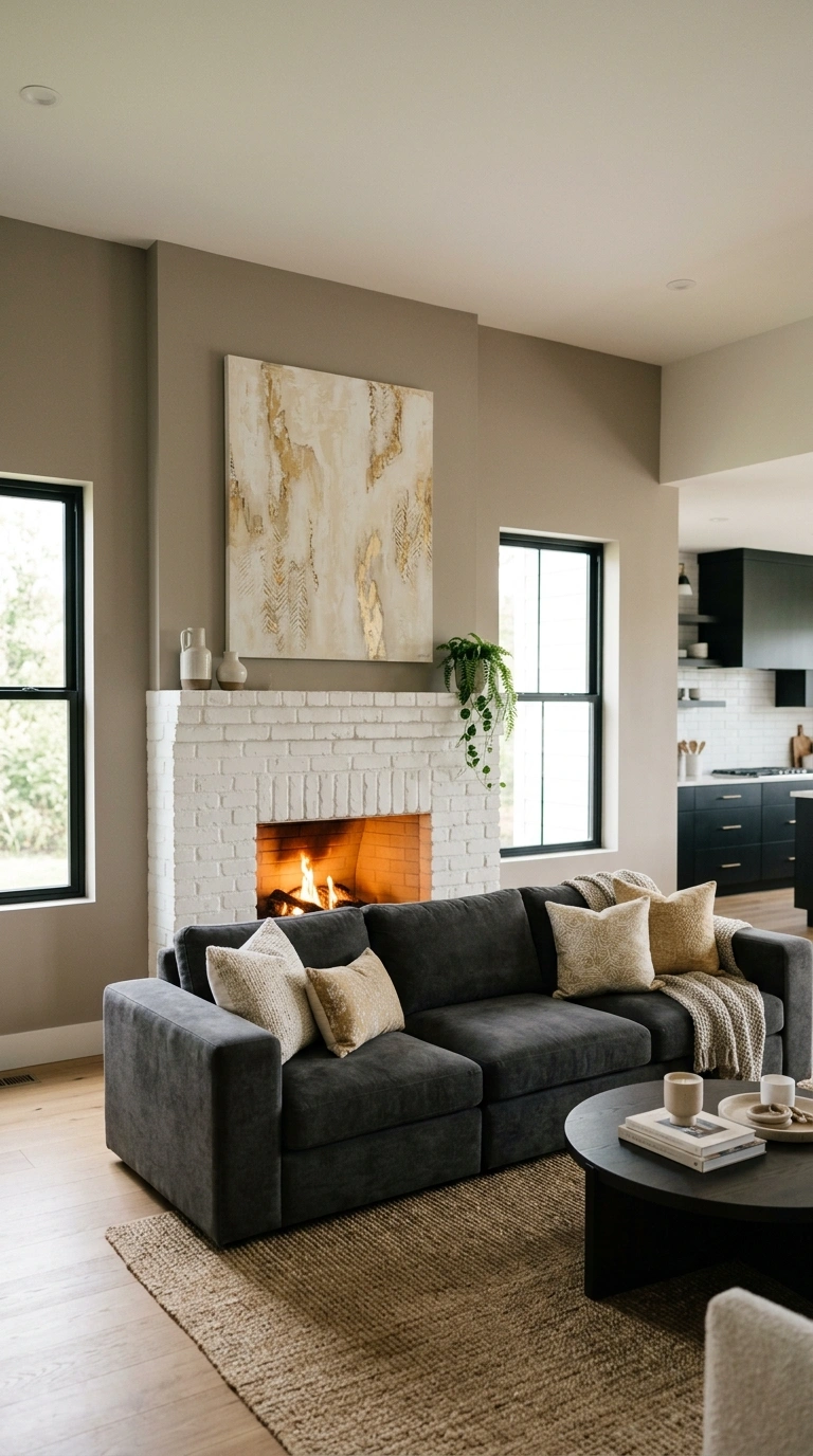
Muted taupe is one of the most versatile neutral paint colors you can choose. It sits comfortably between beige and brown with just a hint of purple undertone. This gives it a depth that plain beige simply cannot match. Muted taupe looks beautiful in living rooms with a white brick fireplace, deep charcoal sofas, and a large abstract artwork in cream and gold tones. The color ties everything together and makes the room feel cohesive and intentional.
12. Soft Chalk
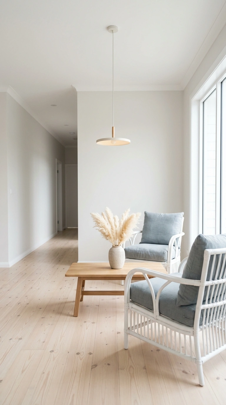
Soft chalk is a clean, powdery white with very soft blue undertones. It looks almost white in bright sunlight but picks up the coolest, most elegant tone in evening light. This color is perfect for coastal or Scandinavian-style interiors. Use it with light pine floors, white rattan furniture, and soft blue-gray linen cushions. Add a low wooden coffee table and some dried pampas grass for a naturally styled, Instagram-ready living room.
13. Warm Clay
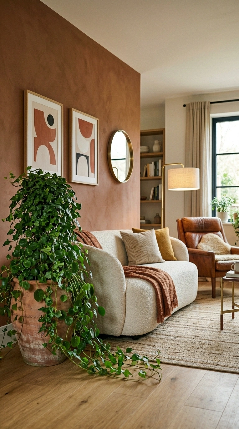
Warm clay is a deeper, more saturated neutral that falls somewhere between terracotta and tan. It is earthy and grounding, and it adds real warmth to rooms that feel too cool or sparse. Try warm clay on a single accent wall in a living room. Keep the other walls in a soft ivory and add a cream bouclé sofa, a leather armchair in cognac brown, and a flat-weave rug in natural tones. The result is a space that feels bold but still relaxed.
14. Silver Birch
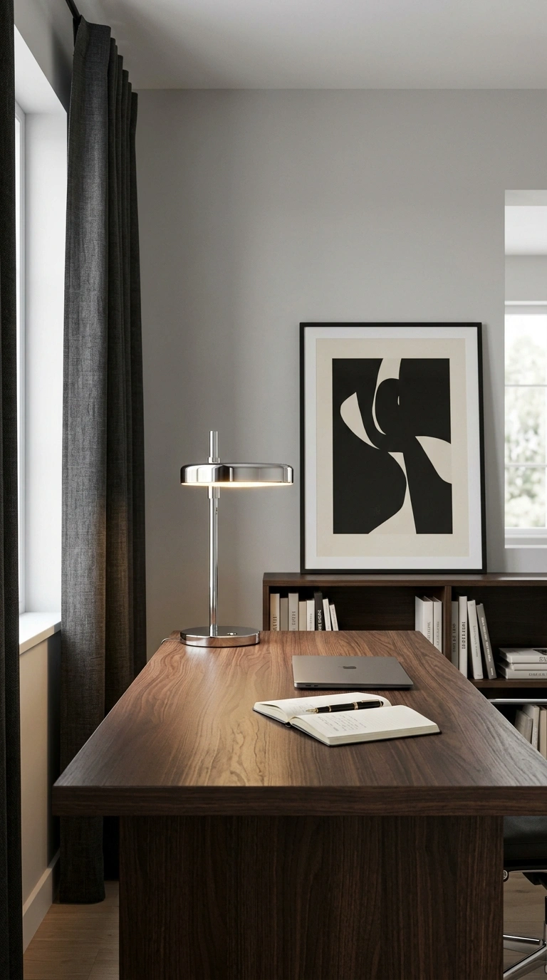
Silver birch is a cool-toned neutral gray with soft silver shimmer in its undertones. It is one of the most refined neutral paint colors for modern homes and adds an almost metallic quality to walls without being shiny. This shade is ideal for home offices, libraries, or formal sitting rooms. Pair it with charcoal linen curtains, a dark espresso wood desk, and sleek chrome or nickel fixtures. Add a single large art print in black and cream to anchor the space.
15. Aged Lace
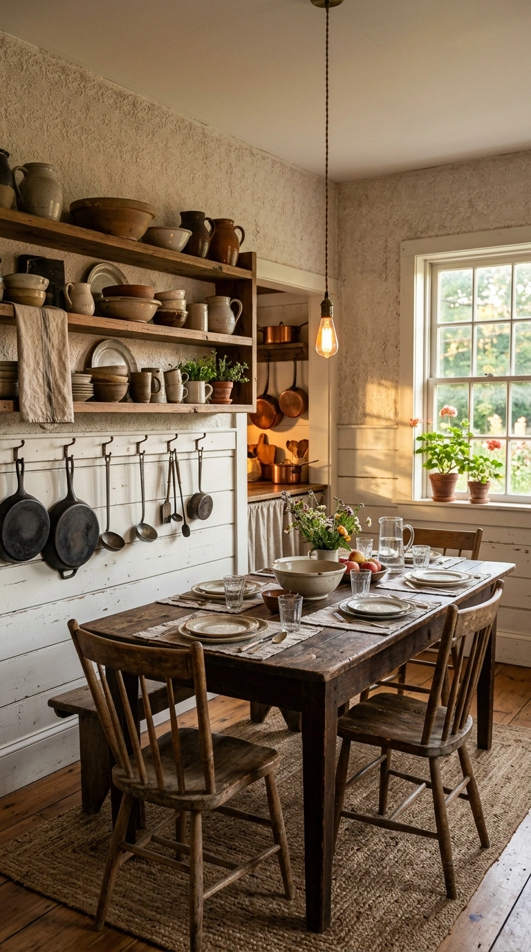
Aged lace is a warm off-white with a gentle yellow-cream quality. It is softer and more lived-in than a bright white and warmer than a standard ivory. Rooms painted in aged lace feel instantly welcoming and unhurried. This color works perfectly in country kitchens and farmhouse-style dining rooms. Combine it with shiplap paneling, open wooden shelves, vintage ironware, and mismatched pottery for a room that looks curated over time rather than designed all at once.
16. Pale Driftwood
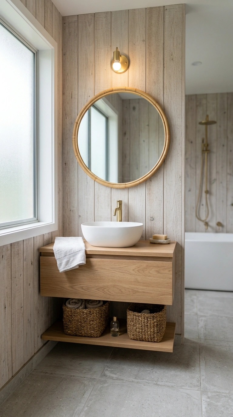
Pale driftwood is a cool, slightly weathered neutral with ash and gray undertones. It looks like the color of naturally aged timber and brings a quiet, coastal calm to any room. Use pale driftwood in a bathroom alongside stone-effect tiles, a white vessel sink, and woven seagrass baskets for storage. A bamboo mirror frame and a linen hand towel in natural white finish the look beautifully without adding any noise.
17. Dusty Lavender Gray
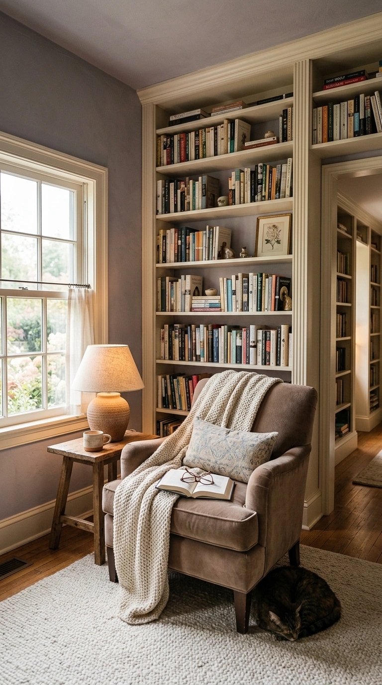
Dusty lavender gray sounds bold but is actually one of the softest neutral paint colors available. In most lighting, it reads as a cool gray with just the gentlest whisper of purple. It is elegant, calm, and quietly distinctive. This shade is beautiful in bedrooms and reading nooks. Pair it with cream-painted bookshelves, a velvet armchair in warm taupe, and a soft wool area rug in ivory. Add a small ceramic table lamp with a cream linen shade for perfect reading light.
18. Nude Beige
Nude beige is a light, skin-toned neutral that looks fresh and current. It has a flattering warmth that makes rooms feel comfortable and photogenic in every kind of light. Try nude beige in an open-plan living space with light oak furniture, white linen curtains, and soft natural textures throughout. Layer a cream sheepskin rug over light wooden floors and display a cluster of white ceramic vases on a floating shelf for a look that feels effortlessly styled.
19. French Gray
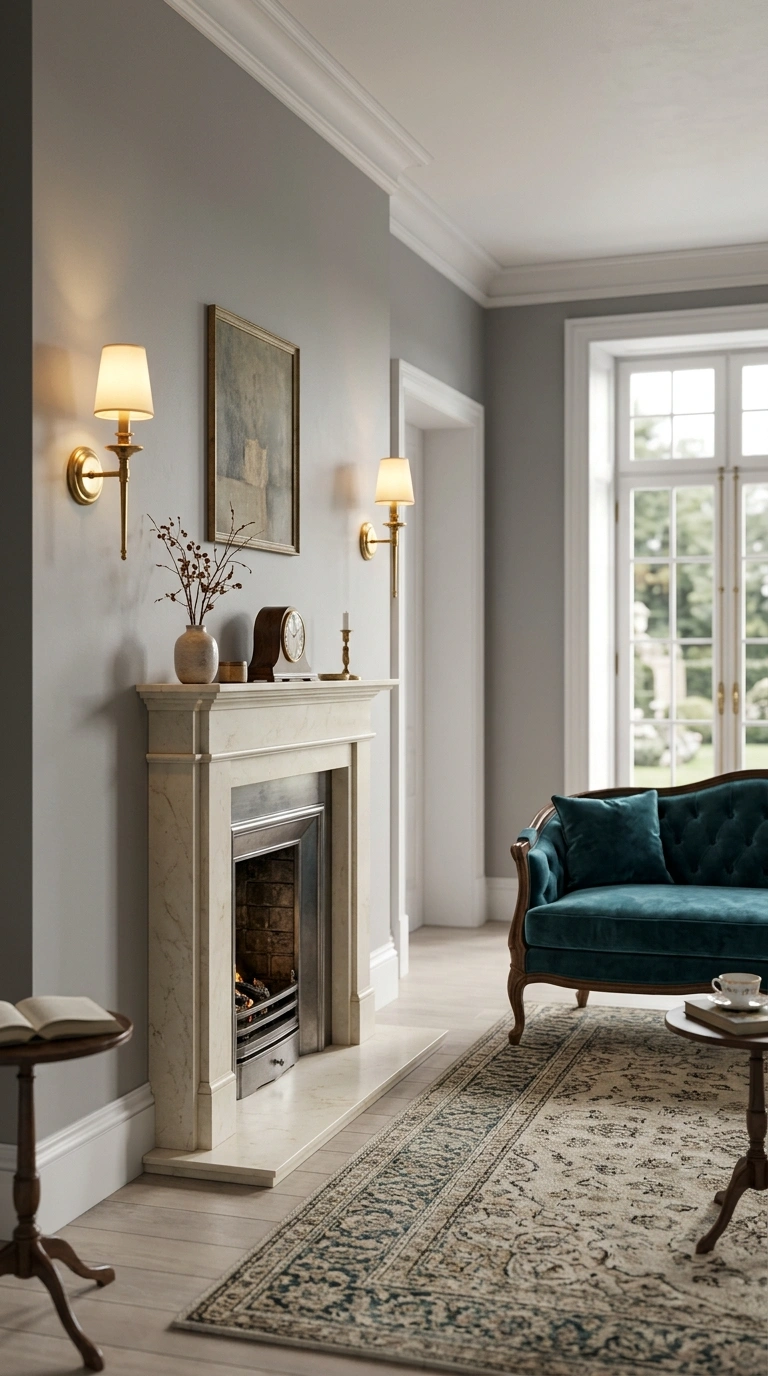
French gray is a classic, time-honored neutral with cool blue-gray undertones. It has been popular in European interiors for decades and it never looks dated. This color adds polish and quiet sophistication to any room. French gray looks stunning in a formal dining room or a traditional living room. Combine it with white painted trim, a cream marble fireplace surround, tufted velvet cushions in deep teal, and antique brass light fixtures. The room will feel like something from a beautifully curated home magazine.
20. Warm Putty
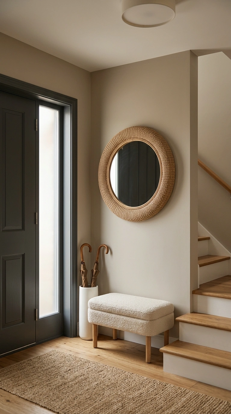
Warm putty is a soft mid-tone neutral with beige-brown-gray qualities all at once. It is complex enough to be interesting but calm enough to serve as a perfect backdrop for bold artwork or colorful accessories. Use warm putty in an entryway with a dark charcoal front door, warm oak stair treads, and a large round woven mirror. Add a single ceramic umbrella stand and a small bench upholstered in textured cream boucle to create an entrance that sets the tone for the whole home.
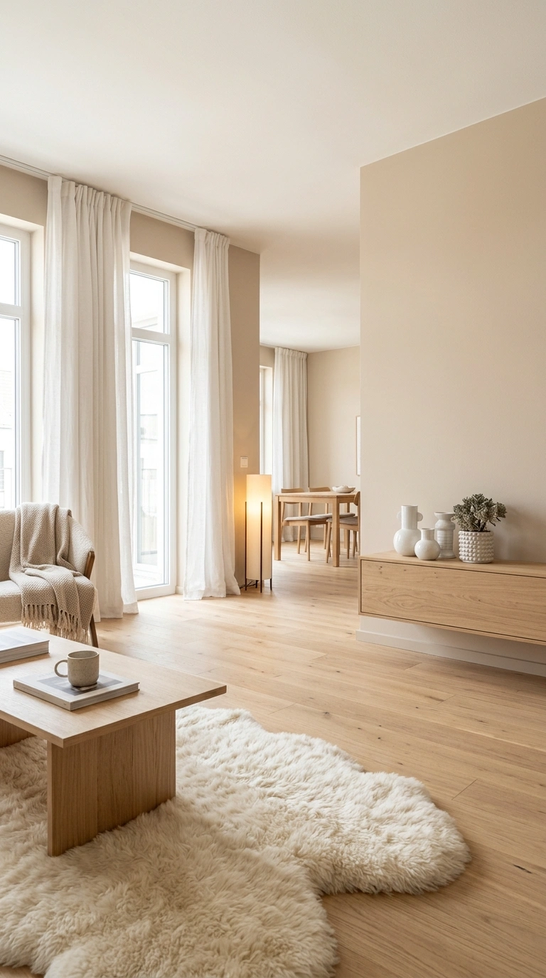
21. Mist Gray
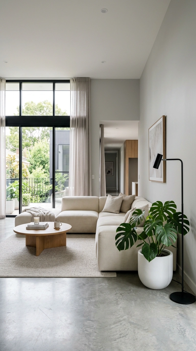
Mist gray is a very light, almost ethereal neutral that reads closer to white in bright rooms but picks up soft blue-gray qualities in lower light. It is one of the cleanest-looking neutral paint colors you can choose for a modern home. This color is perfect for open-plan spaces and rooms with large windows. Combine it with polished concrete floors, a cream modular sofa, and architectural indoor plants like a monstera or fiddle leaf fig. Keep accessories minimal and focused for maximum effect.
22. Burnished Gold
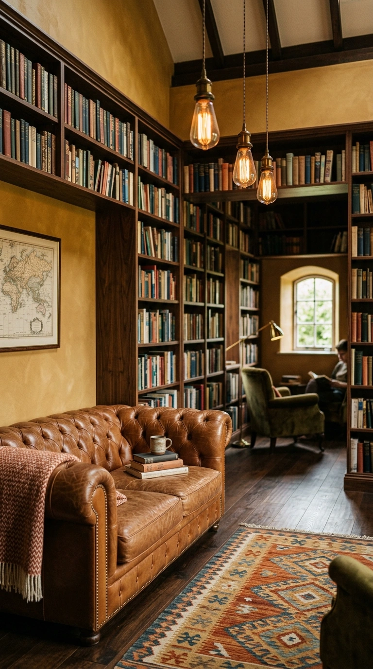
Burnished gold is a deeper, richer neutral that sits between tan, amber, and warm brown. In natural light, it has an almost luminous quality that makes walls glow. It is one of the boldest choices on this list but still firmly in the neutral family. Try burnished gold on the walls of a cozy study or home library. Add floor-to-ceiling built-in shelves in a deep walnut finish, a leather Chesterfield sofa in cognac, and a patterned kilim rug in complementary earthy tones. Layer in Edison bulb pendant lights for the perfect reading atmosphere.
23. Cream Marble
Cream marble is an off-white with very faint gray veining tones baked into its character. It is softer than bright white and cooler than ivory. This is the paint color that makes rooms look polished and freshly renovated. Use cream marble in a bathroom or kitchen alongside actual stone surfaces to create a seamless, luxurious look. Add brushed brass fixtures, a cream ceramic basin, and soft white towels folded neatly on a wooden rack. The result is a room that feels like a five-star hotel.
24. Pale Seashell
Pale seashell is a barely-there warm white with subtle pink and peach undertones. It is one of those colors that looks almost white on the paint chip but adds the most beautiful warmth to a real room in real light. This shade is wonderful in children’s rooms, bathrooms, and light-filled reading spaces. Pair it with natural wood accents, white bedding, and pastel accessories in soft blush and mint. The room will feel fresh, gentle, and perfectly comfortable.
25. Deep Greige
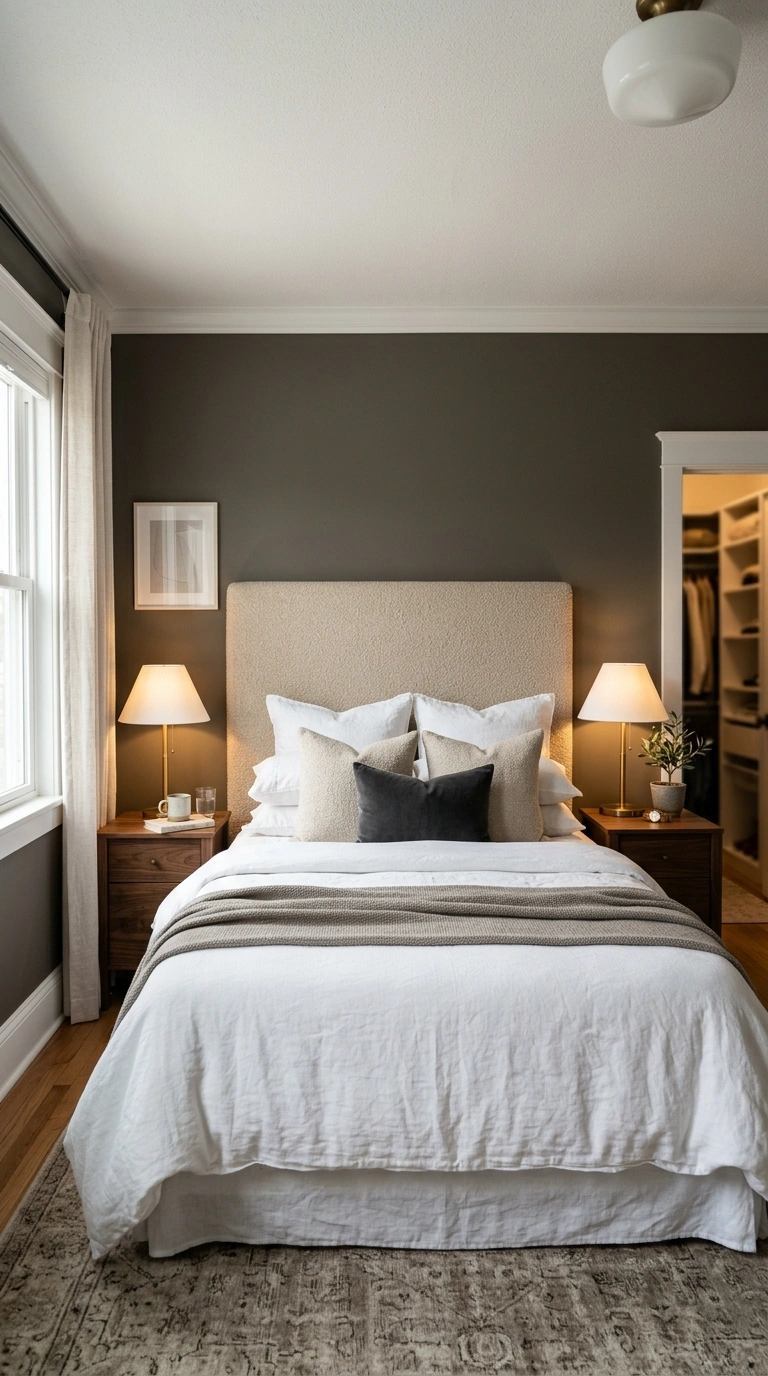
Deep greige takes the classic greige formula and adds a little more depth and confidence. It is still firmly a neutral but it carries more visual weight than a lighter shade. This makes it ideal for rooms where you want some drama without using a bold color. Use deep greige in a master bedroom or a formal living room. Combine it with crisp white trim, a king-size bed with a tall upholstered headboard in warm oatmeal boucle, dark walnut side tables, and brushed brass lamps. The result is a room that looks rich, layered, and beautifully composed.
Conclusion
Picking the right neutral paint color is one of the smartest design decisions you can make. A good neutral unifies the whole room and gives everything you put in it a better backdrop to shine. Start with the undertone first, whether warm, cool, or balanced, and let the natural light in your room guide your final choice. Pick one or two favorites from this list, get some sample pots, and watch how differently each color looks on your actual walls at different times of day. Once you find the right one, the rest of the room falls into place surprisingly fast.
FAQs:
What is the most popular neutral paint color for living rooms?
Soft greige is currently one of the most popular neutral paint colors for living rooms because it works with almost every furniture style and looks good in both natural and artificial light. Warm ivory is another top choice that suits both traditional and modern interiors beautifully.
How do I choose the right neutral paint color for my home?
Start by identifying the undertone you want, whether warm, cool, or balanced. Then get sample pots and paint large test patches on your actual walls. Look at them at different times of day because neutral colors can shift dramatically between morning light and evening lamplight.
Do neutral paint colors make a room look bigger?
Yes, lighter neutral paint colors like stone white, soft chalk, and mist gray reflect more light and make rooms feel larger and more open. Deeper neutrals like pale mushroom and deep greige add coziness but work best in rooms that already have good natural light.
What furniture colors go with neutral paint colors?
Neutral walls pair well with almost any furniture color, which is one of their main advantages. Warm oak, walnut, and cream work especially well with warm neutrals. Charcoal, white, and black furniture pairs beautifully with cooler neutral shades like French gray or silver birch.
Are neutral paint colors still in style in 2025 and 2026?
Neutral paint colors are more popular than ever in 2025 and 2026. The current trend leans toward warmer neutrals with earthy undertones like warm putty, aged lace, and dusty sage rather than the cold stark whites and grays that were popular a decade ago.