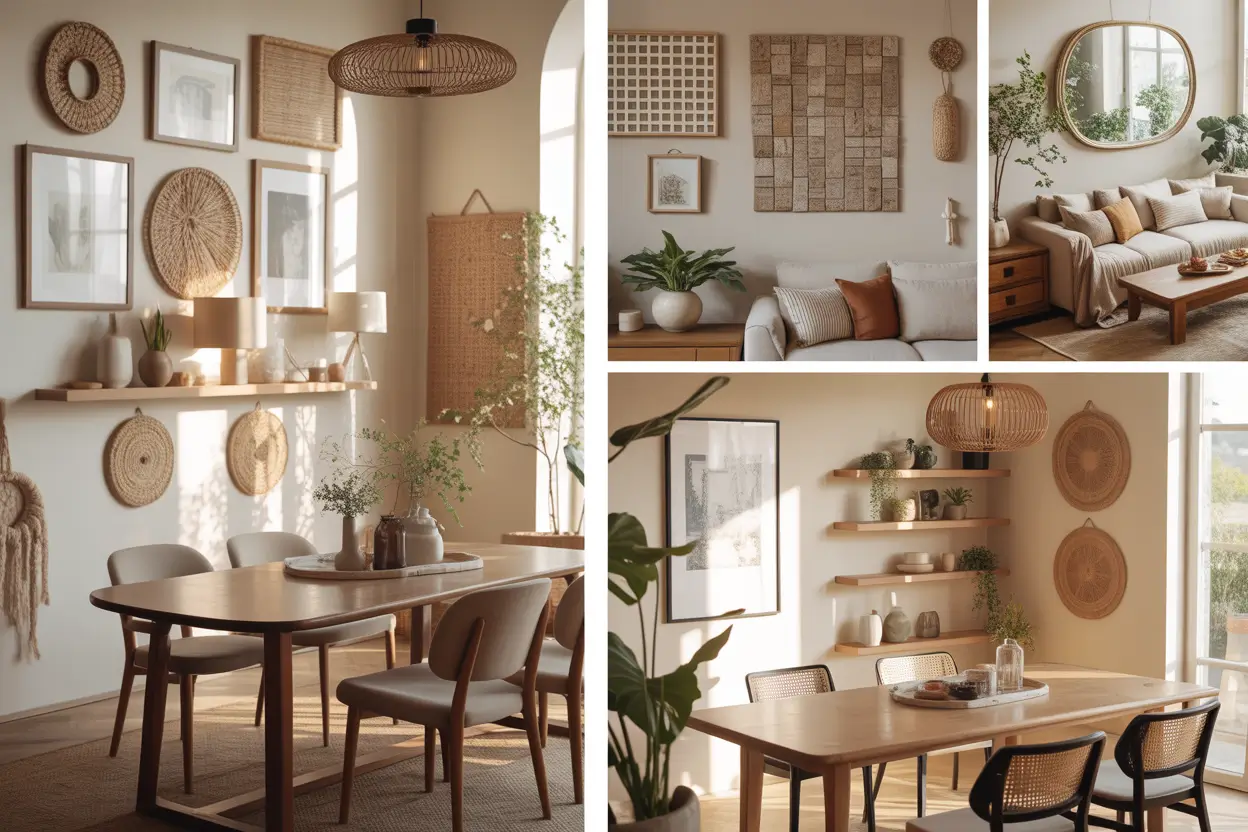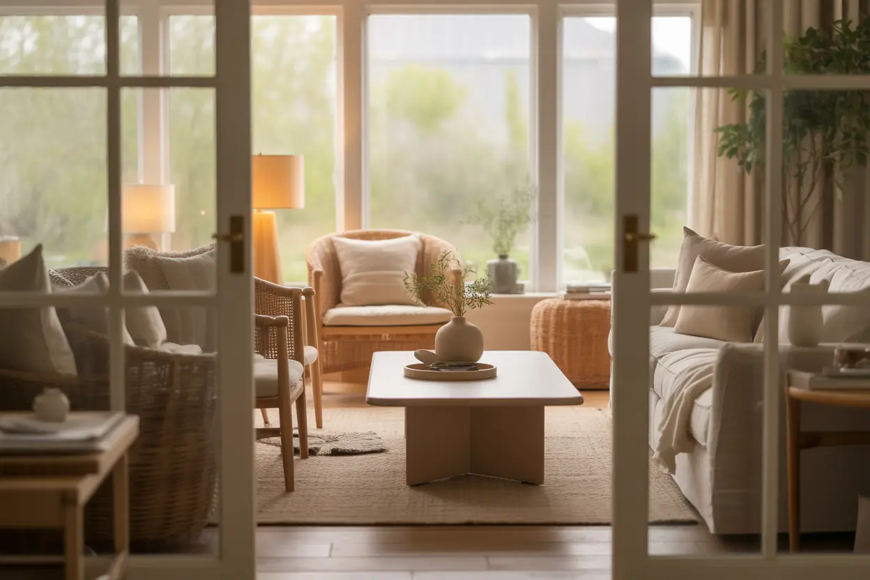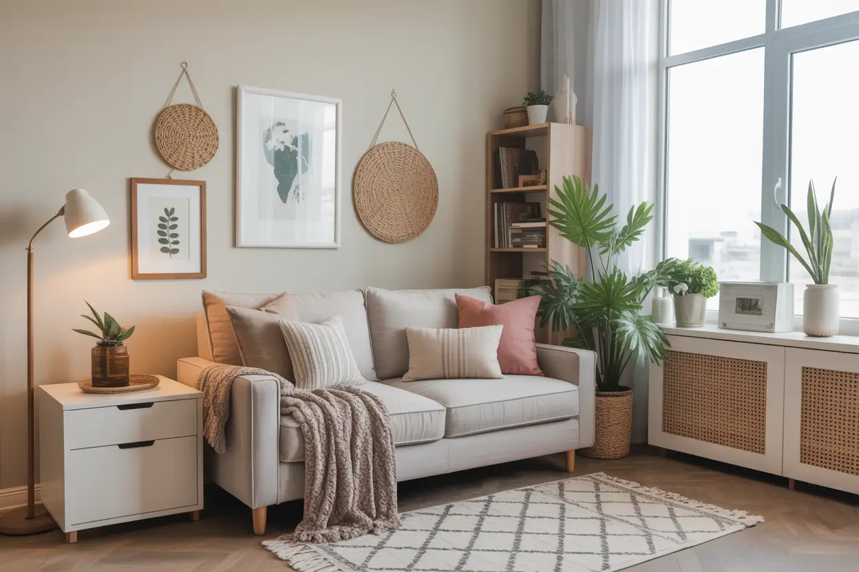
23 Modern Home Decor Ideas That Balance Comfort and Style
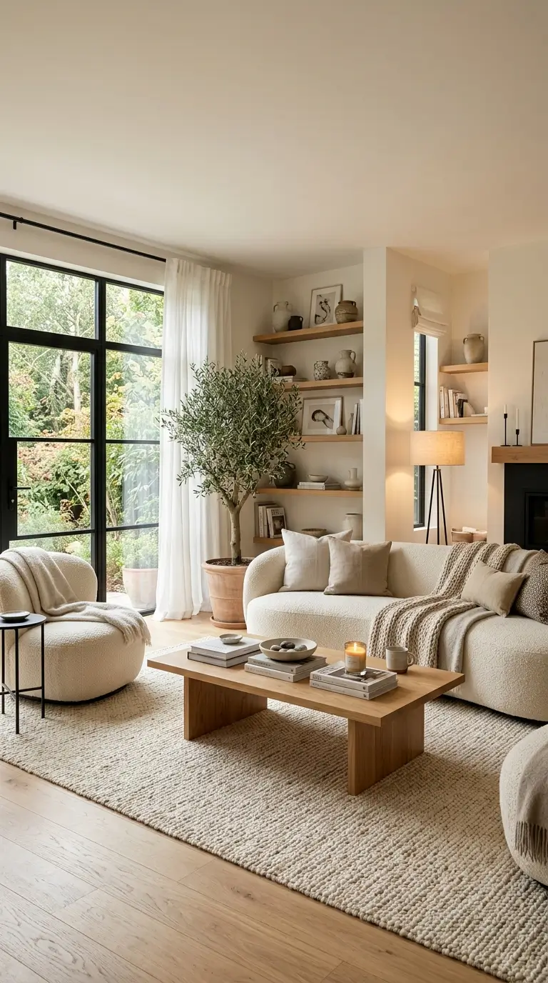
A lot of modern home decor photographs beautifully and feels terrible to actually live in: hard-edged furniture, sparse rooms, lighting that’s either too bright or nonexistent. The homes that manage to look intentional and still feel genuinely comfortable are usually following a handful of specific, learnable choices, not just luck or a bigger budget.
This guide covers 23 real techniques for building a space that’s both, and each one goes beyond a single tip to give you something to actually check or measure against, so you can apply the thinking to your own rooms rather than just copying a shopping list.
1. Layered Textures Instead of Matching Sets
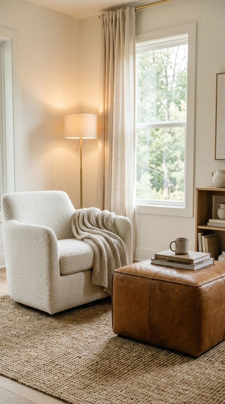
A room built from a matched furniture and textile set looks coordinated but often feels flat, since every surface reflects light the same way. I like using a vintage-style rolling bar cart because it adds texture and character without making the setup feel too matched. I’ve found that open shelves also make it easy to arrange cups, jars, and small decorations while keeping everything within reach.
A simple three-texture starting point for any single seating area:
- One soft, nubby texture (bouclé, chenille, or a chunky knit throw)
- One smooth, structured texture (leather, or a tightly woven cotton)
- One natural, woven texture (jute, rattan, or a coarse wool rug)
Rooms that hit all three tend to photograph as “layered” even at a single, tight color palette, while rooms using only one texture family read as flat no matter how well the colors coordinate.
2. Curved Silhouettes Mixed With Clean Lines
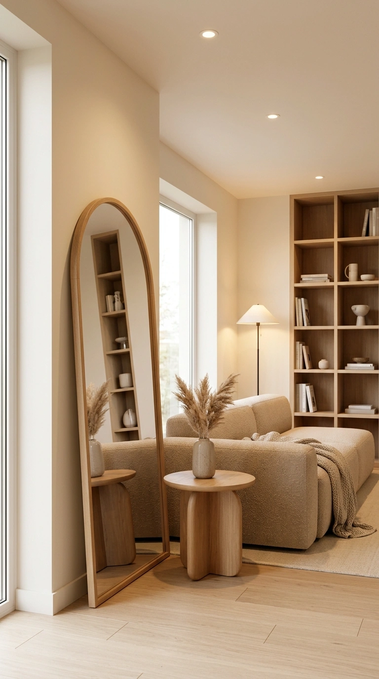
An entirely rectilinear room, straight sofa, square coffee table, boxy shelving, reads as more architectural than welcoming. One thing I always reach for is a round wall mirror because it softens all the straight edges without changing the whole room. I’ve found that one gentle curve can make the space feel calmer and more balanced right away.
Where to add the first curve, in order of cost:
- A round mirror (cheapest, fastest change)
- A curved or oval side table
- An arched doorway trim or a curved floor lamp base
- A fully curved sofa or sectional (most expensive, biggest commitment)
Starting at the top of that list lets you test whether the softer shape actually suits your space before committing to a large curved furniture purchase.
Also Read > 19 Small Bedroom Decor Ideas With Feminine Charm
3. Deep, Oversized Seating Over Sleek, Low-Profile Furniture
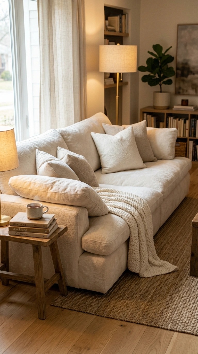
Furniture chosen purely for its silhouette often sacrifices actual sit-in comfort: shallow seat depth, low backs, firm cushions that photograph crisply but don’t invite anyone to stay.
I usually keep a soft knit throw blanket folded over one arm of a deep sofa because it makes the seating feel even more inviting. It adds another layer of texture without hiding the shape of the furniture, and the whole space feels more relaxed and comfortable.
What to check before buying a sofa for comfort, not just looks:
| Measurement | Comfortable Range |
|---|---|
| Seat depth | At least 22-24 inches |
| Seat cushion height | 17-19 inches from the floor |
| Back cushion height | At least 26-28 inches for real lounging support |
A sofa that measures short on all three of these can still look striking in a photo, but it usually gets described as “nice to look at, not great to sit on” once it’s actually in daily use.
4. Warm Minimalism, Not Empty Minimalism
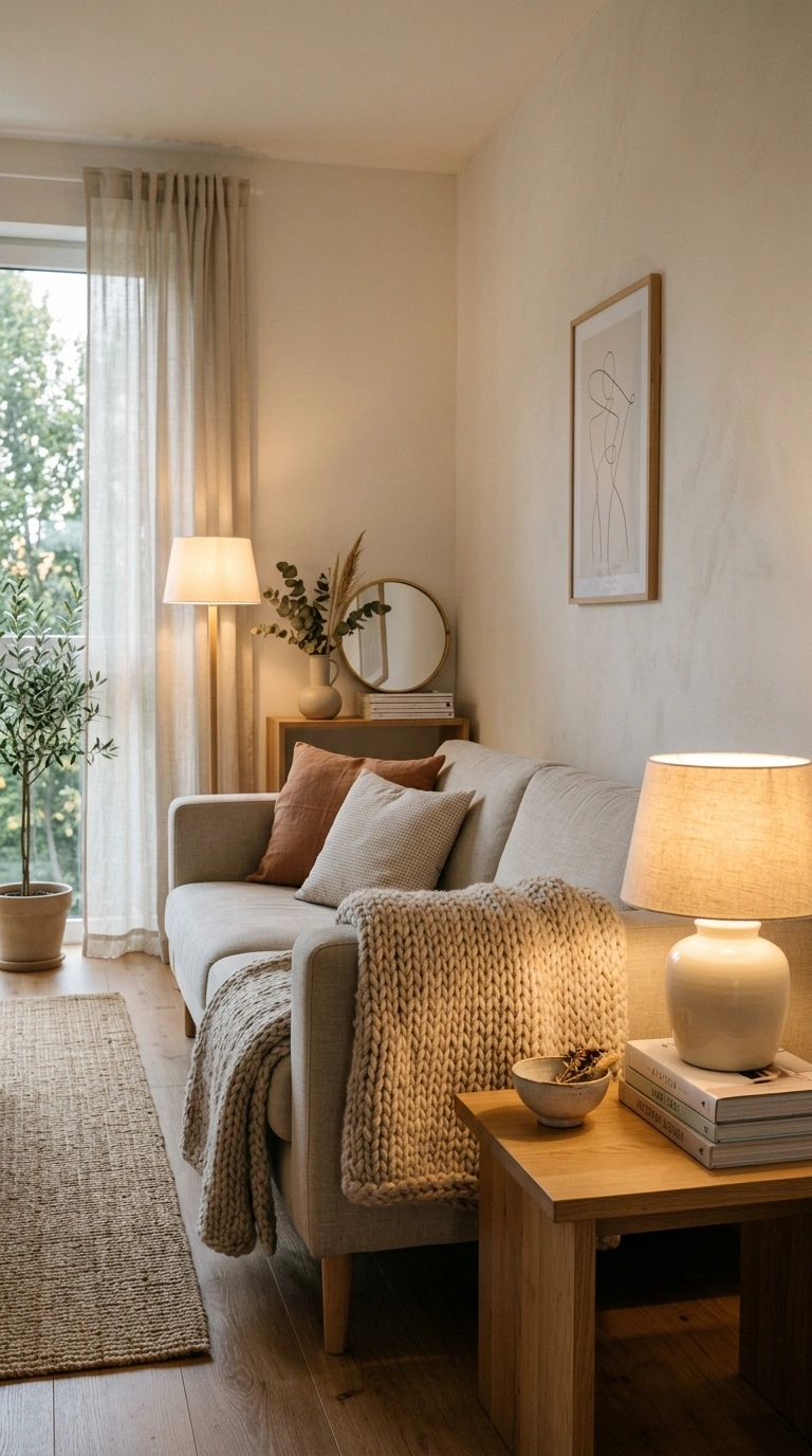
Minimalism gets confused with emptiness, but a truly comfortable minimalist room still has warmth. I like keeping a large ceramic table vase on a console or coffee table, even if it only holds a few stems. It gives a minimalist room a little weight and warmth without taking away from the clean look.
Warm minimalism vs. cold minimalism:
| Cold Minimalism (avoid) | Warm Minimalism (aim for) |
|---|---|
| Bright overhead light only | Warm lamp light, dimmable |
| Hard, glossy surfaces throughout | At least one soft textile layer per room |
| Zero personal objects | One or two curated, meaningful pieces |
| Empty walls left blank by default | One intentional piece of art or a mirror |
If a room feels cold rather than calm, it’s usually missing one item from the right-hand column, not because it has “too little” in some general sense.
5. Mixing High and Low Furniture Pieces
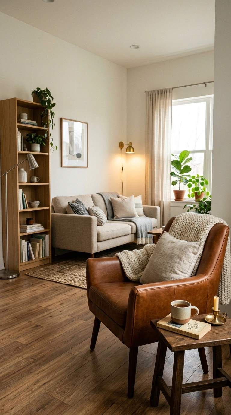
Spending everything evenly across a room often means every piece is decent but nothing feels special.
A simple splurge-and-save split:
| Splurge On | Save On |
|---|---|
| One seating piece you touch daily (the sofa or your main chair) | Side tables and occasional furniture |
| A rug that anchors the whole room | Basic hardware and small accessories |
| Real wood or leather on the piece closest to eye level | Storage pieces tucked out of the main sightline |
This concentrates your budget where it actually gets noticed and used, rather than spreading it thin across every single item.
6. Statement Lighting as Functional Art
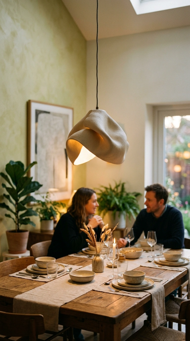
A sculptural pendant or an interesting floor lamp does double duty: it lights the room and acts as a visual focal point, which is more efficient than hanging separate art on a wall that a plain fixture leaves unaddressed.
A statement floor lamp can do more than fill a dark corner. It gives the room a stronger focal point, so there’s less pressure to decorate every nearby wall with extra artwork or accessories.
Sizing rule for a pendant over a table: the fixture’s diameter should measure roughly one-third to one-half the width of the table beneath it. A pendant sized correctly reads as a deliberate choice; one that’s too small looks like an accessory that got lost above too much table.
7. Tactile Natural Materials Throughout
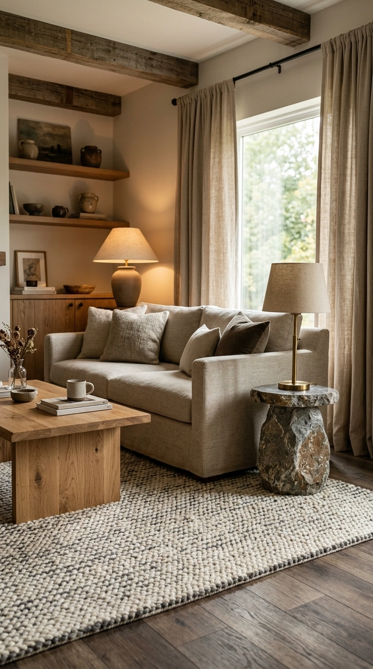
Wood, stone, linen, and wool all invite touch in a way that laminate, acrylic, and polyester don’t. Instead of mixing in more decorative objects, try adding a handwoven wool throw. It brings another natural texture into the room, making wood and stone surfaces feel softer while keeping the overall look simple.
| Material | Where It Adds the Most Warmth | What to Avoid Pairing It With |
|---|---|---|
| Wood | Furniture legs, shelving, flooring | Cool white overhead LED light, which flattens wood grain |
| Stone | Countertops, a side table, a small tray | Overuse across every surface, which can read cold in bulk |
| Linen | Curtains, upholstery, bedding | Heavy starching, which removes the material’s natural softness |
| Wool | Rugs, throws | Direct, constant sun exposure, which fades wool faster than synthetic fiber |
8. Negative Space as a Design Tool, Not a Gap to Fill
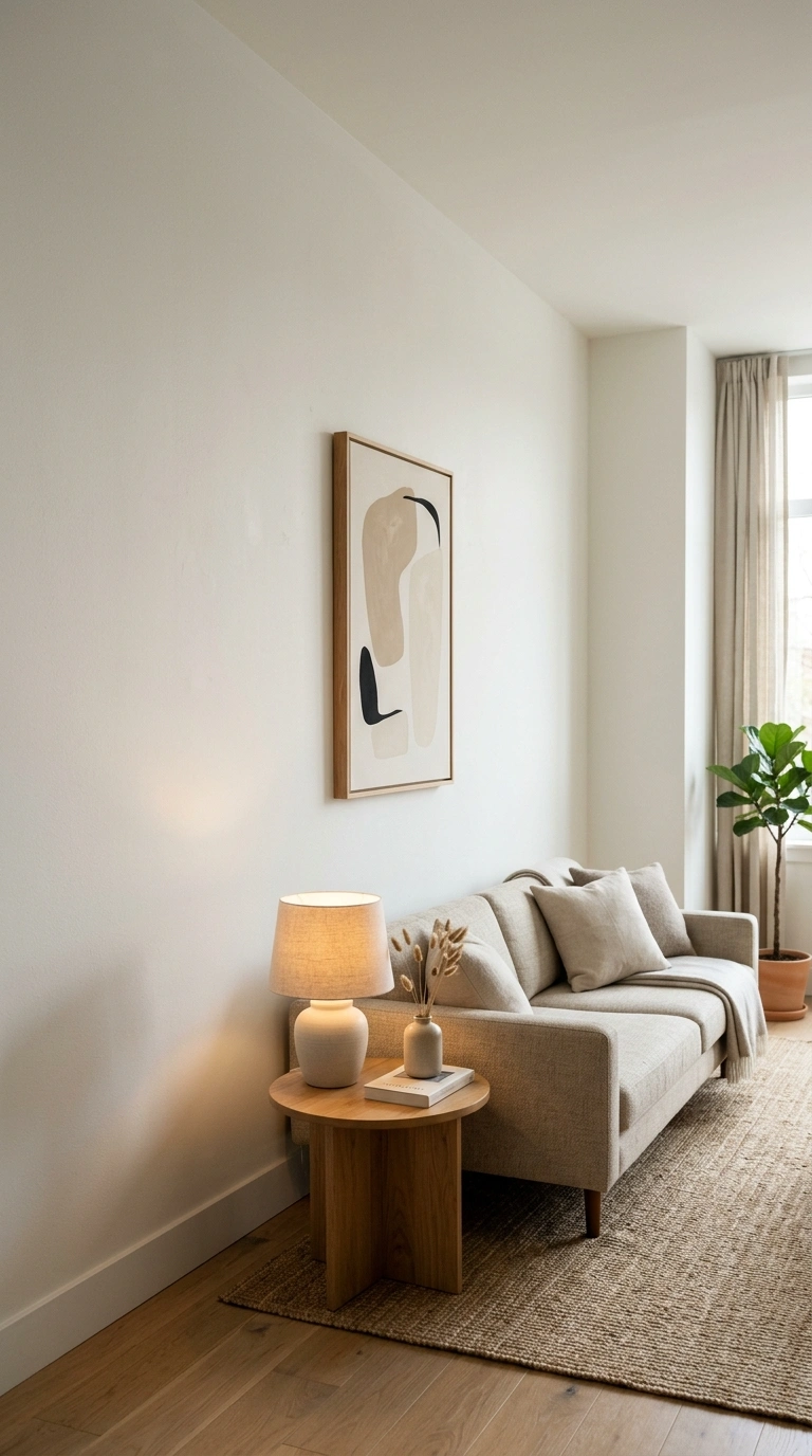
Empty wall space, an uncluttered shelf, a room with breathing room around each piece of furniture, isn’t unfinished; it’s what lets the eye rest.
A rough target: aim to leave about 20-30% of any given wall or shelf visually empty, rather than filling every available inch. Below that, a space starts to read as cluttered; above roughly 50% empty, it can start to feel unfinished or sparse instead of intentional.
9. One Bold Color Anchor Per Room
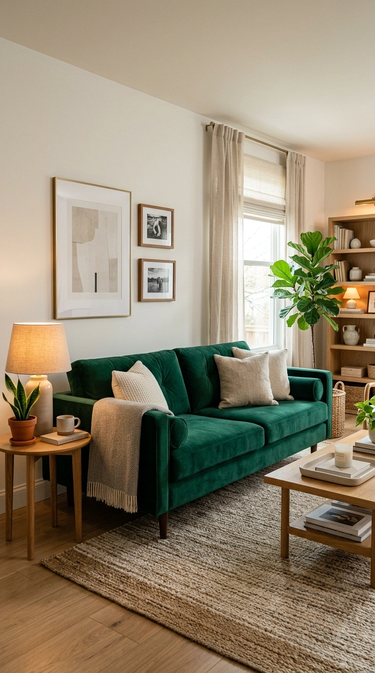
A room using several bold colors in equal measure competes with itself. A large accent area rug works well for this because it introduces one clear color without spreading bold shades across every corner of the room. The rest of the palette can stay quiet, letting that single color become the feature that ties everything together.
A simple ratio:
- 70% neutral base (walls, largest furniture piece)
- 20% your one bold anchor color (a sofa, a rug, or an accent wall)
- 10% a supporting accent (a smaller pillow, a vase, a piece of art)
Rooms that break this ratio, giving two or three colors equal visual weight, tend to feel busier and less resolved than one confident anchor color paired with a mostly neutral supporting cast.
10. Layered Rugs for Visual and Physical Grounding
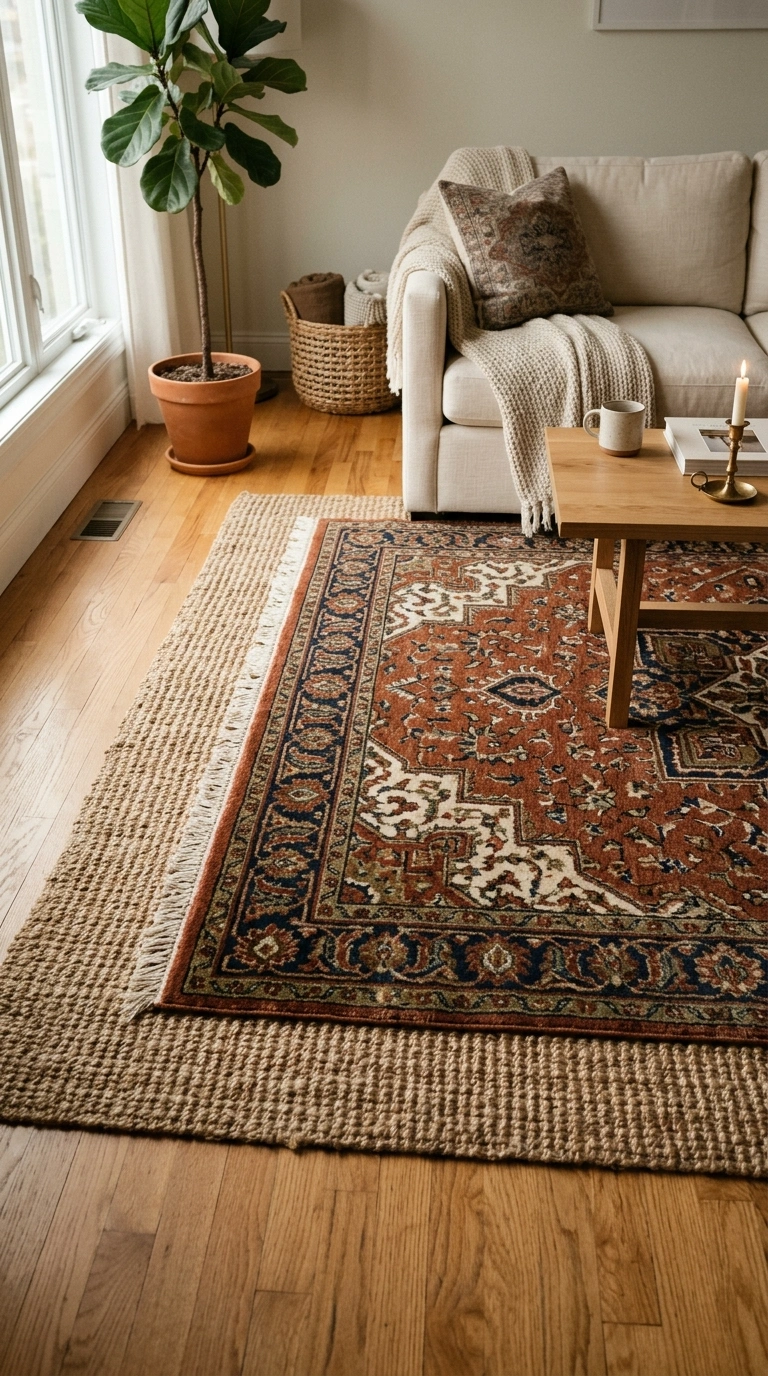
A room with a rug layered over a larger natural fiber base rug adds depth underfoot and visually anchors the furniture arrangement more effectively than a single rug or bare flooring.
The proportion that makes it work: the top rug should cover roughly two-thirds of the base rug’s surface area, with an even border of the base rug showing on all sides. Covering more than about 80% of the base erases the layered look entirely; covering less than half makes the pairing look accidental rather than styled.
11. Open Shelving Styled Slightly Imperfectly
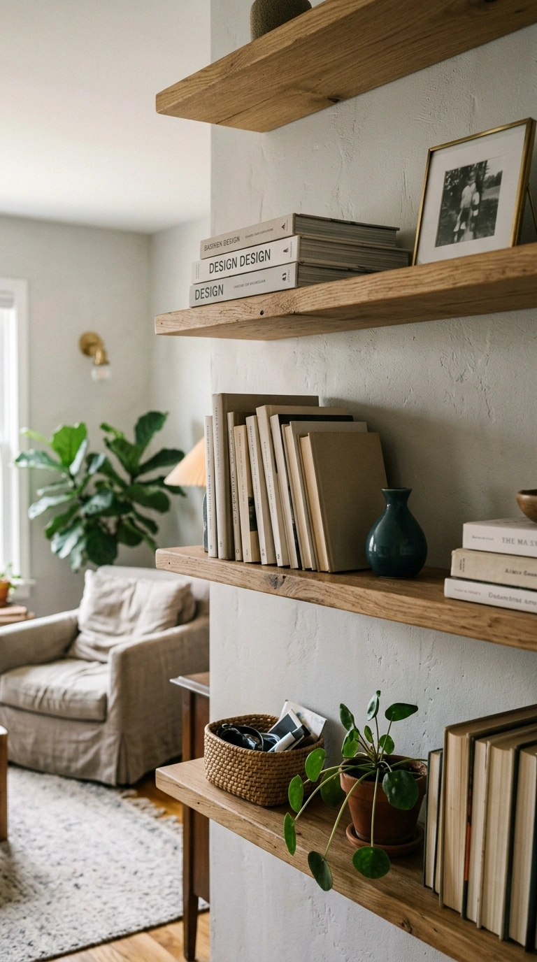
Open shelving styled with mathematically perfect symmetry reads as staged.
Three small imperfections that make a shelf read as real, not staged:
- Stack two or three books at slightly different heights instead of perfectly aligned
- Turn one object at a subtle angle instead of facing every item dead-on
- Leave one small gap of genuinely empty space rather than filling every inch
A shelf with all three of these small breaks from symmetry consistently reads as more like an actual home and less like a showroom display, even though the individual items haven’t changed.
Also Read > 23 Moody Blue Sherwin-Williams Bedroom Paint Colors for a Luxurious Primary Suite
12. Mixing Vintage and New Pieces
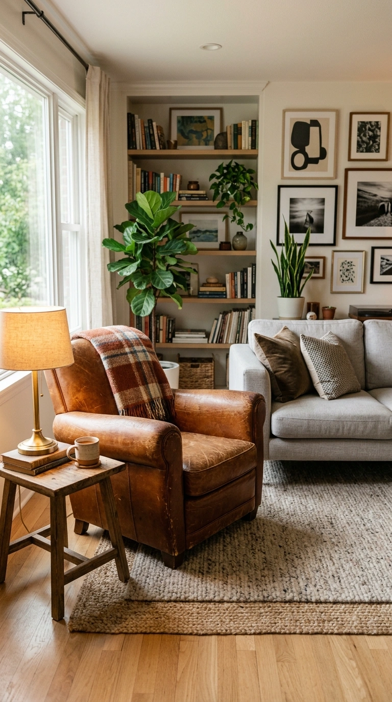
An entirely new furniture collection can feel like a catalog page.
Where to find one good vintage piece without a long search: estate sales typically offer the best prices but require checking listings regularly; consignment furniture shops cost more but let you see and test the piece in person; and local online marketplaces sit in between, offering good prices if you’re willing to sort through more mismatched listings to find one worth buying.
Adding even one secondhand or vintage piece, a worn leather chair, an antique mirror, a mid-century side table, brings a history that new furniture alone can’t replicate, and it usually costs less than the equivalent new piece.
13. Layered, Adjustable Lighting
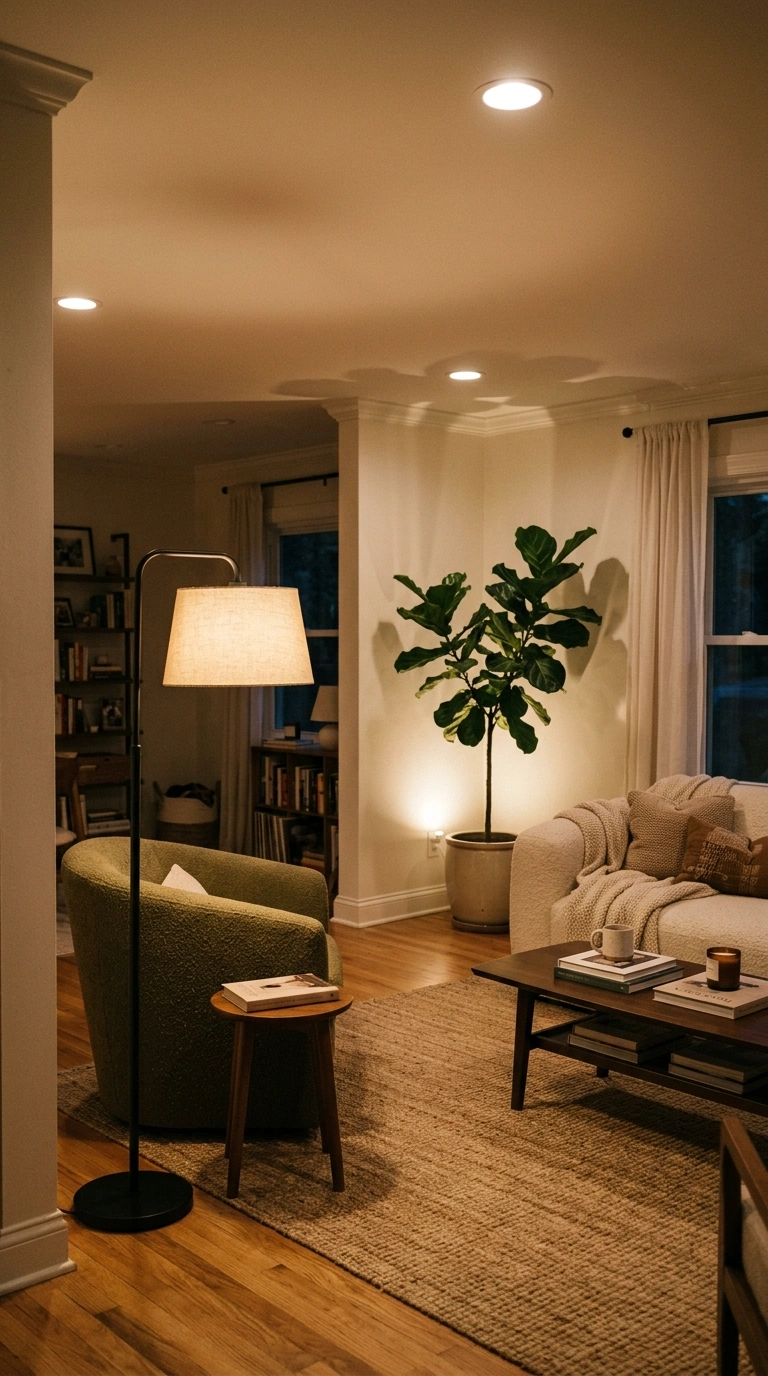
A single overhead fixture forces a room into one mood at all times: bright and functional or nothing.
The three-layer checklist most rooms are missing at least one of:
- Ambient light (overhead or general room brightness), ideally on a dimmer
- Task light (a reading lamp, under-cabinet strip) aimed at where you actually do things
- Accent light (a small uplight on a plant, a picture light) purely for mood, not function
Most rooms that feel flat and one-note in the evening are running on ambient light alone; adding just the task or accent layer, even a single lamp, usually fixes it.
14. Cozy Textiles on Hard Modern Furniture
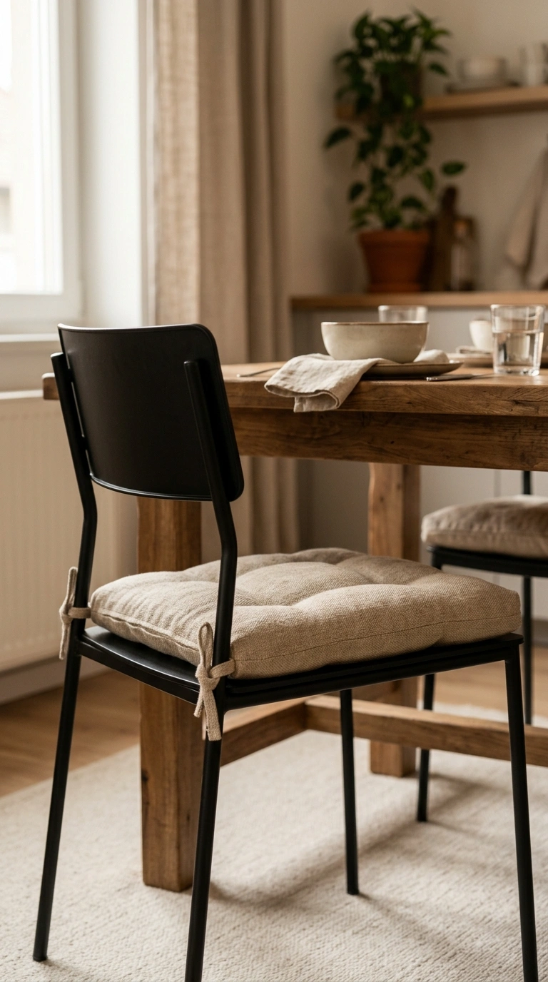
Modern furniture often leans on hard materials, metal frames, glass tops, molded plastic, which can read as cold without a textile layer to soften them.
| Hard Piece | Textile Pairing That Softens It |
|---|---|
| Metal-framed dining chair | A tied-on seat cushion in linen or wool |
| Glass-top coffee table | A woven tray or a stack of textured books on top |
| Molded plastic accent chair | A sheepskin or chunky knit throw draped over the back |
15. Functional Storage That Doesn’t Look Like Storage
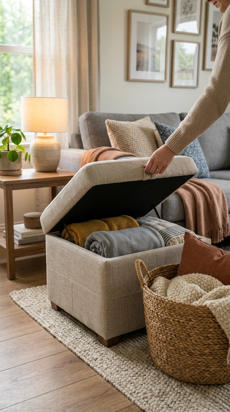
Storage that’s visually heavy, bulky cabinets, stacks of plastic bins, makes a room feel cluttered even when everything is technically organized.
Visually light vs. visually heavy storage, for the same function:
| Function Needed | Visually Heavy Option | Visually Light Option |
|---|---|---|
| Extra blankets | Plastic storage bin | Woven basket with a lid |
| Remote controls, small items | Open tray on the coffee table | A drawer inside a storage ottoman |
| Books and media | Stacked cardboard boxes | Low open shelving styled intentionally |
16. Sculptural Furniture That’s Still Genuinely Usable
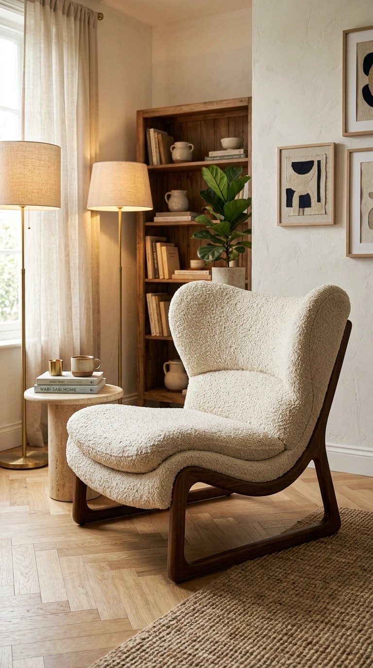
A striking, sculptural chair that’s uncomfortable to actually sit in eventually gets avoided, turning an expensive piece into a purely decorative object.
Before buying a statement piece, check:
- Has anyone in your household actually sat in it for more than five minutes, either in-store or via a return-friendly online order?
- Does the seat depth and back height match the comfort ranges in Idea 3 above, or is the shape purely decorative?
- Would you still want it in the room if it never got sat in? If not, it’s better suited as a smaller accent piece than a primary seat.
17. Indoor Plants as a Living Design Element
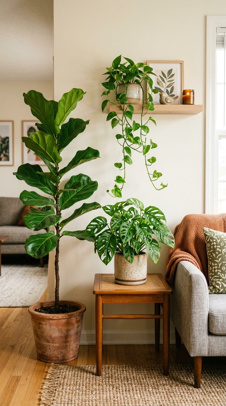
Plants bring color, texture, and a subtle sense of life that static decor can’t replicate, and unlike most other design elements, they change slightly over time.
| Plant Size | Design Role | Light Commitment Needed |
|---|---|---|
| Large floor plant (fiddle leaf, palm) | Fills an empty corner, adds height | Bright, indirect light most of the day |
| Medium tabletop plant | Softens a shelf or console table | Moderate, tolerates some inconsistency |
| Small trailing plant | Adds movement to a high shelf or hanging planter | Low to moderate, forgiving of missed waterings |
18. Matte Finishes Over High-Gloss
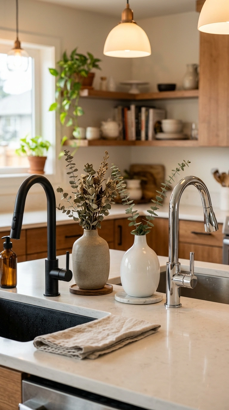
High-gloss surfaces photograph well but show fingerprints, dust, and scratches more visibly in daily life, and they can read as cold or slick rather than warm.
Where the difference shows up most: cabinet hardware, ceramic vases, and metal light fixtures. A matte black faucet versus a chrome one, or a matte stoneware vase versus a glossy porcelain one, changes how a room feels at close range even when the color and shape are otherwise identical.
19. Personal Objects Displayed With Intention
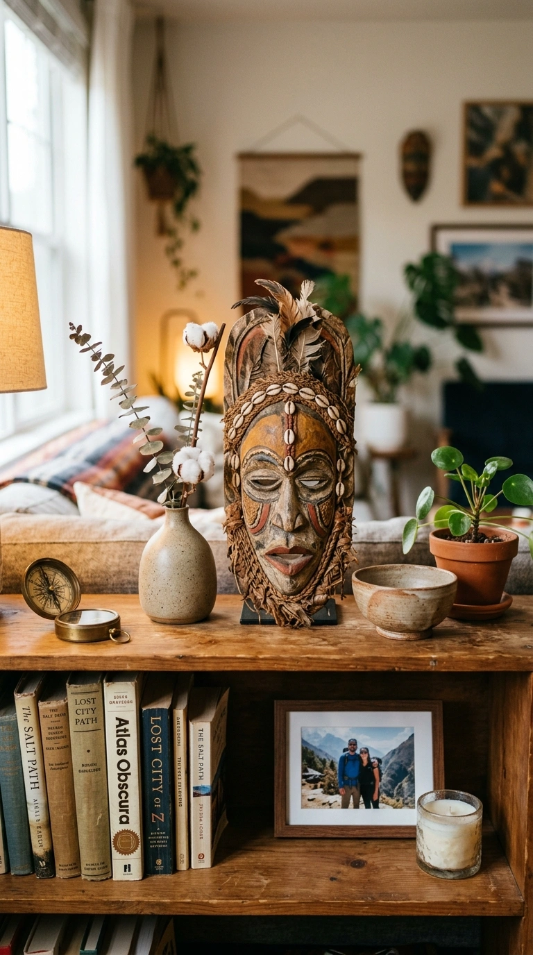
A shelf of only purely decorative, store-bought objects can feel generic no matter how well-chosen each piece is.
Do: mix in one genuinely personal item per major shelf or surface, a travel souvenir, a piece from a specific artist, a family object, and let it sit among simpler pieces rather than isolated on its own pedestal.
Don’t: cover an entire wall or shelf in sentimental objects at once; when everything is meaningful, nothing reads as a focal point, and the individual stories get lost in the density.
20. Multi-Purpose Furniture in Smaller Spaces
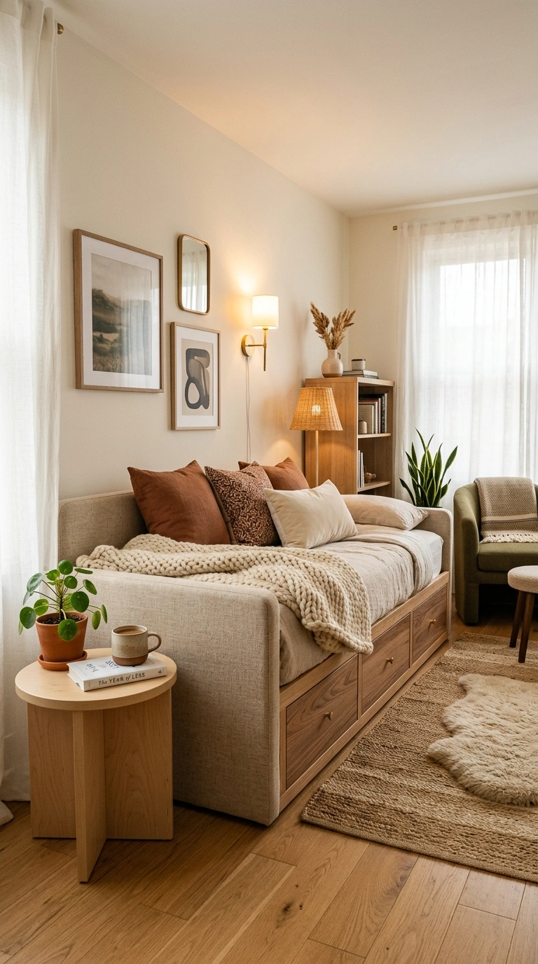
Multi-purpose furniture lets a smaller room feel less cramped than filling it with single-function pieces for every possible need.
| Single-Function Piece | Multi-Purpose Swap |
|---|---|
| Coffee table + separate ottoman | A large storage ottoman used as both |
| Guest bed + linen closet | A daybed with built-in drawer storage |
| Dining table (rarely expanded) + console table | An expandable console/dining hybrid table |
21. Consistent Color Temperature Across Every Light Source
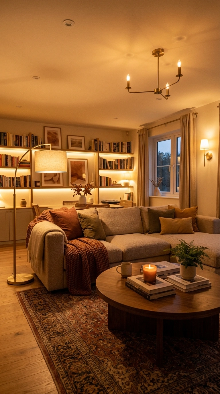
A room lit by a mix of warm and cool bulbs feels visually inconsistent even if every individual fixture looks fine on its own.
The mistake, specifically: buying a new lamp or LED strip without checking its Kelvin rating against your existing fixtures. A 2700K lamp next to a 4000K overhead light creates two visibly different “zones” of light in the same room, which reads as unplanned even when every fixture individually looks nice. Standardizing on 2700-3000K across a room fixes this without replacing any furniture.
22. Breathing Room Between Furniture Pieces
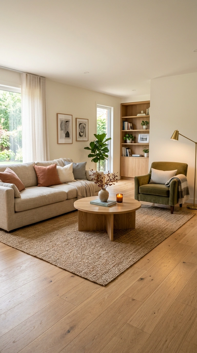
Furniture pushed tightly against walls or crowded close together can make a room feel smaller and more cramped, even with generous floor space.
Minimum walking clearance by area:
| Area | Minimum Clearance |
|---|---|
| Main walking path through a room | 30-36 inches |
| Between a coffee table and sofa | 14-18 inches |
| Around a dining table (for chairs to pull out and people to pass) | 36-42 inches |
Rooms that fall short of these on the main walking path are the ones that feel cramped even when the furniture itself isn’t oversized.
23. A Signature Scent as an Invisible Design Layer
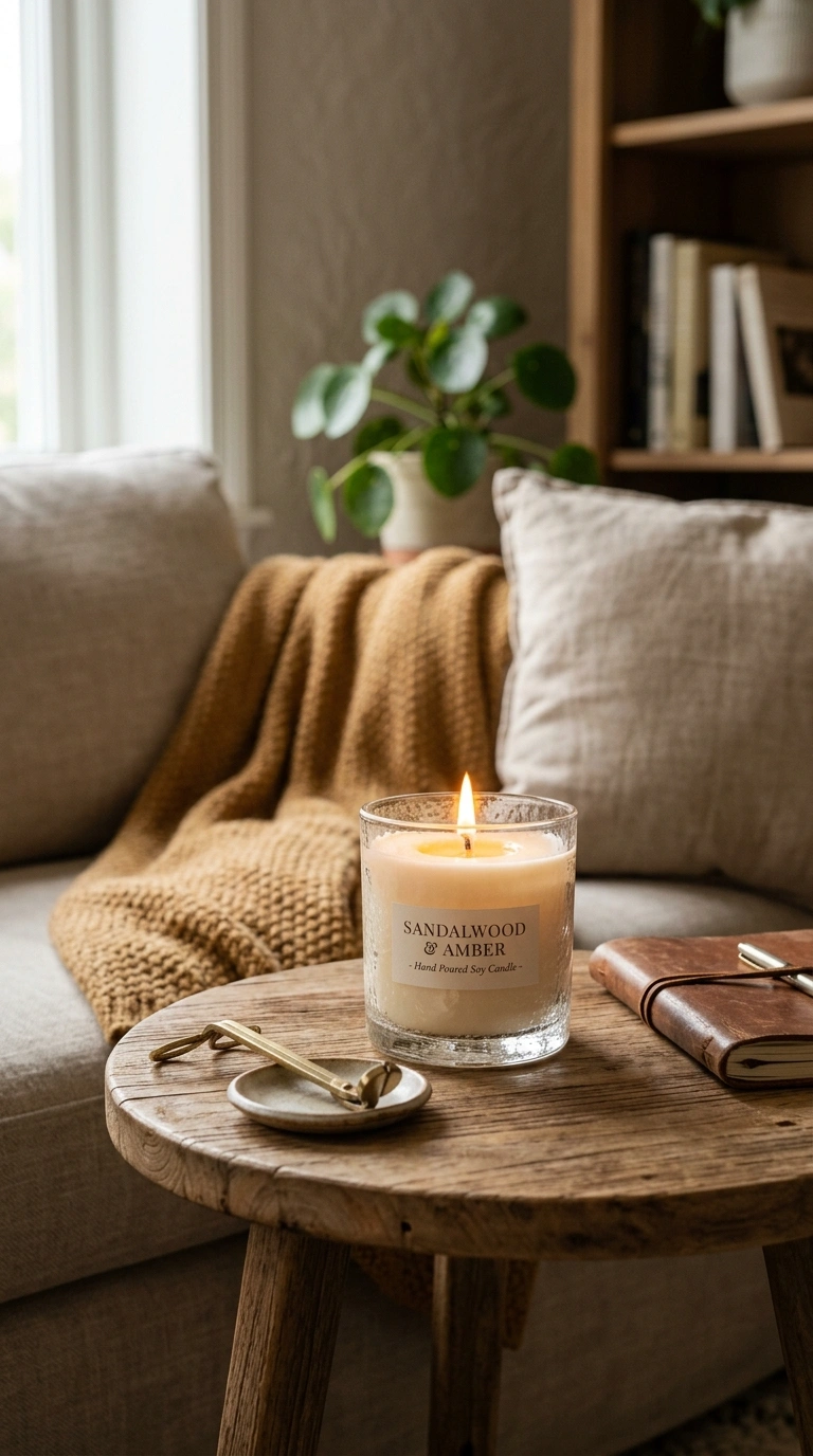
Scent is easy to overlook as a design element, but a consistent, subtle scent becomes part of how a space feels without anyone being able to point to exactly why.
Do: pick one scent family (woody, citrus, floral) and stick with it across a season, refreshing the same candle or diffuser oil rather than switching scents every time you buy something new.
Don’t: layer multiple strong, competing scents in the same room, like a scented candle and a plug-in air freshener with a different fragrance profile running at once, which tends to read as overwhelming rather than intentional.
Most of these ideas aren’t about spending more money; they’re about making a specific, checkable choice instead of a default one, like matching your seat depth to a real comfort range, or keeping your color temperature consistent across every fixture. Pick two or three that address whatever currently feels off in your space, whether that’s flat lighting or furniture that looks good but nobody wants to sit in.
Save your favorite ideas to Pinterest so you have them ready when you’re ready to apply them to your own home.
FAQs
How do I make modern decor feel cozy instead of cold?
Layering three different textures in the same seating area, keeping every light source at a consistent 2700-3000K, and adding at least one soft textile to hard modern furniture are the most reliable, checkable ways to keep modern home decor from feeling sterile.
Is minimalism the same as an empty room?
No. Warm minimalism still includes dimmable lamp light, at least one soft textile layer, and one or two personal objects; a room that skips all of these reads as cold and underfurnished rather than successfully minimal.
Should all my furniture match?
Not necessarily. Mixing three textures, and even mixing one vintage piece with newer furniture, generally reads as more considered than an entirely matched set, as long as the color palette stays reasonably tight.
What’s the easiest way to make a modern room feel warmer without buying anything new?
Checking every light source in the room against a single 2700-3000K color temperature and adjusting any mismatched bulbs is one of the most effective changes that doesn’t require new furniture.
How much empty space should a room have?
Aim to leave roughly 20-30% of a given wall or shelf visually empty, and keep at least 30-36 inches of walking clearance along main paths through the room; both numbers are a useful check against a space that’s started to feel cluttered.