18 Beautiful Kitchen Cabinet Colors Designers Love
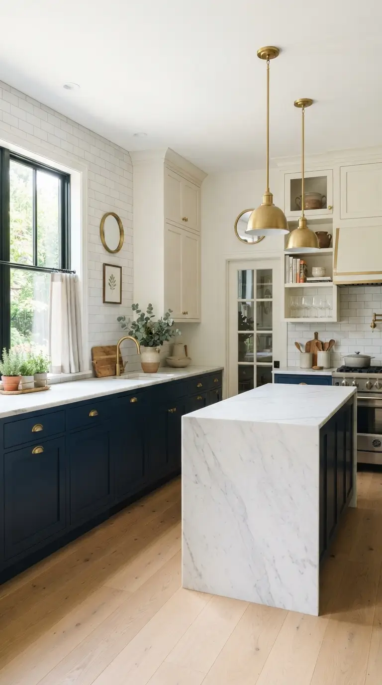
Picking a cabinet color is one of the biggest decisions in any kitchen remodel, and it is also one of the easiest to get wrong. The wrong shade can make a small kitchen feel darker or a bright kitchen feel cold. Designers run into this problem often, so they tend to return to a handful of colors that work in almost any kitchen, big or small, modern or traditional. In this list, you will find 18 kitchen cabinet colors that professional designers keep choosing for their clients, from soft neutrals to bold, moody shades. Each one comes with tips on where it works best, what finishes to pair with it, and what hardware or countertop choices bring it all together. Whether you are painting existing cabinets or picking new ones, this list will help you narrow down a color that feels right for your home and lasts for years, not just one season.
1. Classic Navy Blue
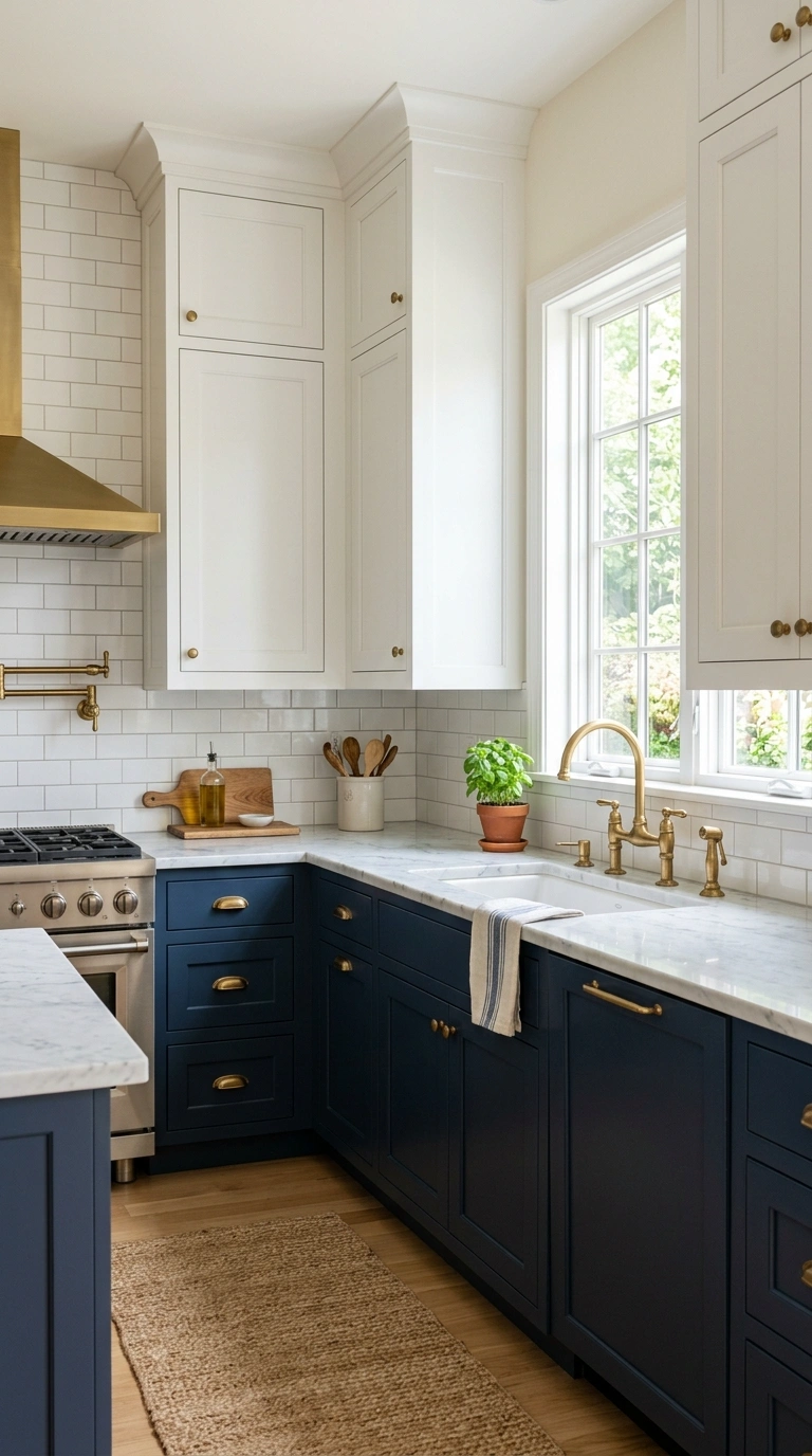
Navy blue cabinets bring a rich, grounded color into the kitchen without feeling as heavy or stark as full black. This shade works beautifully on lower cabinets paired with white or cream uppers, or across an entire kitchen when the room gets plenty of natural light. It reads as both classic and current, which is part of why designers keep coming back to it.
Pair navy with brass or gold hardware for a warm contrast, or with brushed nickel for a cooler, more modern feel. A white marble or quartz countertop keeps the look bright, while a butcher block top adds warmth. Navy also works well against a white subway tile backsplash, which lets the cabinet color stay the star of the room. This shade tends to hide daily fingerprints and smudges better than lighter colors, making it practical for busy kitchens.
2. Soft Sage Green
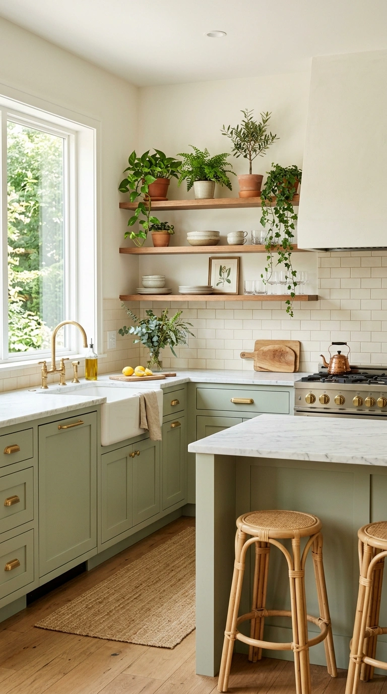
Sage green has become one of the most requested cabinet colors because it feels calm, natural, and easy to live with over time. Unlike brighter greens, sage leans gray and muted, which keeps it from feeling like a trend that will look dated in a few years. It works especially well in kitchens with lots of wood tones or natural light.
Pair sage cabinets with warm wood open shelving, unlacquered brass hardware, and a honed marble or soft white quartz countertop for a look that feels collected rather than matchy. This color also works nicely as an island color while keeping the surrounding cabinets a soft white, giving the room a subtle two-tone effect. Sage tends to look best in a matte or satin finish rather than high gloss, since the softer sheen matches its relaxed, natural feel.
3. Warm Charcoal Gray
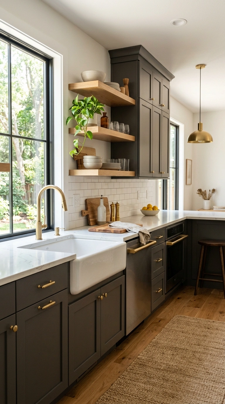
A warm charcoal gray gives a kitchen a moody, sophisticated look without going as dark or dramatic as true black. This shade works well on full kitchens in larger, brighter rooms, or as a lower cabinet color paired with a lighter upper cabinet in smaller kitchens that need to stay open and airy.
Pair charcoal with brushed brass or matte black hardware for a modern edge, and use a light colored countertop like white quartz or a pale marble to keep the contrast balanced. A wood floor with warm undertones helps prevent the space from feeling cold, since charcoal alone can lean a bit stark without warmer materials nearby. Open shelving in natural wood against charcoal cabinets is also a popular pairing, since it softens the color with texture and warmth.
4. Creamy White Cabinets
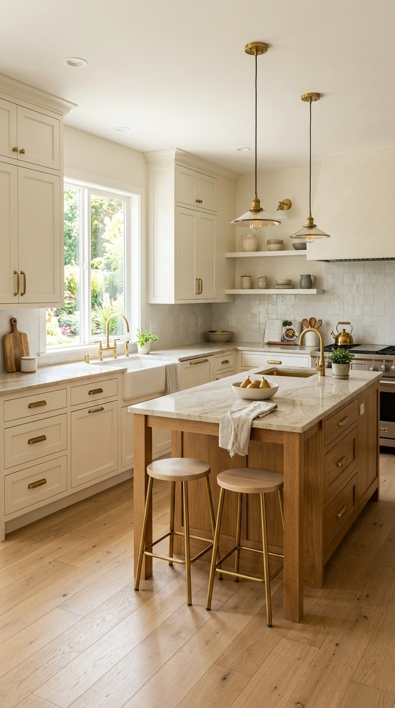
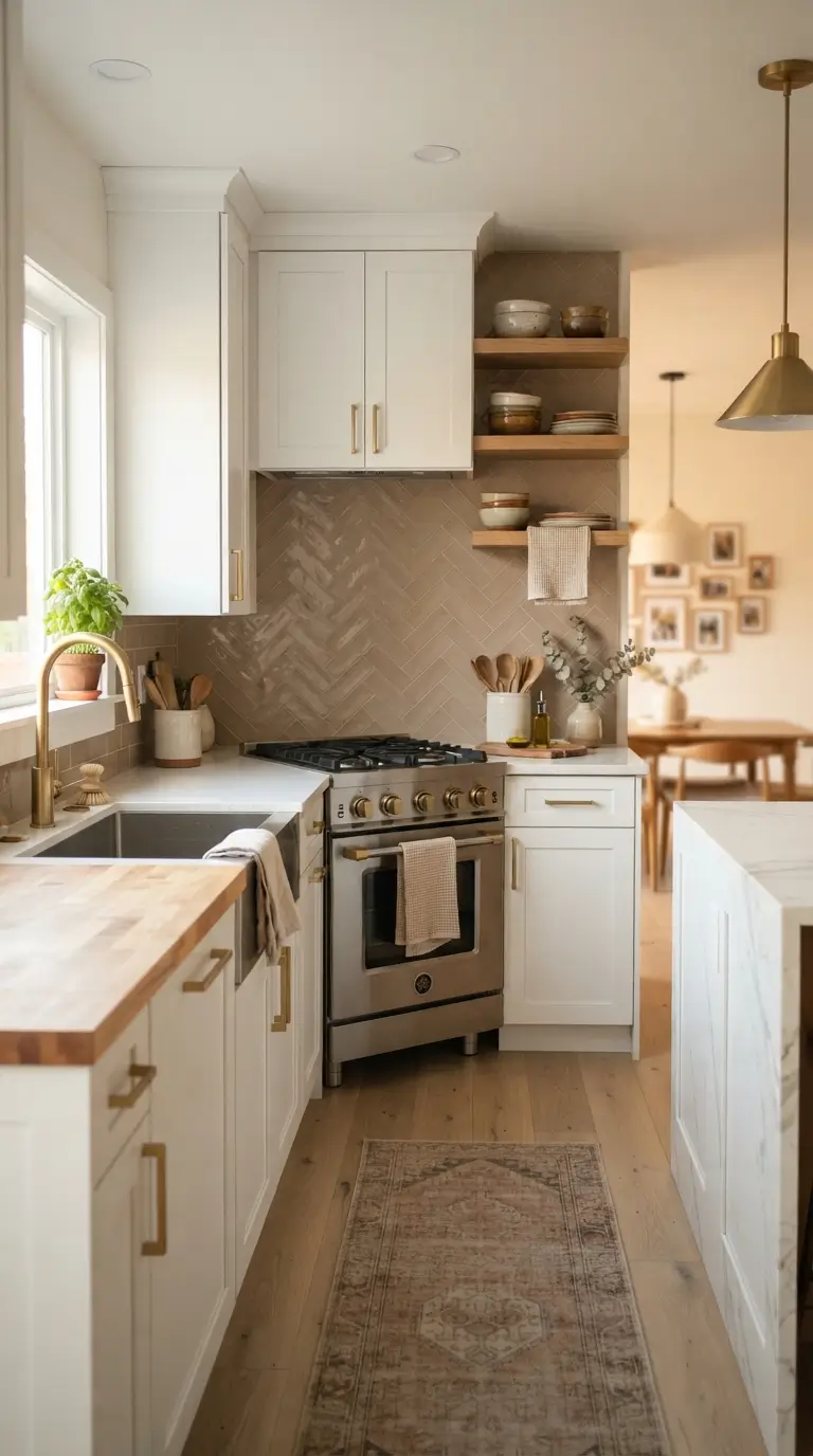
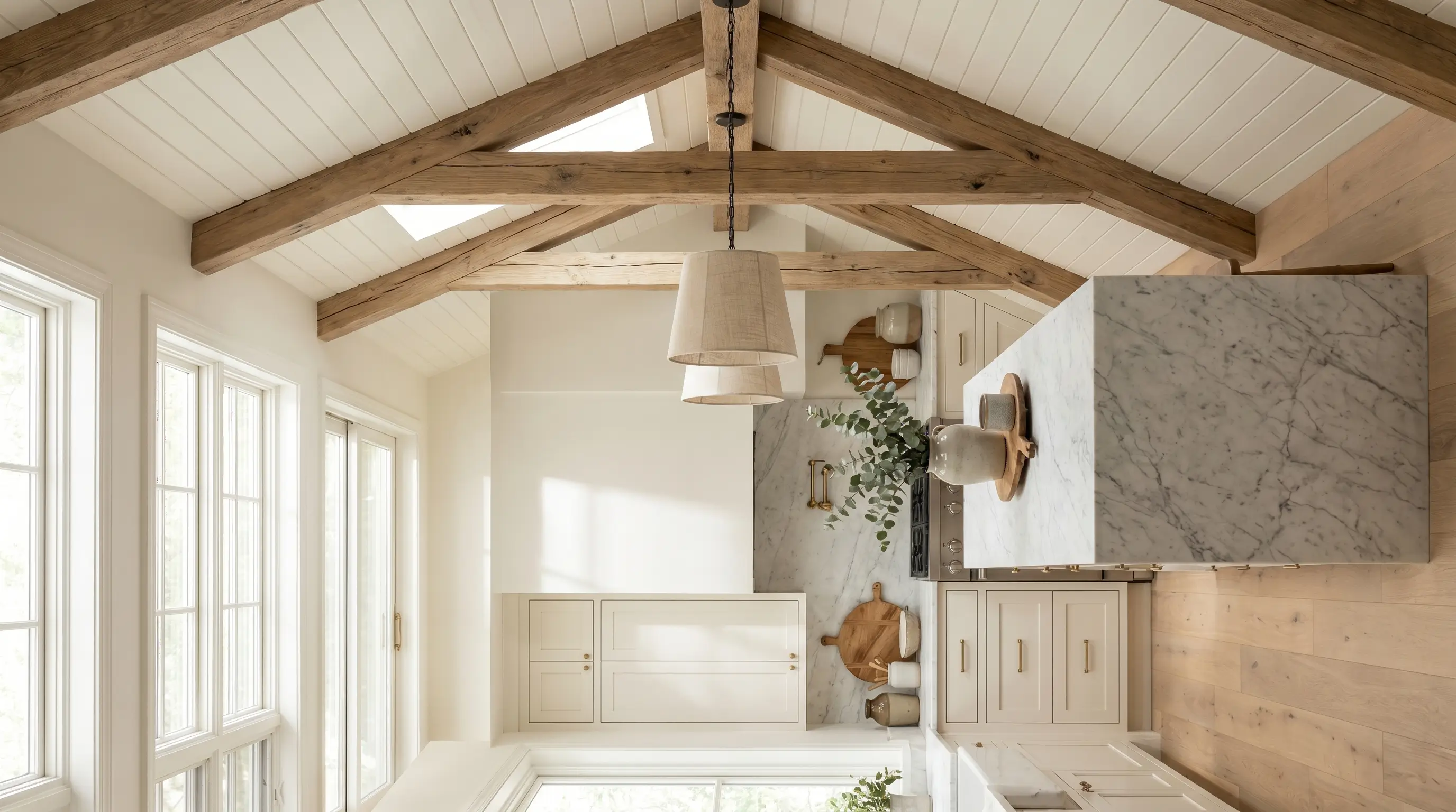
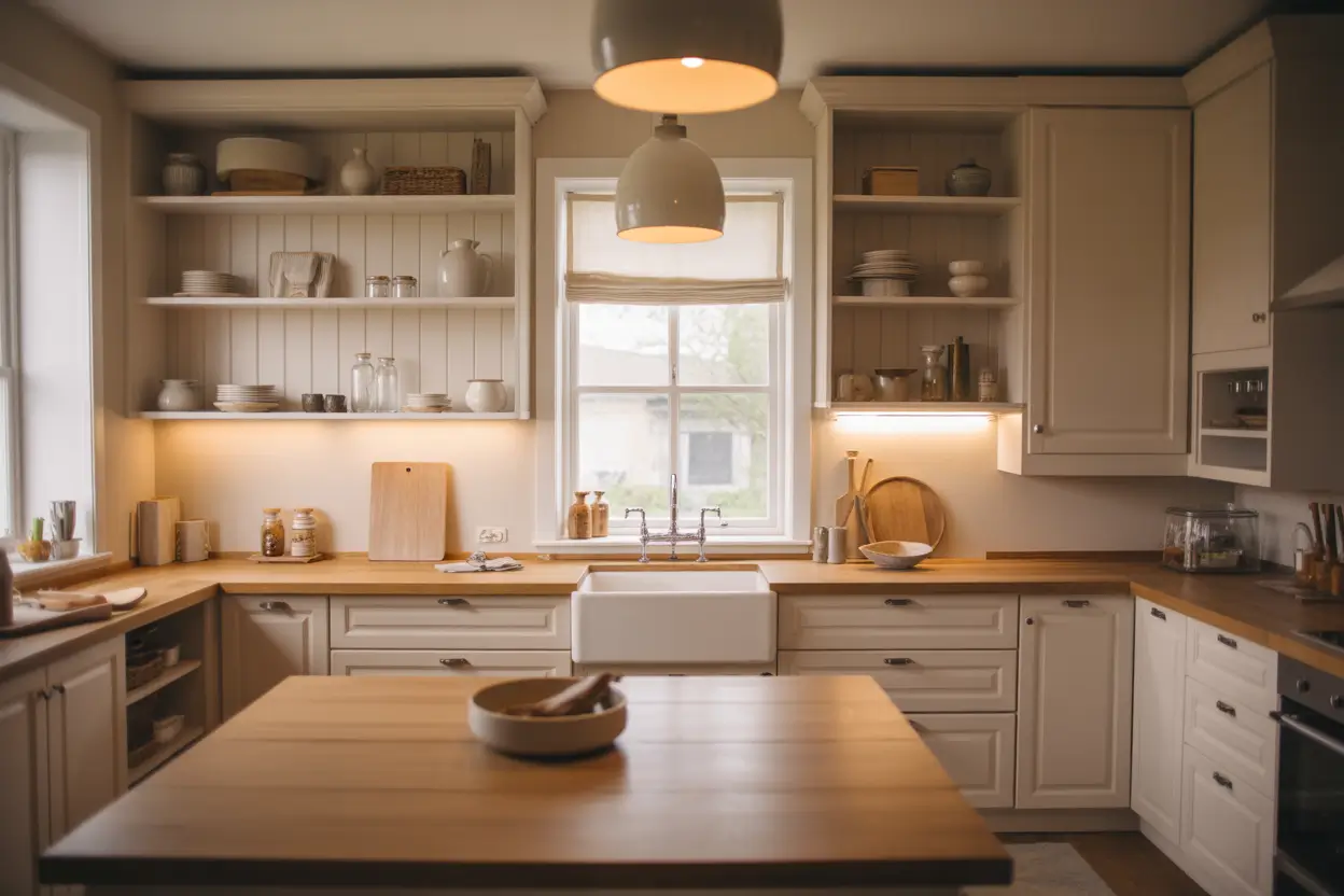
A soft, creamy white is one of the most timeless cabinet colors because it works with nearly every style, from farmhouse to modern minimalism. Unlike a stark, cool white, cream has a slight warmth to it that keeps a kitchen feeling cozy rather than clinical, which is especially helpful in kitchens with less natural light.
Pair cream cabinets with brass, gold, or aged bronze hardware to bring out the warmth in the paint, and choose a countertop with warm veining rather than a pure white slab so the whole kitchen feels cohesive. This color pairs beautifully with a wood island or wood open shelving, since the contrast between warm wood and creamy white feels welcoming rather than sterile. Cream also shows less daily wear than a bright white, making it a practical long term choice for busy households.
5. Two-Tone Black White
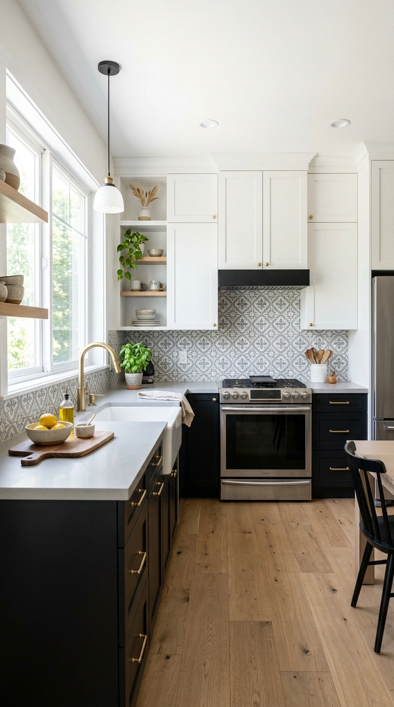
Pairing black lower cabinets with white upper cabinets creates a bold, graphic look that still feels balanced rather than overwhelming. The black grounds the kitchen visually, while the white keeps the upper half of the room feeling light and open, which works especially well in kitchens with tall ceilings or an open floor plan.
Choose a matte black finish for the lower cabinets to avoid too much shine, and pair the combination with brass or unlacquered brass hardware for warmth against the strong contrast. A white or light gray countertop ties the two tones together, while a patterned tile backsplash can add a bit of extra personality without competing with the cabinet colors. This combination photographs especially well thanks to its clear, confident contrast.
6. Rich Forest Green
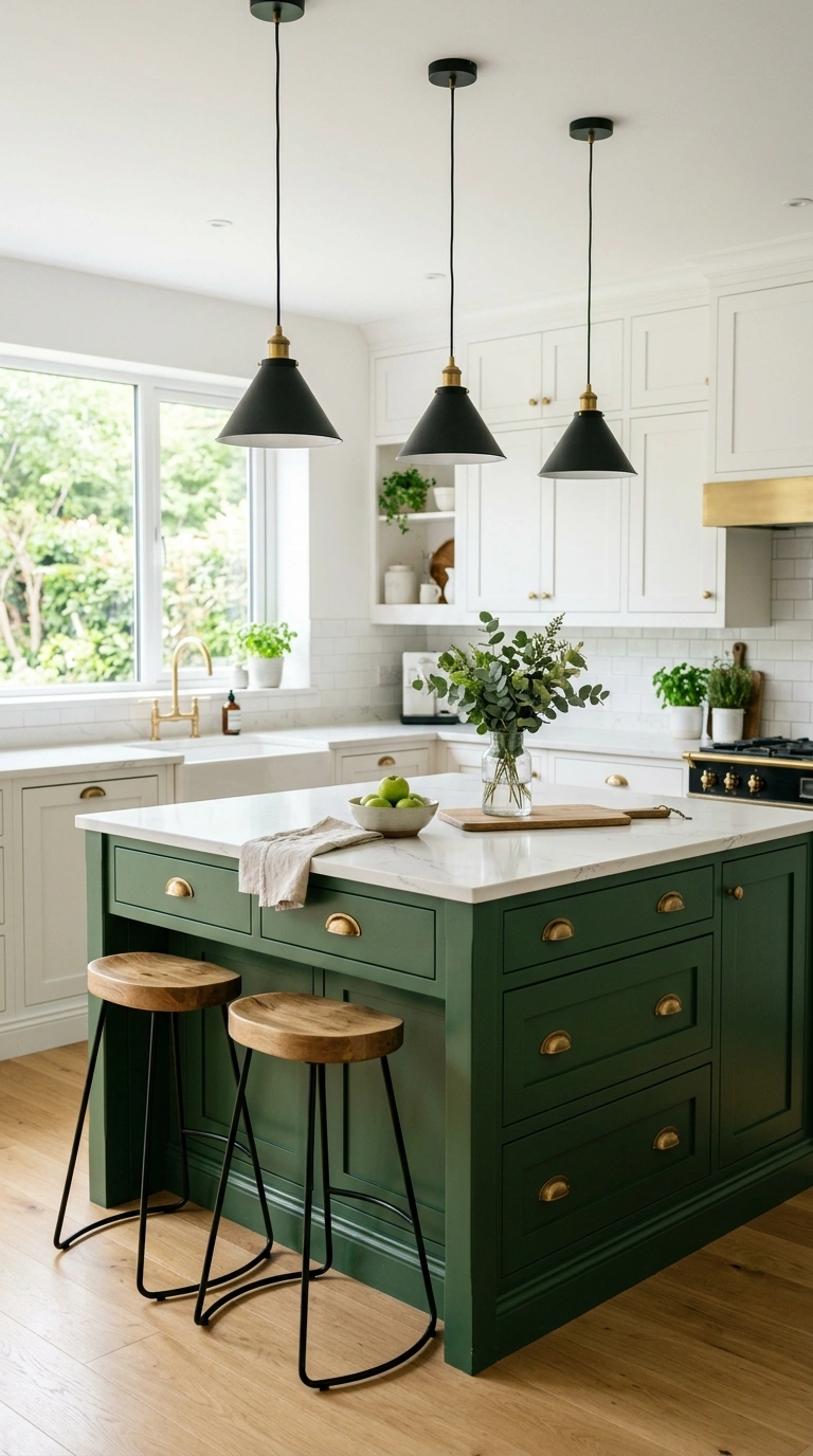
A deep forest green cabinet color brings a bold, nature inspired look into the kitchen that feels elegant rather than overwhelming when used thoughtfully. This shade works particularly well on a kitchen island, letting the surrounding cabinets stay a lighter neutral so the green becomes a clear focal point in the room.
Pair forest green with brass or matte gold hardware for a traditional, upscale feel, or with brushed nickel for something a little more understated. A white or cream quartz countertop keeps the look from feeling too dark, while wood floors and open shelving add warmth around the deep color. Forest green also pairs beautifully with black metal light fixtures, which echo the richness of the cabinet color from above.
7. Muted Terracotta Tone
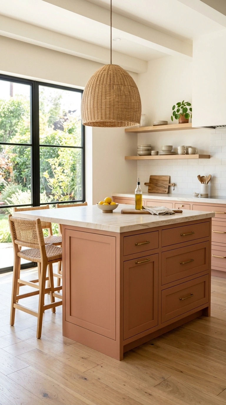
A soft, muted terracotta brings warmth and a slightly earthy feel into a kitchen, standing out from the usual blues and grays without feeling too bold or trendy. This color works especially well in kitchens with a lot of natural light, since the warm undertone glows nicely in sunlight throughout the day.
Pair terracotta cabinets with brass or aged bronze hardware, which naturally complements the warm base of the color, and choose a countertop in a warm white or cream stone rather than a stark white to keep the palette cohesive. Wood floors, woven light fixtures, and a few terra cotta pots on open shelves reinforce the earthy feel of this cabinet color. This shade tends to work best on lower cabinets or an island rather than a full kitchen, since a little goes a long way.
8. Soft Blush Pink
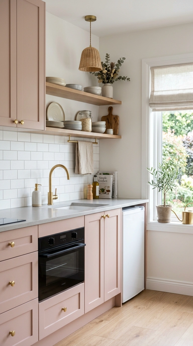
A soft, dusty blush pink gives a kitchen a gentle, welcoming feel without tipping into anything too sweet or overly feminine. This color works especially well when kept muted rather than bright, since a dustier pink reads as sophisticated and pairs easily with both warm and cool metals.
Pair blush cabinets with brass or rose gold hardware for a cohesive warm palette, or with brushed nickel for a softer contrast that feels more neutral overall. A white or light gray countertop keeps the kitchen from feeling too saturated, while a simple white subway tile backsplash lets the cabinet color remain the focal point. This shade often works best on an island or a small kitchenette rather than a full wall of cabinets, since it stays fresh rather than overwhelming.
9. Deep Emerald Green
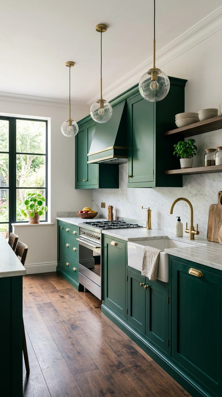
Emerald green cabinets bring a jewel toned richness to a kitchen that feels luxurious without needing much else in the room to stand out. This color works well in kitchens with brass fixtures and warm lighting, since the combination brings out the depth and shine of the green.
Pair emerald with brass or gold hardware and a light stone countertop, such as a soft white marble or quartz with subtle veining, to balance the intensity of the cabinet color. A dark wood floor can also work beautifully here, adding warmth underneath the cool tone of the green above. This shade tends to photograph especially well in kitchens with pendant lighting, since the warm glow highlights the color’s natural depth and shine.
10. Warm Olive Green
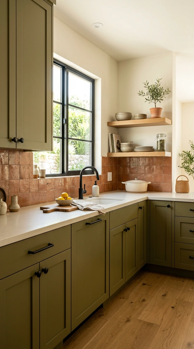
Olive green cabinets bring an earthy, grounded feel to a kitchen that sits somewhere between a classic green and a warm neutral. This color has become popular because it pairs easily with both wood tones and black metal accents, making it flexible across several kitchen styles.
Pair olive cabinets with black or brass hardware, and choose a warm white or cream countertop rather than a stark white for the best contrast. A tile backsplash in a cream or terra cotta tone continues the earthy palette, while open wood shelving adds texture next to the solid cabinet color. Olive works well as a full kitchen color or as an island accent, giving homeowners flexibility depending on how bold they want the final look to feel.
11. Classic Black Cabinets
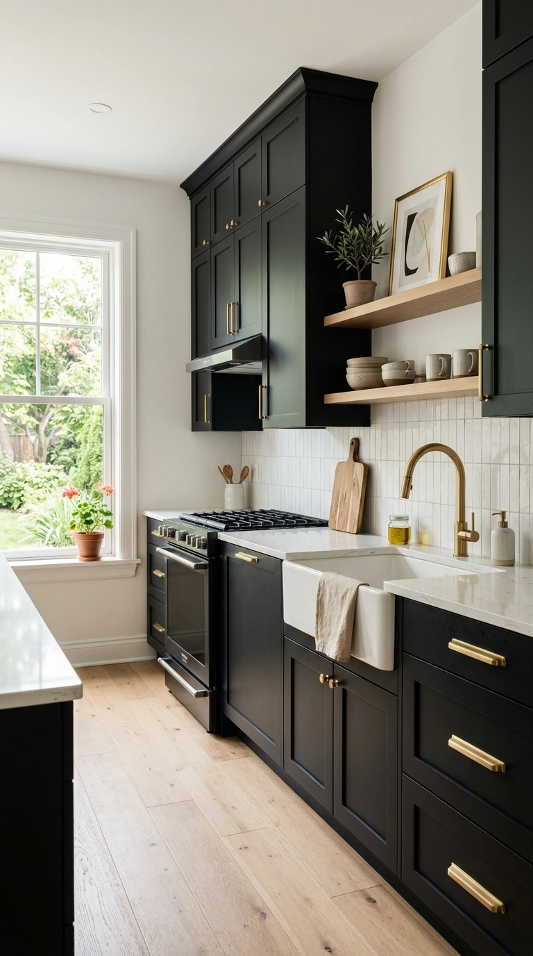
Full black cabinets create a dramatic, high contrast look that works surprisingly well in kitchens with good natural light and enough open space to keep the room from feeling too dark. This color choice tends to make a kitchen feel more like a designed statement piece rather than just a functional space.
Pair black cabinets with brass or unlacquered brass hardware for warmth, and use a light quartz or marble countertop to balance the depth of the cabinet color. White walls, light wood floors, and a large window all help keep a black kitchen from feeling closed in. This color hides fingerprints and daily wear exceptionally well, which makes it a popular, practical choice for busy family kitchens despite its bold appearance.
12. Soft Greige Tone
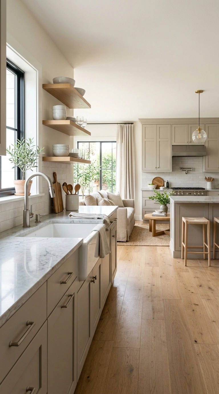
Greige, a blend of gray and beige, is one of the most versatile cabinet colors because it shifts slightly depending on the light in the room, reading warmer in some spaces and cooler in others. This makes it an easy choice for kitchens that get light from multiple directions throughout the day.
Pair greige cabinets with brushed nickel or matte black hardware, both of which work well against its neutral base, and choose a countertop with soft gray or beige veining to tie the palette together. This color pairs nicely with both warm wood floors and cooler tile floors, which is part of why it remains such a flexible, long lasting choice. Greige also works well in open concept homes, since it transitions smoothly into adjoining living spaces.
13. Buttery Yellow Cabinets
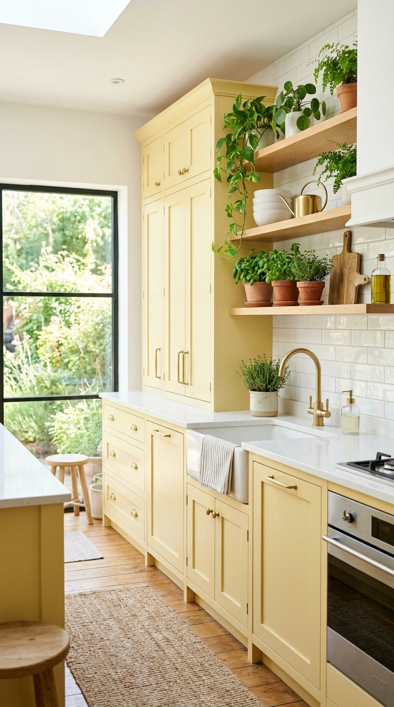
A soft, buttery yellow brings a cheerful, sunny feel to a kitchen without being as bold as a bright, saturated yellow. This color works especially well in kitchens that do not get a ton of natural light, since the warm tone helps brighten the space throughout the day.
Pair buttery yellow with brass or aged brass hardware to keep the warm tones consistent, and choose a white or cream countertop so the yellow stays the focal point of the room. A simple white tile backsplash keeps the palette from feeling too busy, while a few green plants on open shelving add a fresh, natural contrast. This shade tends to work best on a full kitchen in smaller spaces or as an island color in larger ones.
14. Dusty Blue Gray
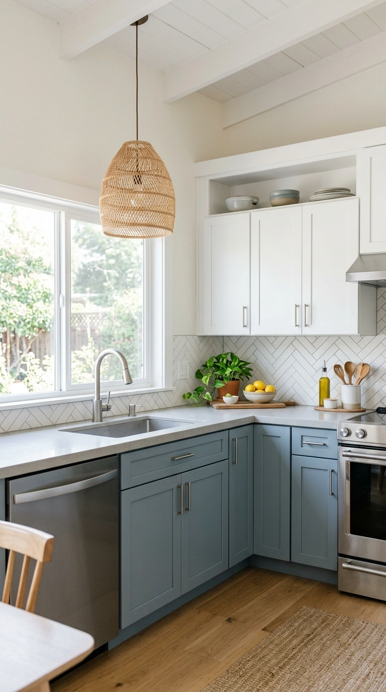
A dusty, muted blue gray offers a softer alternative to navy while still bringing color into the kitchen beyond a plain neutral. This shade feels calm and collected, working well in both farmhouse style kitchens and more modern spaces with clean, simple lines.
Pair dusty blue cabinets with brushed nickel or matte black hardware, and choose a white or light gray countertop to keep the overall palette feeling airy. This color pairs especially well with woven light fixtures and natural wood accents, which add warmth against the cooler cabinet tone. Dusty blue gray also works nicely as a two tone kitchen color, paired with white uppers for a soft, layered look.
15. Two-Tone Navy Wood
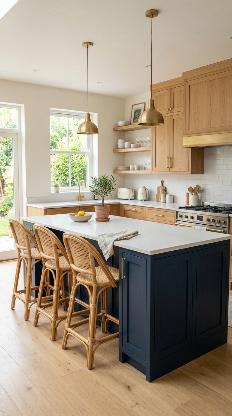
Combining navy blue cabinets with natural wood cabinetry creates a rich, layered look that feels both current and timeless. Typically the navy is used on the lower cabinets or the island, while wood tone cabinets or open shelving fill in the rest of the kitchen, creating a balanced mix of color and natural texture.
Pair this combination with brass or matte black hardware, and a white or light stone countertop to keep the palette from feeling too dark overall. A woven pendant light or rattan bar stools tie the wood tones together nicely, while a simple white backsplash keeps the eye moving smoothly between the two cabinet colors. This pairing works especially well in kitchens that already have wood floors, since it ties the whole room together.
16. Warm Taupe Cabinets
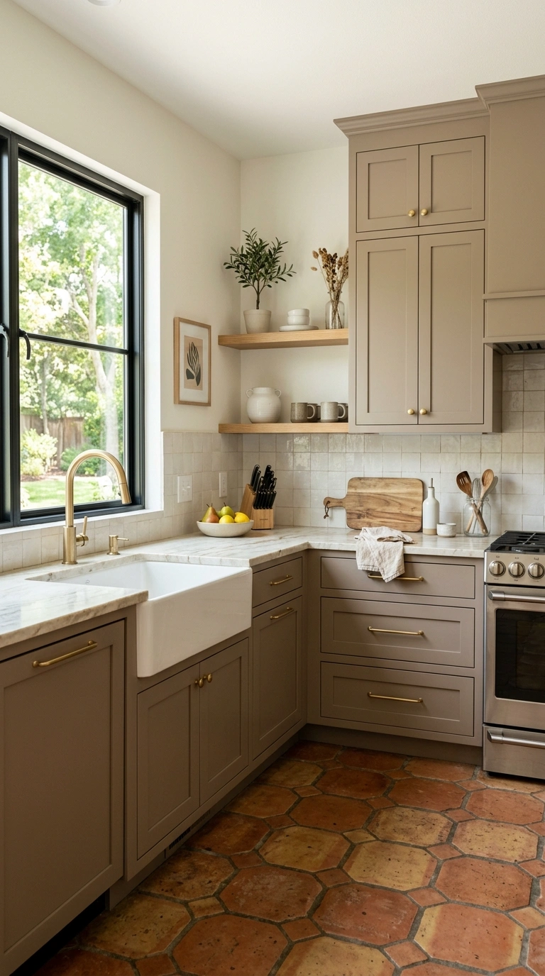
Taupe cabinets offer a warm, earthy neutral that feels more interesting than a plain beige while still working easily with almost any kitchen style. This color sits comfortably between brown and gray, which makes it flexible for kitchens with either warm or cool undertones elsewhere in the room.
Pair taupe cabinets with brushed brass or bronze hardware, and choose a countertop with warm gray or cream veining to complement the cabinet tone. This color works particularly well with terra cotta tile floors or warm wood flooring, since both bring out the earthy quality of the paint. Taupe also photographs beautifully in natural light, which is part of why it remains a steady favorite among kitchen designers.
17. Matte Black Island
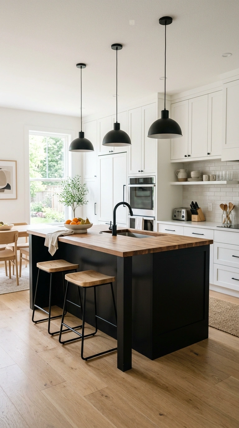
Rather than painting an entire kitchen black, many designers choose to paint just the island in a deep matte black, letting the surrounding cabinets stay a lighter neutral like white or cream. This creates a striking focal point in the center of the room without making the whole kitchen feel dark.
Pair the black island with brass or gold hardware and a warm wood or butcher block countertop on top for contrast against the surrounding lighter cabinets. Black pendant lights hung above the island echo the cabinet color from overhead, tying the whole look together. This approach is especially popular in kitchens with an open floor plan, since it adds drama without overwhelming an already spacious room.
18. Soft Clay Pink
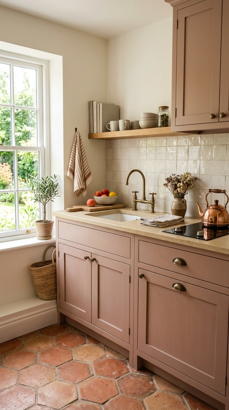
A muted clay pink, warmer and more earthy than a typical blush, brings a subtle but distinctive color into the kitchen that still feels grounded and mature rather than playful. This shade works especially well on an island or a smaller kitchenette, where its warmth can shine without covering the entire room.
Pair clay pink with brass or aged bronze hardware, and choose a warm white or cream countertop rather than a stark white to keep the palette cohesive. A terra cotta tile floor or warm wood flooring underneath reinforces the earthy undertones of the paint color. This shade tends to age well over time, since its muted, dusty quality keeps it from feeling like a passing trend.
Choosing a cabinet color does not have to be stressful. Pick two or three shades from this list that match your kitchen’s light and style, then test them with real paint samples before committing. The right color will make your kitchen feel finished, warm, and truly yours.