23 Bedroom Color Combinations Designers Are Loving
Picking one good bedroom color is easy. Pairing two or three colors so they actually work together, at the right proportions, is where most bedrooms either come together or fall apart. This guide covers 23 real bedroom color combinations, and each one includes something practical: an exact ratio, an undertone comparison, a metal or wood pairing suggestion, or an honest “works well if / skip if” breakdown, so you’re choosing a palette with a plan instead of guessing from a paint chip wall. Pick one combination that matches your room’s natural light and your comfort with contrast, and use its ratio as a starting point.
1. Navy Blue and Warm White
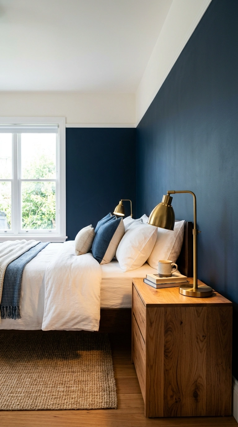
Navy and warm white is one of the most reliably classic bedroom pairings, reading as crisp and put-together without needing any other color to make it feel finished.
A simple ratio:
- 60% warm white (walls, ceiling)
- 30% navy (bedding, an accent wall, or curtains)
- 10% warm wood or brass accents (frames, a lamp base)
Pairing navy with warm white, rather than a stark, cool-toned white, keeps the combination from feeling cold or nautical-themed by default.
2. Sage Green and Cream
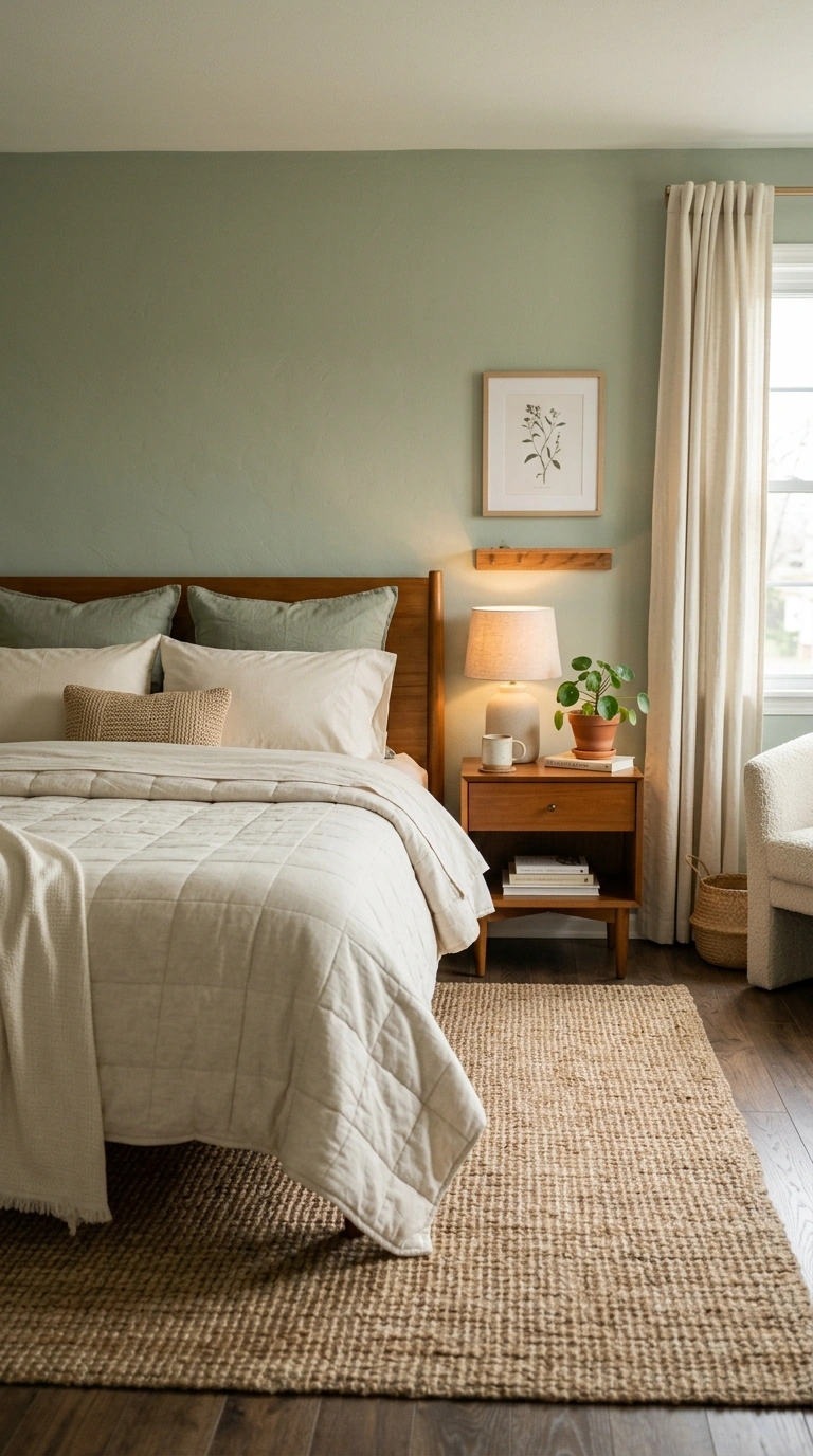
Sage green and cream read as soft and natural together, since both colors sit in a similarly muted, low-saturation range that never fights for attention.
This combination works especially well with warm wood furniture and natural fiber textiles like jute or linen, since the muted palette lets material texture do more of the visual work than bold color contrast.
Best paired with: brushed brass or warm bronze hardware, which adds richness without disrupting the soft, quiet mood.
3. Terracotta and Charcoal
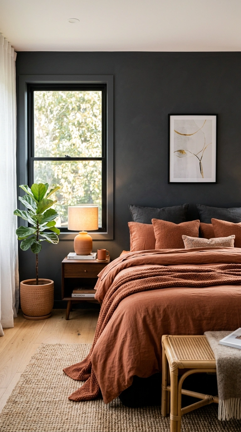
Terracotta and charcoal create a warm-meets-moody combination that reads as bold and editorial, but like other high-contrast dark pairings, it depends heavily on your room’s natural light.
Works well if:
- Your bedroom gets strong natural light during the day to offset the darker charcoal
- You want one dominant color (typically charcoal on a larger surface) with terracotta as the accent
Skip it if: your bedroom is small and naturally dim, since the combined depth of both colors can feel heavy rather than warm in low light.
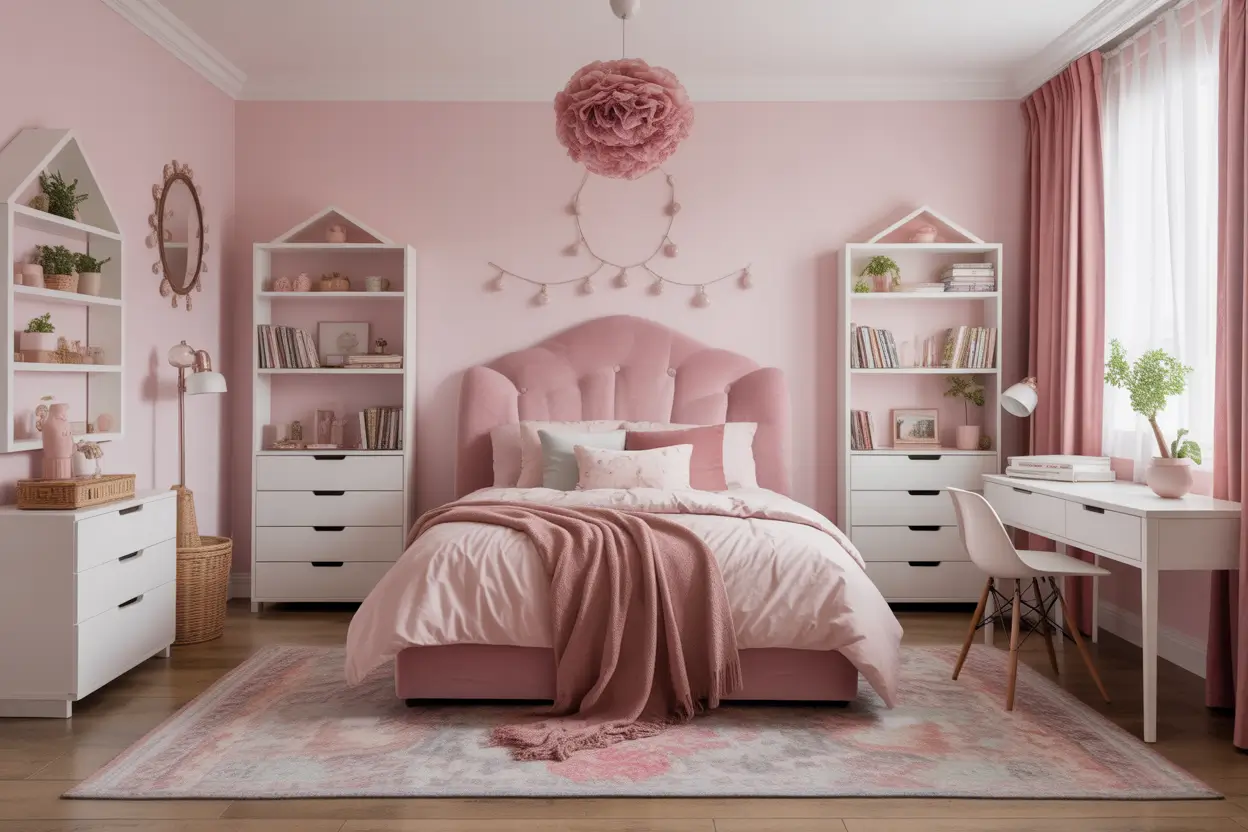
4. Blush Pink and Warm Gray
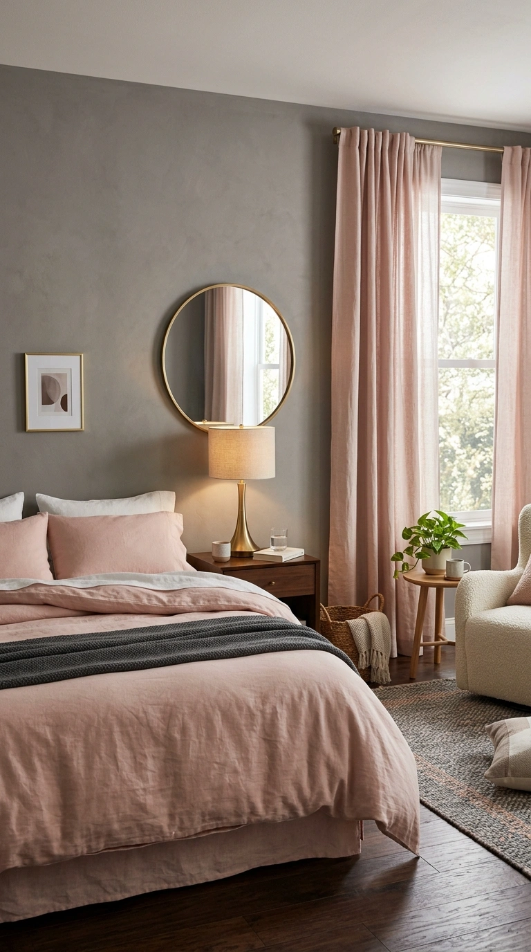
Blush pink and warm gray together read as soft but genuinely sophisticated, avoiding the overly sweet quality that pink alone can sometimes carry in a bedroom.
A simple ratio:
- 50% warm gray (walls or bedding)
- 40% blush pink (an accent wall, curtains, or a headboard)
- 10% warm metal accents (brass or rose gold hardware)
The warm gray does most of the work here, grounding the blush pink so it reads as adult and considered rather than overly pastel.
5. Olive Green and Rust
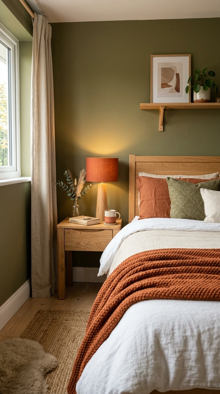
Olive green and rust bring an earthy, grounded feel that leans heavily into a nature-inspired palette, working especially well with natural materials like wood, jute, and linen.
A common mistake: using olive and rust in equal amounts, which can start to feel muddy rather than layered. Let one color, usually olive as a wall color, dominate, with rust appearing only in smaller accents like a throw or a lamp shade.
6. Chocolate Brown and Powder Blue
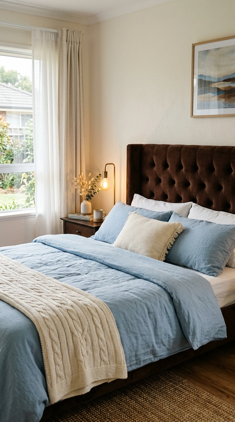
Chocolate brown and powder blue is an unexpected pairing that works because the warmth of the brown balances the coolness of the blue, creating genuine visual interest without feeling jarring.
| Element | Color |
|---|---|
| Walls or headboard | Chocolate brown |
| Bedding or curtains | Powder blue |
| Small accents | Cream or warm white |
This combination reads as more current and less predictable than most single-tone neutral bedrooms, while still feeling calm rather than busy.
7. Mustard Yellow and Charcoal
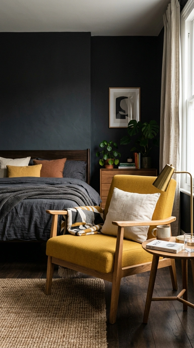
Mustard yellow and charcoal create a bold, graphic combination, but mustard is a color that needs real restraint to avoid overwhelming a room.
A simple ratio:
- 70% charcoal (walls, larger furniture)
- 20% mustard (an accent pillow, a chair, or artwork)
- 10% warm wood tone (to soften the combination)
Using mustard at anything beyond a genuine accent-level percentage tends to push the room toward feeling more like a rental car interior than a considered bedroom palette.
8. Burgundy and Blush
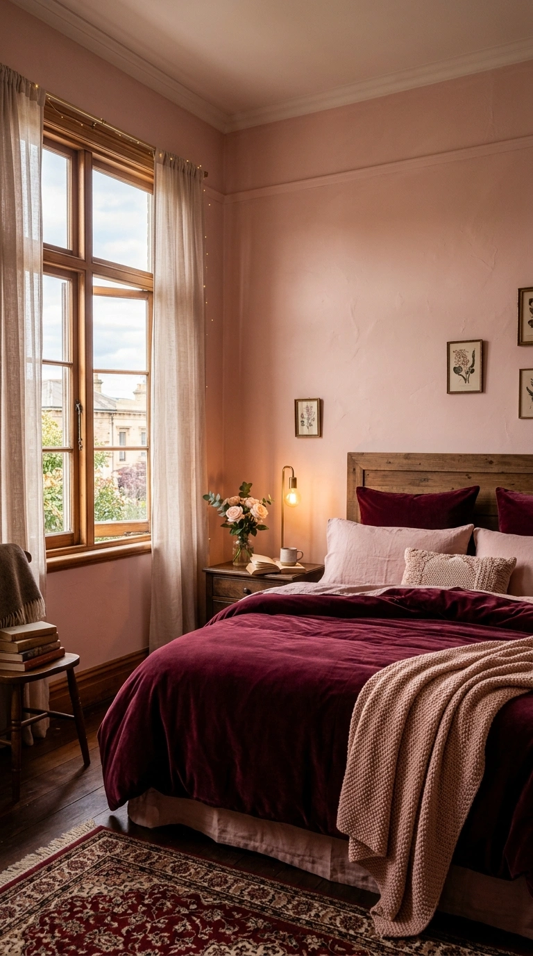
Burgundy and blush pair a deep, romantic wine tone with a much softer pink, creating drama without going fully dark and moody.
Works well if: you want a genuinely romantic, jewel-toned bedroom and have decent natural light to keep the burgundy from reading as too heavy.
Skip it if: your bedroom is very small and already dim, since this combination’s overall depth works better in a room with some breathing room.
9. Forest Green and Cream
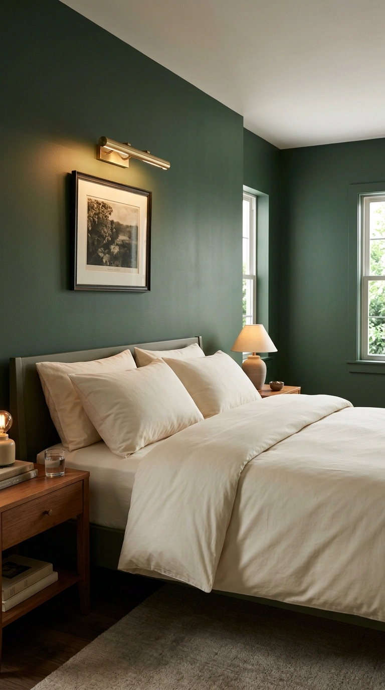
Forest green and cream read as classic and grounding, a combination that has stayed reliably popular because the deep green pairs so naturally with both warm and cool metal accents.
| Metal Accent | Effect |
|---|---|
| Brass or gold | Warmer, more traditional feel |
| Black or bronze | More modern, slightly more dramatic feel |
Either metal choice works well with this combination, which makes it one of the more flexible pairings on this list depending on the rest of your furniture.
10. Dusty Blue and Terracotta
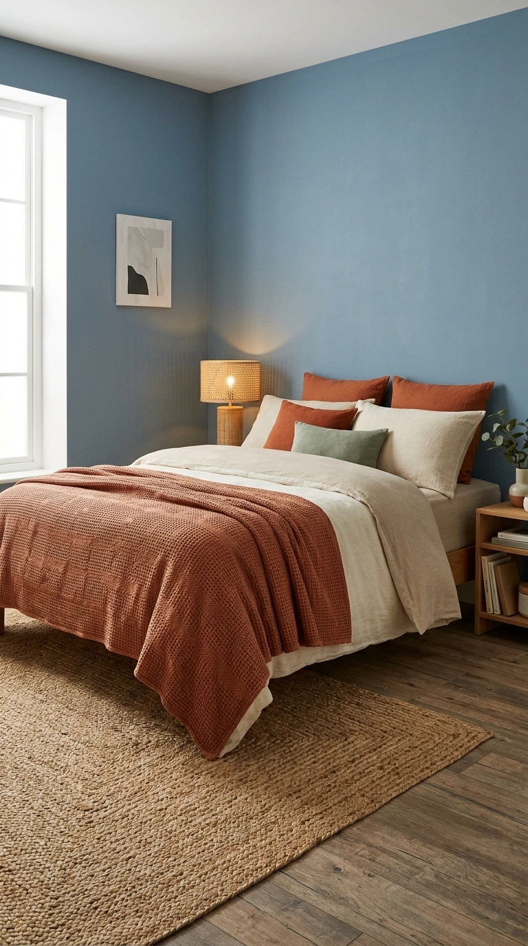
Dusty blue and terracotta balance a cooler, muted blue with a warm clay tone, creating a combination that leans slightly Southwestern or desert-inspired without being overtly themed.
A simple ratio:
- 55% dusty blue (walls or bedding)
- 35% terracotta (an accent wall, throw, or rug)
- 10% warm wood or woven natural textures
This pairing works particularly well with natural fiber rugs and woven baskets, since the combination already leans toward an earthy, textural feel.
11. Black and Warm Wood Tones
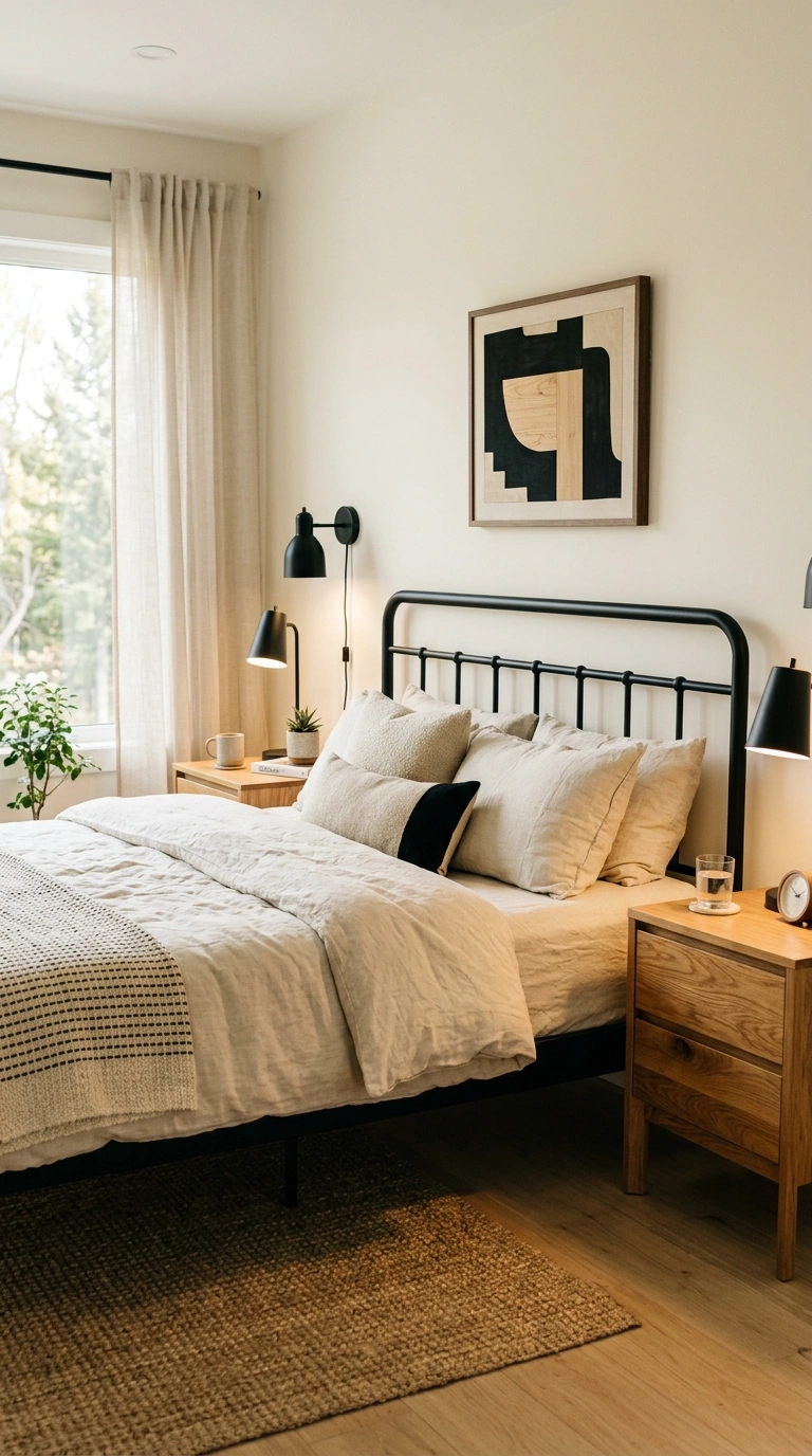
Black paired with warm wood tones, rather than black paired with white, creates a modern but still warm bedroom palette, avoiding the starker, more clinical feel of a pure black-and-white room.
Do:
- Use black in smaller doses: a bed frame, curtain rods, or lamp bases
- Pair with honey oak or warm walnut furniture
- Add a cream or ivory bedding layer to keep the room from feeling too dark overall
Don’t:
- Use black on more than one or two large surfaces (walls plus bedding plus furniture) without a lighter layer to balance it
- Pair black with cool-toned gray wood, which can push the room toward feeling cold rather than warm
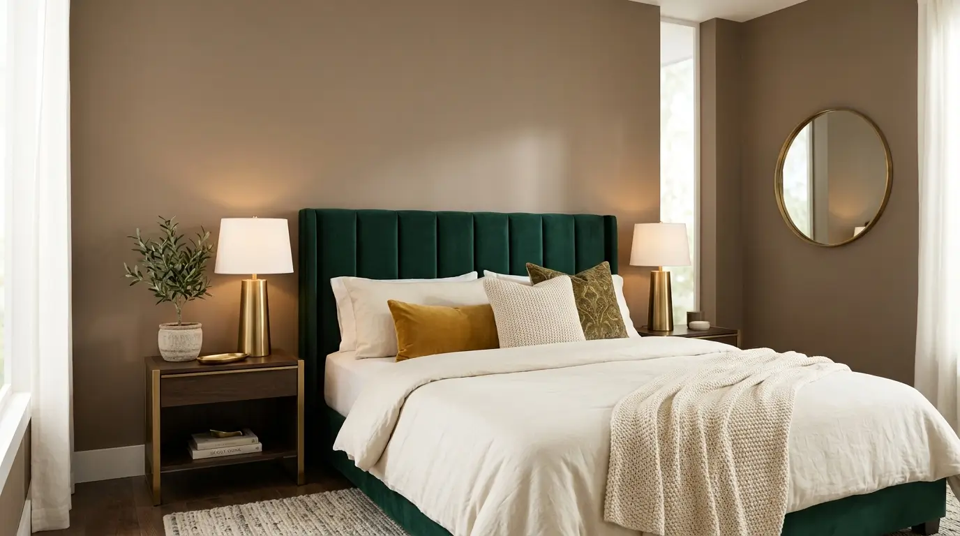
12. Warm Taupe and Emerald
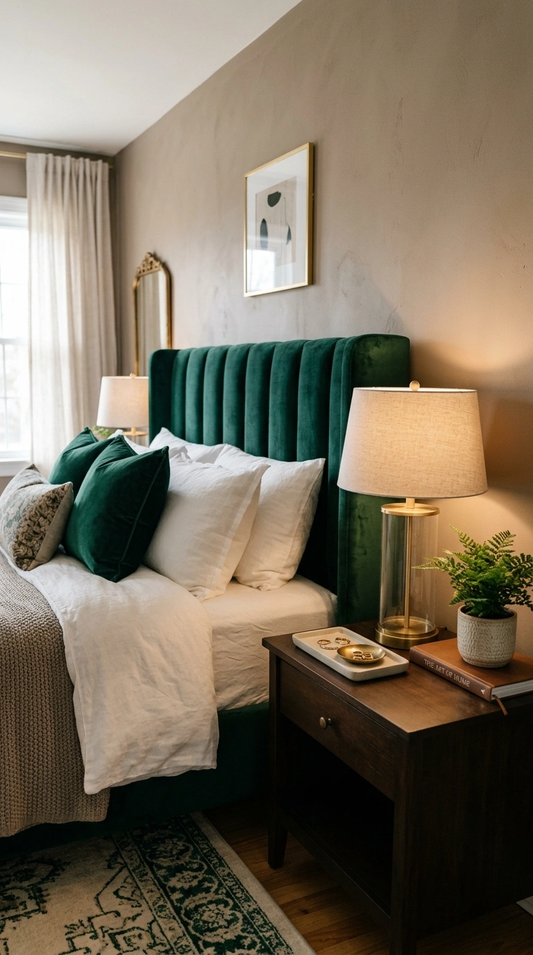
Warm taupe as a base, with emerald green as an accent, creates an elegant, rich combination that reads as more editorial than a typical neutral bedroom.
Best paired with: brass or aged brass accents, which bridge the warmth of the taupe and the richness of the emerald more naturally than cooler metals like chrome.
Keep emerald to smaller doses, like a velvet headboard or accent pillows, letting warm taupe carry the majority of the room’s visual weight.
13. Camel and Cream
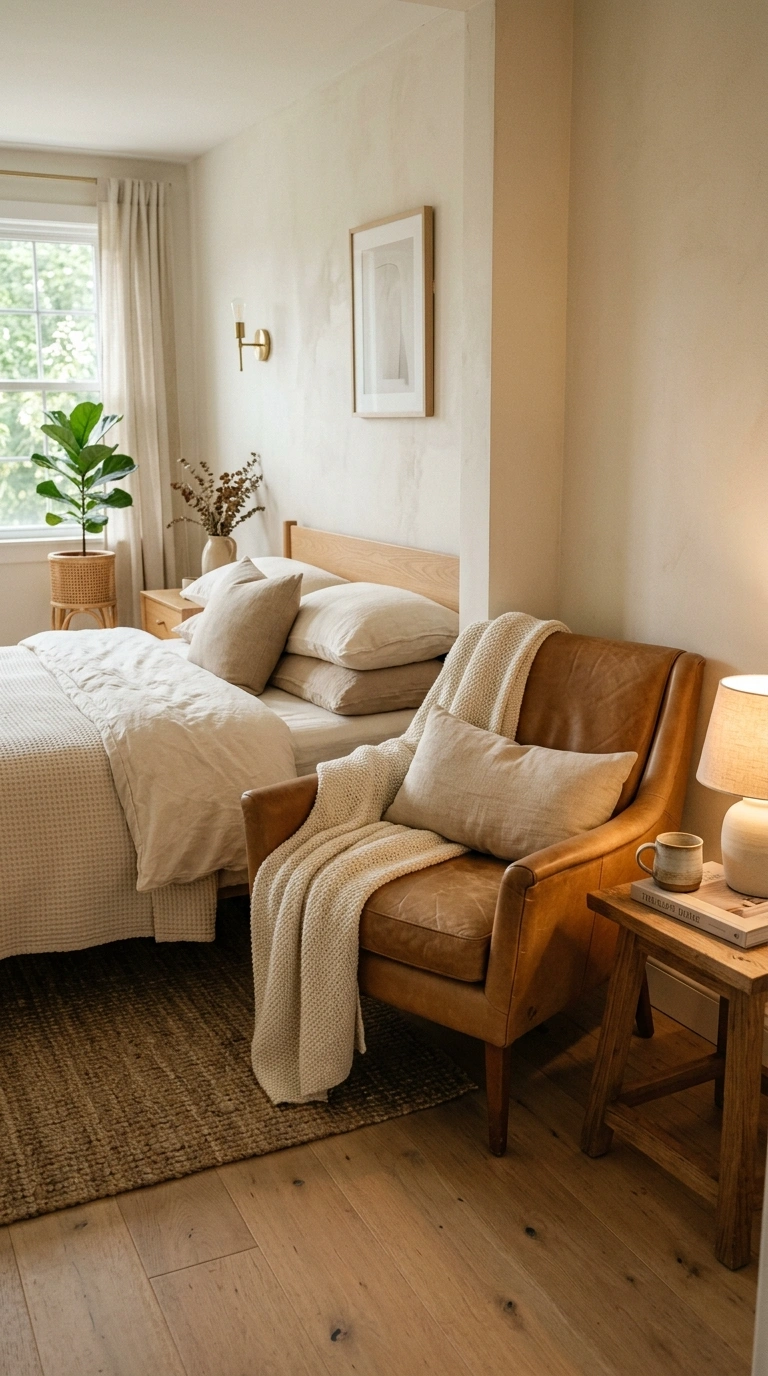
Camel and cream together create a warm, quiet-luxury feel, leaning on tonal harmony rather than contrast, similar in spirit to the tonal layering approach used in many neutral bedrooms.
| Depth | Where to Use It |
|---|---|
| Cream (lightest) | Walls and ceiling |
| Camel (mid-tone) | Bedding, curtains, or a leather accent chair |
| Deeper brown (darkest, used sparingly) | Small accents only |
This combination photographs as understated but reads as genuinely elevated in person, largely because of the tonal depth rather than any single standout color.
14. Slate Gray and Warm Ochre
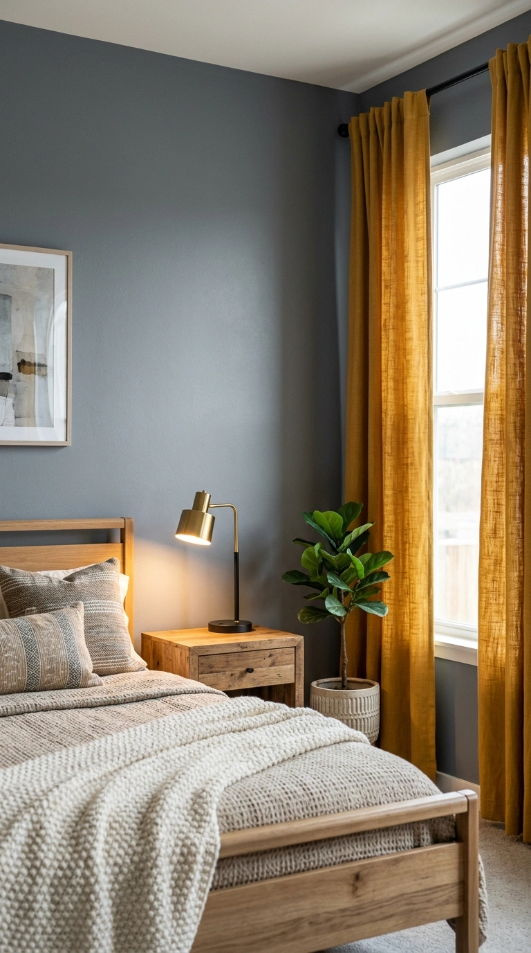
Slate gray and warm ochre pair a cooler gray base with a warm, golden-toned accent, creating a modern-rustic feel that avoids the coldness a gray-only room can sometimes have.
Undertone testing tip: since slate gray can lean either blue or green depending on the specific paint, test your chosen shade next to your ochre accent fabric or paint sample before committing, since some slate grays clash with warmer ochre tones more than others.
15. Plum and Sage
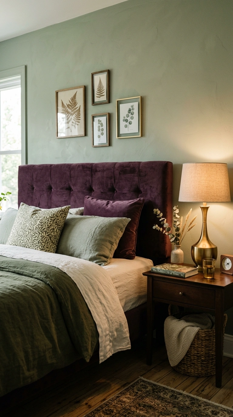
Plum and sage combine a deep, moody purple-red with a soft, muted green, creating a botanical-leaning but genuinely dramatic combination.
A simple ratio:
- 65% sage green (walls, main bedding tone)
- 25% plum (an accent wall, headboard, or curtains)
- 10% warm brass or gold accents
This combination works particularly well in bedrooms with layered greenery or botanical artwork, since both colors already lean toward a garden-inspired mood.
16. Warm Gray and Rust
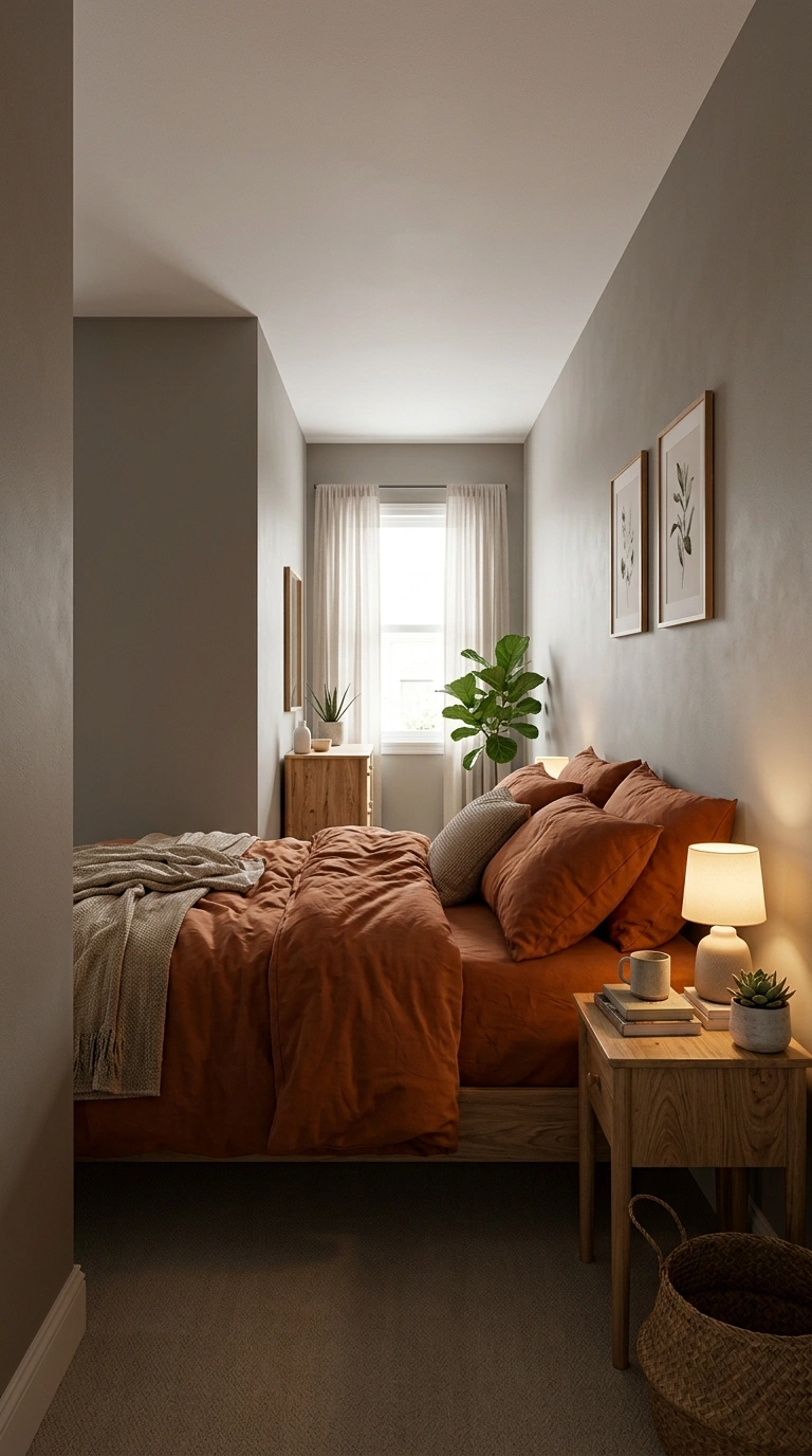
Warm gray and rust create a balanced, calm combination that works in almost any bedroom style, from modern to traditional, since neither color pushes too far in either direction.
A common mistake: choosing a cool-toned gray instead of a warm one for this pairing. Cool gray fights against rust’s warmth, while warm gray (with a beige or taupe undertone) supports it, making the whole combination feel more cohesive.
17. Ivory and Chocolate Brown
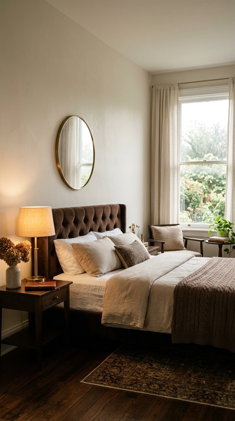
Ivory and chocolate brown create a warm, classic combination reminiscent of a well-designed hotel room, relying on contrast between light and dark rather than any bold accent color.
| Element | Color | Approx. Ratio |
|---|---|---|
| Walls, ceiling | Ivory | 55% |
| Bedding, headboard, or furniture | Chocolate brown | 35% |
| Small accents | Warm brass or gold | 10% |
This is one of the most universally flattering combinations on this list, working in bedrooms of nearly any size, light level, or existing furniture style.
18. Soft Pink and Sage Green
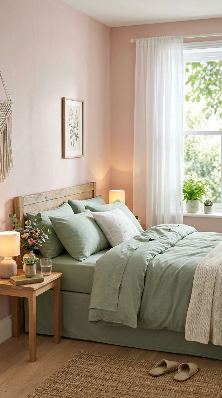
Soft pink and sage green together create a fresh, garden-inspired combination, softer and less bold than pairings like burgundy and blush, and well-suited to bright, airy bedrooms.
Works well if: your room already gets good natural light, since this combination leans light and airy rather than moody, and can feel washed out in a consistently dim room.
Best paired with: natural wood tones and light, woven textiles, which support the garden-inspired feel without introducing heavier materials like dark leather or black metal.
19. Charcoal and Warm Terracotta
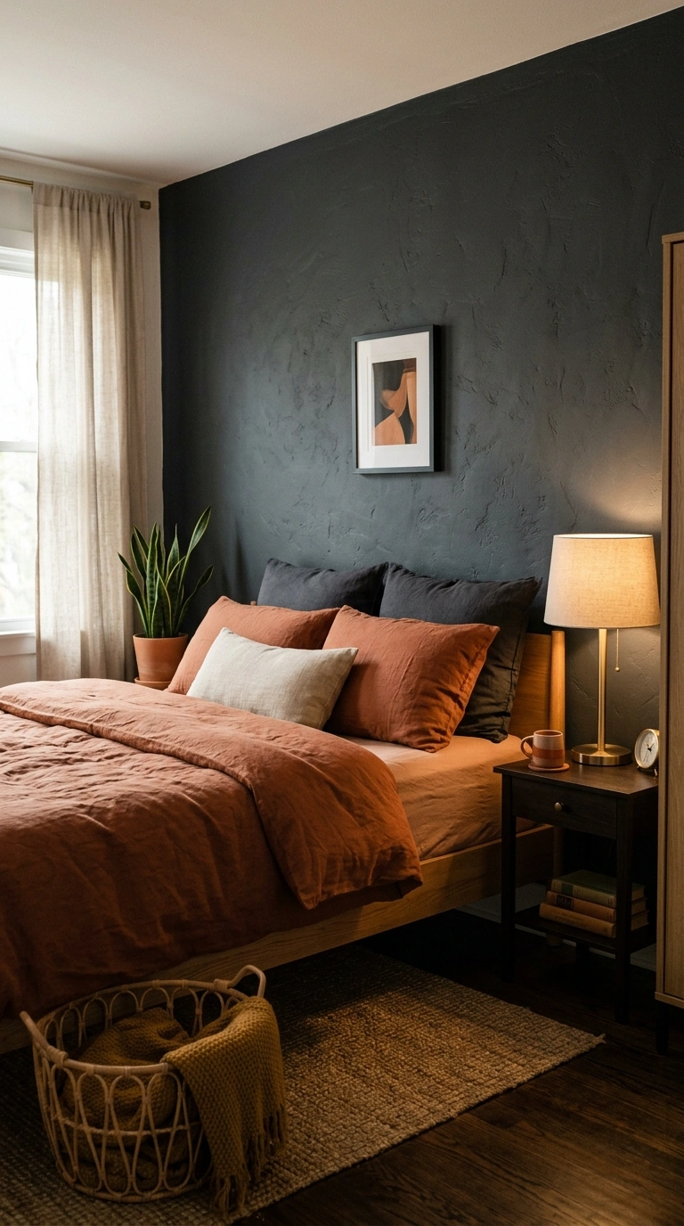
Charcoal and warm terracotta create a bold, grounded combination for people who want real contrast without going as bright as mustard or as soft as blush.
| Metal Accent | Effect |
|---|---|
| Brass or gold | Warms up the charcoal, ties the whole palette together |
| Black or matte bronze | Keeps the look more monochromatic and moody |
Choose based on whether you want the room to feel warmer (brass) or moodier and more uniform (black or bronze), since both work but create noticeably different final effects.
20. Navy and Blush Pink
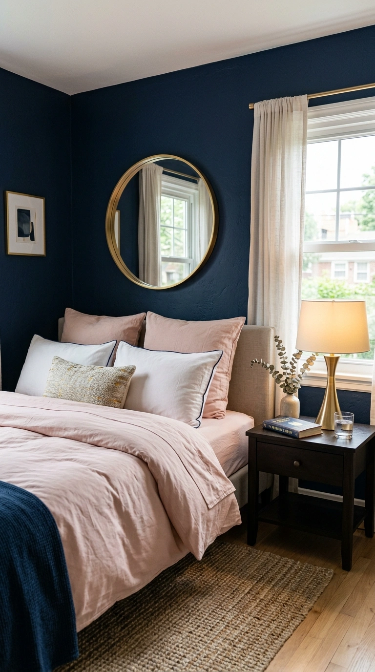
Navy and blush pink is a genuinely unexpected but increasingly popular pairing, working because the darkness of navy grounds the softness of blush rather than clashing with it.
A simple ratio:
- 60% navy (walls or a large upholstered piece)
- 30% blush (bedding, curtains, or a bench)
- 10% warm gold or brass accents
This combination reads as more confident and less conventionally “pretty” than blush paired with cream or white, making it a strong option for someone who wants softness with an edge.
21. Warm Gray and Mustard Yellow
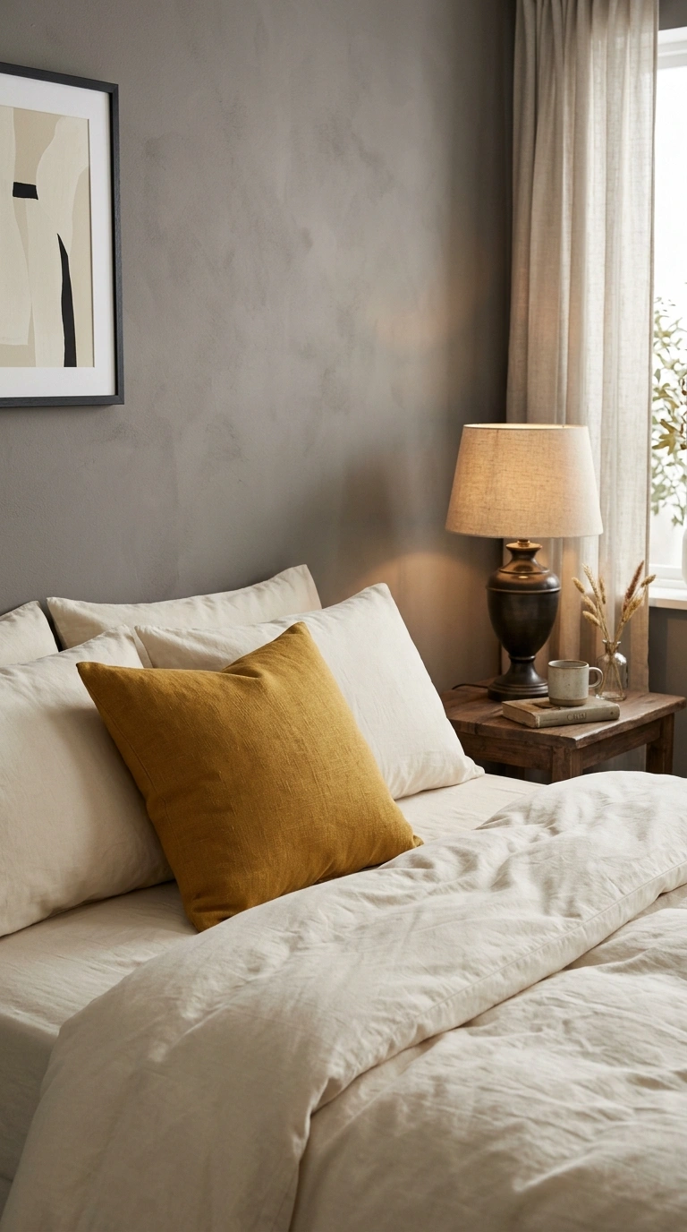
Warm gray as a base with mustard yellow as a small accent brings a subtle boldness to a bedroom without fully committing to a bright, saturated color scheme.
A simple ratio:
- 80% warm gray (walls, bedding, larger furniture)
- 15% mustard (an accent chair, pillow, or artwork)
- 5% black or dark bronze (small hardware accents)
Keeping mustard to a genuine accent-only role, rather than a wall color, is what keeps this combination feeling understated rather than overwhelming.
22. Cream and Bottle Green
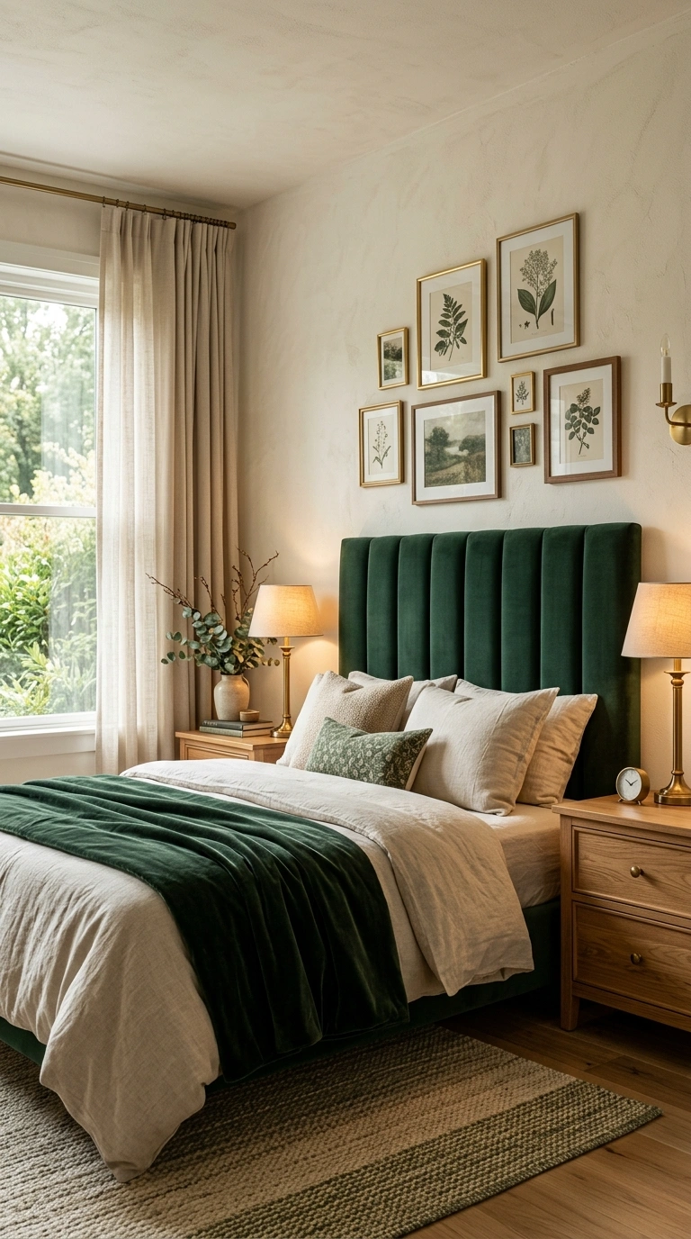
Cream and bottle green (a very deep, saturated green) create a classic, rich combination that blends traditional design sensibilities with a more modern, confident use of dark color.
Best paired with: brass hardware and warm wood furniture, both of which reinforce the traditional-meets-modern feel this combination naturally leans toward.
Bottle green works well as either an accent wall or a headboard fabric, with cream carrying the remaining walls and bedding for balance.
23. Lavender and Warm Gray
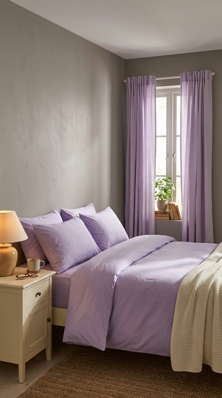
Lavender and warm gray create a calm, grounded combination, with the warm gray preventing lavender’s naturally cool undertone from making the room feel cold.
A simple ratio:
- 60% warm gray (walls, larger furniture)
- 30% lavender (bedding, one accent wall, or curtains)
- 10% a warm neutral like cream or a warm wood tone
This pairing works especially well for adults who like the idea of lavender but worry it will read as too soft or overly sweet on its own; warm gray adds exactly the grounding needed.
Choose one combination that matches your room’s natural light and the mood you actually want, and use its ratio as a starting point rather than an exact rule. The proportion between your colors, not just the shades themselves, is usually what separates a bedroom that looks intentional from one that looks accidental.
Save your favorite bedroom color combinations to Pinterest so you have them ready when you’re ready to pick paint.
FAQs
What bedroom color combination is most timeless?
Ivory and chocolate brown is one of the most universally flattering bedroom color combinations on this list, working across nearly any room size, light level, or furniture style, since it relies on classic light-dark contrast rather than a specific trend color.
What’s a good bedroom color combination for a small, dark room?
Lighter, warmer combinations like soft pink and sage green, or camel and cream, work better in small or dim bedrooms than bold, dark pairings like burgundy and blush, which need more natural light to avoid feeling heavy.
How do I choose between warm and cool color combinations?
Check your existing wood tones and metal hardware first. Warm wood and brass pair best with warm-undertone combinations, while cooler wood and chrome or black metal pair better with cooler-undertone pairings.
Is it okay to use three colors in a bedroom instead of two?
Yes, as long as one color dominates (typically 55-70%), a second serves as a clear secondary accent, and a third stays limited to small details like hardware or a single accent pillow.
What’s the safest bold bedroom color combination to try?
Navy and warm white is one of the safer bold bedroom color combinations, since it reads as classic and crisp rather than overly trendy, and works in bedrooms with a wide range of natural light levels.