How to Choose Paint Colors for Your Home
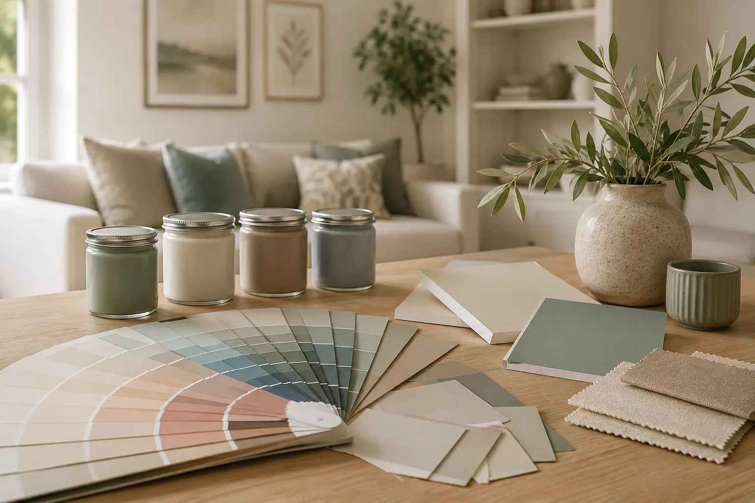
Standing in the paint aisle with fifty shades of white staring back at you is one of the most overwhelming parts of decorating. Choosing paint colors feels simple until you’re actually holding the swatch fan in your hand and every color starts to look the same.
This guide breaks it down into steps that actually work. You’ll learn how light changes a color, why undertones matter more than the color name, and how to pick paint colors for every room in your house without repainting three times.
Start With the Room’s Natural Light
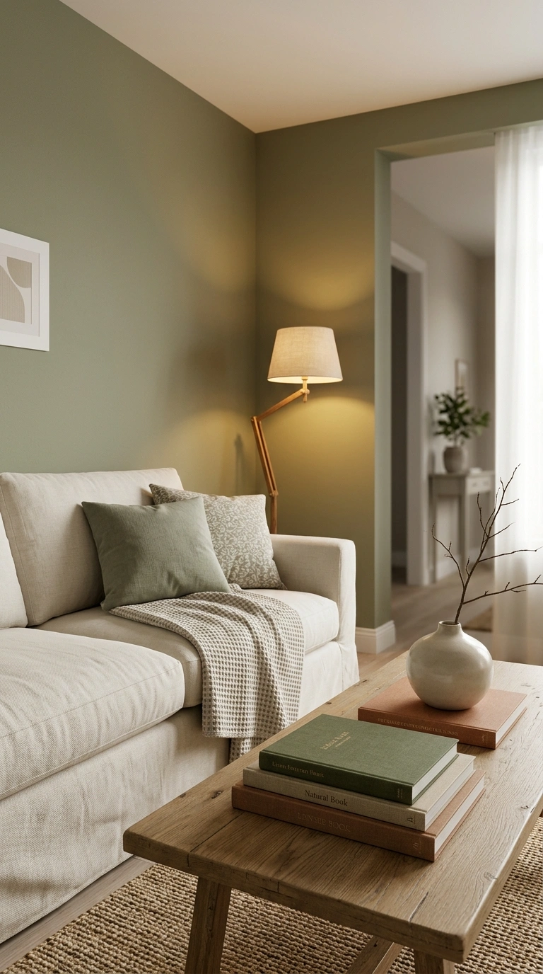
Light changes color more than anything else in the room. A paint color that looks warm and soft in a showroom can turn cold and gray in your hallway.
North-facing rooms get cool, flat light all day, so warm paint colors like soft terracotta or warm ivory balance that out. South-facing rooms get strong, warm light, so cooler tones like sage green or dusty blue stay balanced instead of turning yellow.
Before you pick anything, watch how the room looks at 9 a.m., 1 p.m., and 7 p.m. Paint looks different at every hour, and your final color needs to work in all three.
Test Colors Before You Commit
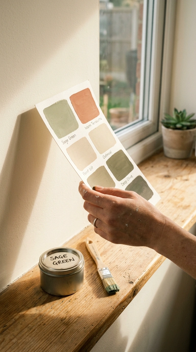
Paint swatches lie. The two-inch square on the card never matches how a color looks across four walls.
Buy sample pots of your top two or three choices. Paint a square at least 12×12 inches on two different walls, since one wall usually gets more light than the other. Live with it for two to three days before deciding.
Tip: Paint the sample onto a piece of poster board instead of the wall. You can move it around the room and hold it next to furniture, flooring, and trim to see how it actually behaves in different spots.
Undertones Are the Detail Most People Miss
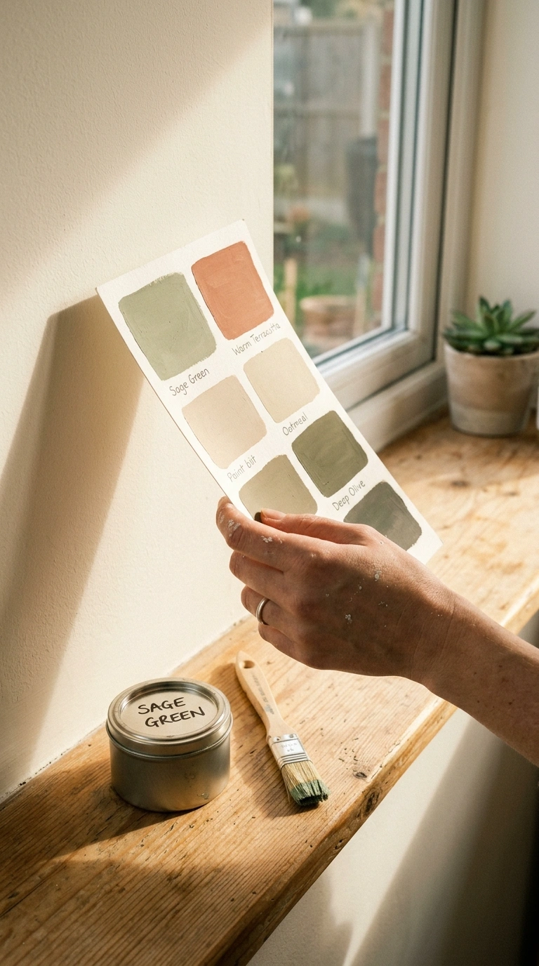
This is the part almost nobody talks about, and it’s the reason paint colors go wrong. Every color, even white, has an undertone hiding underneath it.
A “greige” can lean pink, green, or purple depending on the brand. A crisp white can turn slightly blue or slightly yellow next to your trim. The only way to catch this is to compare your sample against a true white sheet of paper in daylight — the undertone will show up immediately.
| Undertone | How to Spot It | Pairs Well With |
|---|---|---|
| Warm (yellow/orange) | Feels cozy, slightly golden | Wood tones, brass, terracotta |
| Cool (blue/green) | Feels crisp, slightly gray | Silver, marble, black accents |
| Pink/Purple | Shows up in “greige” shades | Blush, sage, muted gold |
Choosing Paint Colors Room by Room
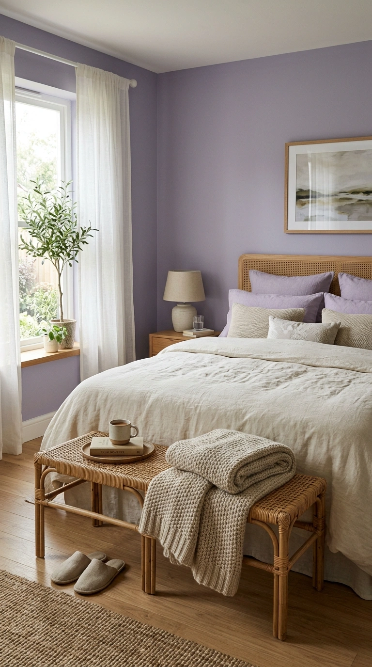
Different rooms serve different purposes, so the color that works in a bedroom won’t always work in a kitchen.
| Room | Mood You Want | Popular Colors | Finish |
|---|---|---|---|
| Living Room | Warm, welcoming | Warm greige, soft olive, dusty terracotta | Eggshell |
| Bedroom | Calm, restful | Sage green, muted lavender, warm ivory | Matte or eggshell |
| Kitchen | Fresh, clean | Soft white, warm cream, sage green | Satin (wipeable) |
| Bathroom | Spa-like, calm | Dusty blue, soft sage, warm gray | Satin or semi-gloss |
| Home Office | Focused, calm | Deep navy, muted olive, warm gray | Eggshell |
Match Paint to Furniture and Flooring You Already Own
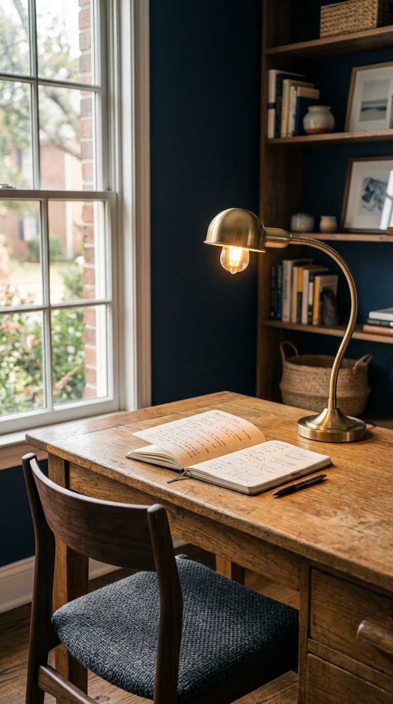
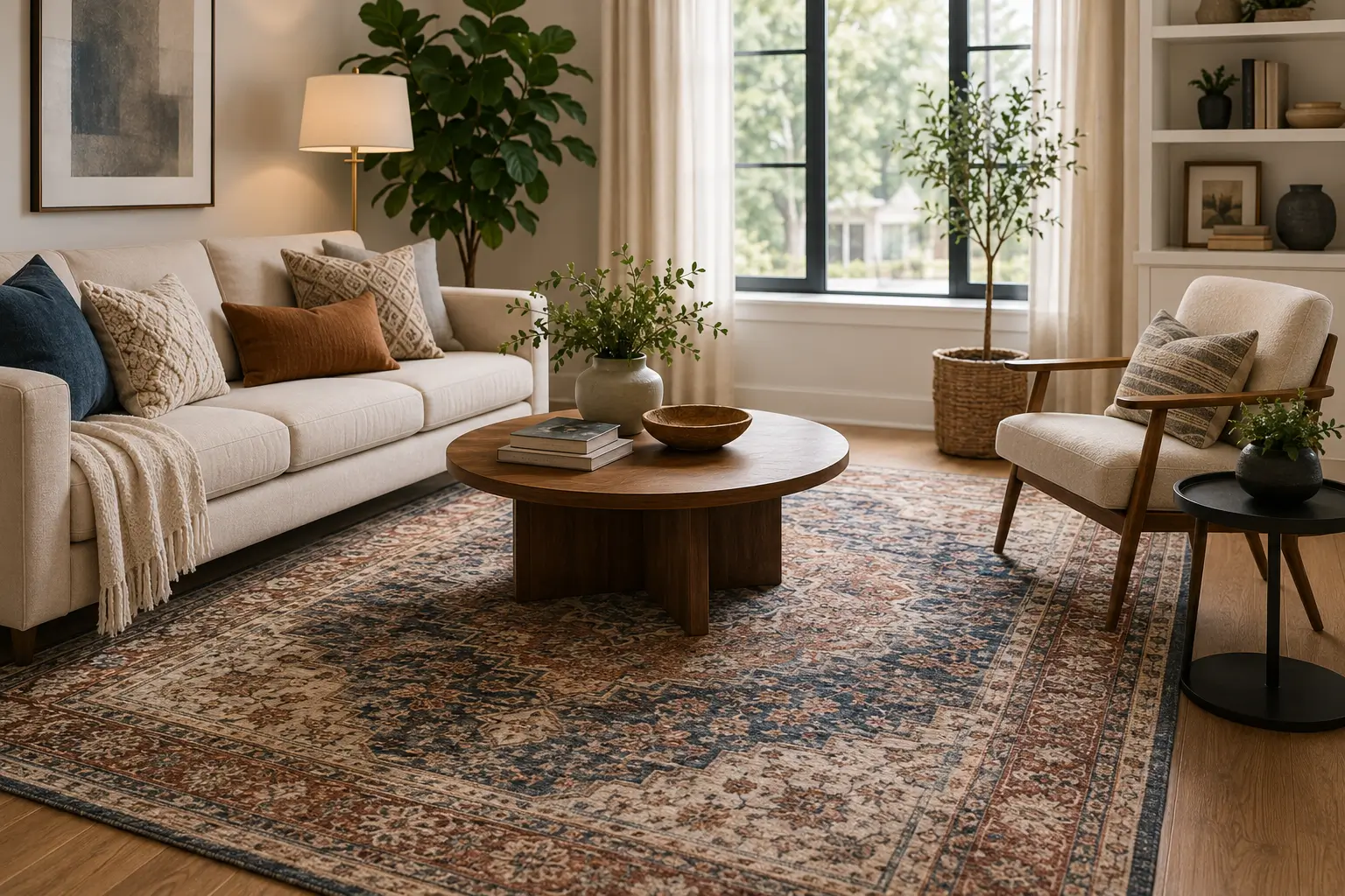
Paint should support the room, not fight it. If your flooring has warm honey or oak tones, cool gray paint will make the wood look muddy. Warm whites and soft greiges work better with warm wood floors.
If your furniture is mostly neutral, you have more freedom to use color on the walls. If your furniture already has bold color or pattern, keep the walls in a quieter neutral so the room doesn’t compete with itself.
Tip: Bring a small fabric swatch or paint chip from your sofa or rug to the paint store. Holding it next to color options in person saves you from guessing at home.
Popular Paint Palettes to Try This Year
- Warm Neutral: warm ivory walls, soft taupe trim, brushed brass fixtures
- Modern Sage: sage green walls, warm white trim, natural oak furniture
- Moody Depth: deep navy accent wall, warm white ceiling, brass or black hardware
- Soft Terracotta: dusty terracotta walls, cream trim, woven natural textures
- Quiet Gray: warm greige walls, white trim, black accents for contrast
Common Paint Color Mistakes to Avoid
- Picking a color under store lighting instead of your own home’s light
- Skipping the sample stage and going straight to the full room
- Ignoring the undertone and only looking at the color name
- Using the same white throughout the house without checking how it reads in each room
- Choosing trend colors without checking if they match your flooring and furniture
Paint is one of the easiest things to change in a home, but it still deserves a slow decision. Test your top choices, watch how they shift through the day, and check the undertones before you commit to a full room. Once you find the right color, save it to your Pinterest board so you always have the exact shade on hand for touch-ups later.